Draw Linear Model Marginal and Conditional Plots in Parallel or Overlaid
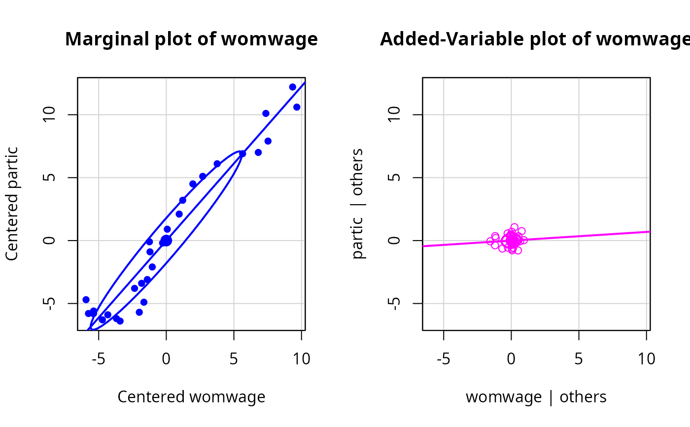
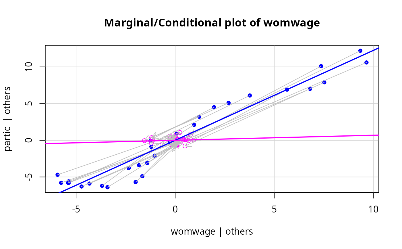
mcPlots.Rdthe mcPlot function draws two graphs or overlays the two graphs. For a response Y and a regressor X, the first plot is the marginal plot of Y versus X with both variables centered, visualizing the conditional distribution of Y given X ignoring all other regressors. The second plot is an added-variable for X after all other regressors, visualizing the conditional distribution of Y given X after adjusting for all other predictors. The added variable plot by default is drawn using the same xlim and ylim as the centered marginal plot to emphasize that conditioning removes variation in both the regressor and the response.The plot is primarily intended as a pedagogical tool for understanding coefficients in first-order models.
Usage
mcPlots(model, ...)

# Default S3 method
mcPlots(model, terms=~., layout=NULL, ask, overlaid=TRUE, ...)

mcPlot(model, ...)

# S3 method for class 'lm'
mcPlot(model, variable, id=FALSE,
    col.marginal=carPalette()[2], col.conditional=carPalette()[3],
    col.arrows="gray", pch = c(16,1), cex=par("cex"), pt.wts=FALSE,
    lwd = 2, grid=TRUE, ellipse=FALSE, overlaid=TRUE, new=TRUE,
    title=TRUE, ...)

# S3 method for class 'glm'
mcPlot(model, ...)
Arguments
- model
model object produced by
lm; the"glm"method just reports an error.- terms
A one-sided formula that specifies a subset of the predictors. One added-variable plot is drawn for each regressor and for each basis vector used to define a factor. For example, the specification
terms = ~ . - X3would plot against all terms except forX3. If this argument is a quoted name of one of the regressors or factors, the added-variable plot is drawn for that regressor or factor only. Unlike other car functions, the formula should include the names of regressors, not predictors. That is, iflog(X4)is used to represent a predictorX4, the formula should specifyterms = ~ log(X4).- variable
A quoted string giving the name of a numeric predictor in the model matrix for the horizontal axis. To plot against a factor, you need to specify the full name of one of the indicator variables that define the factor. For example, for a factor called
typewith levelsA,BandC, using the usual drop-first level parameterization of the factor, the regressors fortypewould betypeBortypeC. Similarly, to plot against the regressorlog(X4), you must specify"log((X4)", not"X4".- layout
If set to a value like
c(1, 2)orc(6, 2), the layout of the graph will have this many rows and columns. If not set, behavior depends on the value of theoverlaidargument; see the details- ask
If
TRUE, ask the user before drawing the next plot; ifFALSEdon't ask.- ...
mcPlotspasses these arguments tomcPlot.mcPlotpasses arguments toplot.- id
controls point identification; if
FALSE(the default), no points are identified; can be a list of named arguments to theshowLabelsfunction;TRUEis equivalent tolist(method=list(abs(residuals(model, type="pearson")), "x"), n=2, cex=1, col=carPalette()[1], location="lr"), which identifies the 2 points with the largest residuals and the 2 points with the most extreme horizontal (X) values.- overlaid
If TRUE, the default, overlay the marginal and conditional plots on the same graph; otherwise plot them side-by-side. See the details below
- col.marginal, col.conditional
colors for points, lines, ellipses in the marginal and conditional plots, respectively. The defaults are determined by the
carPalettefunction.- col.arrows
color for the arrows with
overlaid=TRUE- pch
Plotting character for marginal and conditional plots, respectively.
- cex
size of plotted points; default is taken from
par("cex").- pt.wts
if
TRUE(the default isFALSE), the areas of plotted points for a weighted least squares fit are made proportional to the weights, with the average size taken from thecexargument.- lwd
line width; default is
2(seepar).- grid
If
TRUE, the default, a light-gray background grid is put on the graph.- ellipse
Arguments to pass to the
dataEllipsefunction, in the form of a list with named elements; e.g.,ellipse.args=list(robust=TRUE))will cause the ellipse to be plotted using a robust covariance-matrix. ifFALSE, the default, no ellipse is plotted.TRUEis equivalent toellipse=list(levels=0.5), which plots a bivariate-normal 50 percent concentration ellipse.- new
if
TRUE, the default, the plot window is reset whenoverlaid=FALSEusingpar{mfrow=c(1, 2)}. IfFALSE, the layout of the plot window is not reset. Users will ordinarily ignore this argument.- title
If TRUE, the default, the standard main argument in plot is used to add a standard title to each plot. If FALSE no title is used.
Details
With an lm object, suppose the response is Y, X is a numeric regressor of interest, and Z is all the remaining predictors, possibly including interactions and factors. This function produces two graphs. The first graph is the marginal plot of Y versus X, with each variable centered around its mean. The second conditional plot is the added-variable plot of e(Y|Z) versus e(X|Z) where e(a|b) means the Pearson residuals from the regression of a on b. If overlaid=TRUE, these two plots are overlaid in one graph, with the points in different colors. In addition, each point in the marginal plot is joined to its value in the conditional plot by an arrow. Least squares regression lines fit to the marginal and conditional graphs are also shown; data ellipsoids can also be added. If overlaid=FALSE, then the two graphs are shown in side-by-side plots as long as the second argument to layout is equal to 2, or layout is set by the function. The arrows are omitted if the graphs are not overlaid.
These graphs are primarily for teaching, as the marginal plot shows the relationship between Y and X ignoring Z, while the conditional is the relationship between Y and X given X. By keeping the scales the same in both graphs the effect of conditioning on both X and Y can be visualized.
This function is intended for first-order models with numeric predictors only. For a factor, one (pair) of mcPlots will be produced for each of the dummy variables in the basis for the factor, and the resulting plots are not generally meaningful because they depend on parameterization. If the mean function includes interactions, then mcPlots for main effects may violate the hierarchy principle, and may also be of little interest. mcPlots for interactions of numerical predictors, however, can be useful.
These graphs are closely related to the ARES plots proposed by Cook and Weisberg (1989). This plot would benefit from animation.
References
Cook, R. D. and Weisberg, S. (1989) Regression diagnostics with dynamic graphics, Technometrics, 31, 277.
Fox, J. (2016) Applied Regression Analysis and Generalized Linear Models, Third Edition. Sage.
Fox, J. and Weisberg, S. (2019) An R Companion to Applied Regression, Third Edition, Sage.
Weisberg, S. (2014) Applied Linear Regression, Fourth Edition, Wiley.
Author
John Fox jfox@mcmaster.ca, Sanford Weisberg sandy@umn.edu
Examples
m1 <- lm(partic ~ tfr + menwage + womwage + debt + parttime, data = Bfox)
mcPlot(m1, "womwage")

mcPlot(m1, "womwage", overlaid=FALSE, ellipse=TRUE)