Box-Percentile Panel Function for Trellis
panel.bpplot.RdFor all their good points, box plots have a high ink/information ratio in that they mainly display 3 quartiles. Many practitioners have found that the "outer values" are difficult to explain to non-statisticians and many feel that the notion of "outliers" is too dependent on (false) expectations that data distributions should be Gaussian.
panel.bpplot is a panel function for use with
trellis, especially for bwplot. It draws box plots
(without the whiskers) with any number of user-specified "corners"
(corresponding to different quantiles), but it also draws box-percentile
plots similar to those drawn by Jeffrey Banfield's
(umsfjban@bill.oscs.montana.edu) bpplot function.
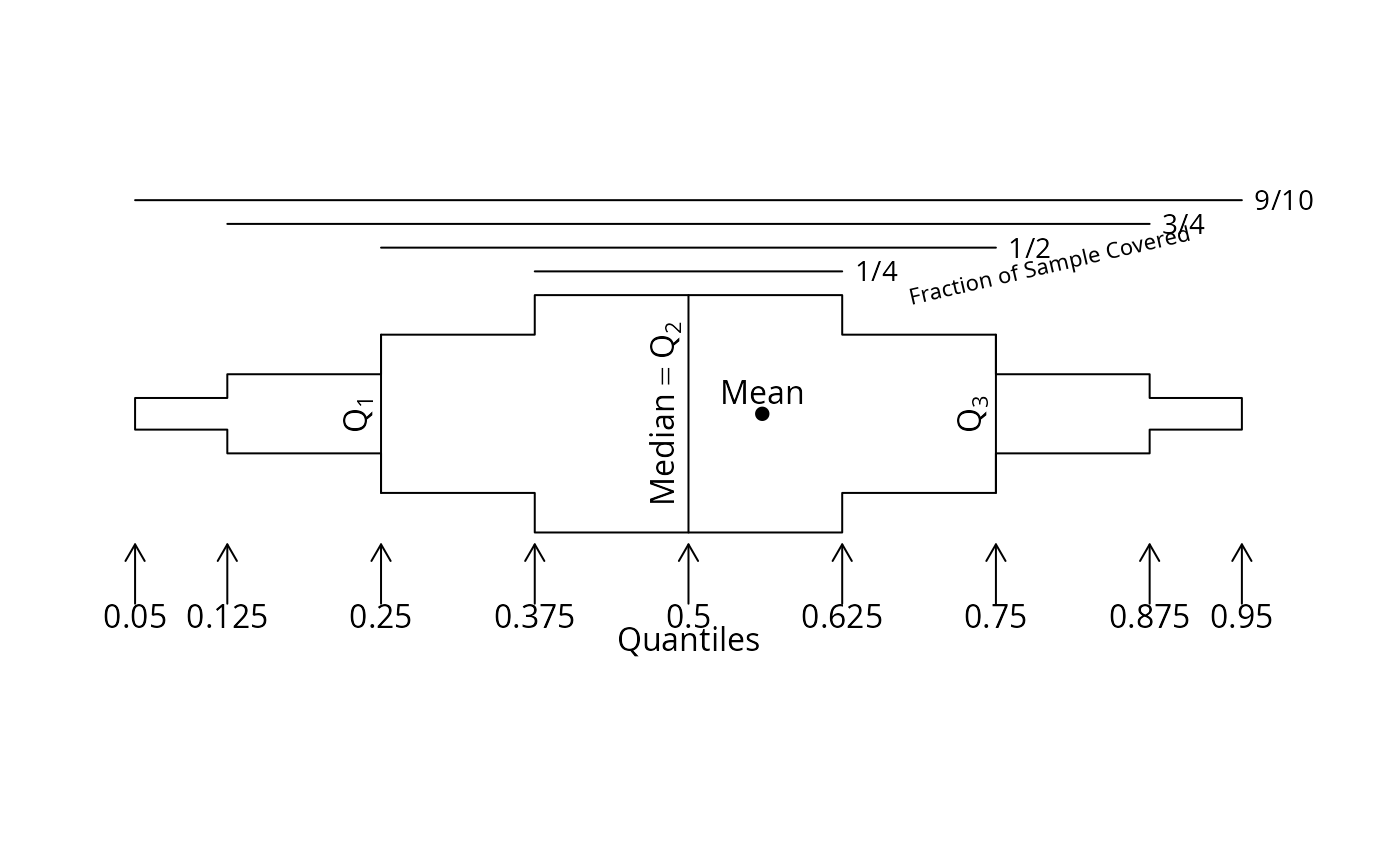
To quote from Banfield, "box-percentile plots supply more
information about the univariate distributions. At any height the
width of the irregular 'box' is proportional to the percentile of that
height, up to the 50th percentile, and above the 50th percentile the
width is proportional to 100 minus the percentile. Thus, the width at
any given height is proportional to the percent of observations that
are more extreme in that direction. As in boxplots, the median, 25th
and 75th percentiles are marked with line segments across the box."
panel.bpplot can also be used with base graphics to add extended
box plots to an existing plot, by specifying nogrid=TRUE, height=....
panel.bpplot is a generalization of bpplot and
panel.bwplot in
that it works with trellis (making the plots horizontal so that
category labels are more visable), it allows the user to specify the
quantiles to connect and those for which to draw reference lines,
and it displays means (by default using dots).
bpplt draws horizontal box-percentile plot much like those drawn
by panel.bpplot but taking as the starting point a matrix
containing quantiles summarizing the data. bpplt is primarily
intended to be used internally by plot.summary.formula.reverse or
plot.summaryM
but when used with no arguments has a general purpose: to draw an
annotated example box-percentile plot with the default quantiles used
and with the mean drawn with a solid dot. This schematic plot is
rendered nicely in postscript with an image height of 3.5 inches.
bppltp is like bpplt but for plotly graphics, and
it does not draw an annotated extended box plot example.
bpplotM uses the lattice bwplot function to depict
multiple numeric continuous variables with varying scales in a single
lattice graph, after reshaping the dataset into a tall and thin
format.
Usage
panel.bpplot(x, y, box.ratio=1, means=TRUE, qref=c(.5,.25,.75),
             probs=c(.05,.125,.25,.375), nout=0,
             nloc=c('right lower', 'right', 'left', 'none'), cex.n=.7,
             datadensity=FALSE, scat1d.opts=NULL,
             violin=FALSE, violin.opts=NULL,
             font=box.dot$font, pch=box.dot$pch,
             cex.means =box.dot$cex,  col=box.dot$col,
             nogrid=NULL, height=NULL, ...)

# E.g. bwplot(formula, panel=panel.bpplot, panel.bpplot.parameters)

bpplt(stats, xlim, xlab='', box.ratio = 1, means=TRUE,
      qref=c(.5,.25,.75), qomit=c(.025,.975),
      pch=16, cex.labels=par('cex'), cex.points=if(prototype)1 else 0.5,
      grid=FALSE)

bppltp(p=plotly::plot_ly(),
       stats, xlim, xlab='', box.ratio = 1, means=TRUE,
       qref=c(.5,.25,.75), qomit=c(.025,.975),
       teststat=NULL, showlegend=TRUE)

bpplotM(formula=NULL, groups=NULL, data=NULL, subset=NULL, na.action=NULL,
        qlim=0.01, xlim=NULL,
        nloc=c('right lower','right','left','none'),
        vnames=c('labels', 'names'), cex.n=.7, cex.strip=1,
        outerlabels=TRUE, ...)
Arguments
- x
continuous variable whose distribution is to be examined
- y
grouping variable
- box.ratio
see
panel.bwplot- means
set to
FALSEto suppress drawing a character at the mean value- qref
vector of quantiles for which to draw reference lines. These do not need to be included in
probs.- probs
vector of quantiles to display in the box plot. These should all be less than 0.5; the mirror-image quantiles are added automatically. By default,
probsis set toc(.05,.125,.25,.375)so that intervals contain 0.9, 0.75, 0.5, and 0.25 of the data. To draw all 99 percentiles, i.e., to draw a box-percentile plot, setprobs=seq(.01,.49,by=.01). To make a more traditional box plot, useprobs=.25.- nout
tells the function to use
scat1dto draw tick marks showing thenoutsmallest andnoutlargest values ifnout >= 1, or to show all values less than thenoutquantile or greater than the1-noutquantile if0 < nout <= 0.5. Ifnoutis a whole number, only the firstn/2observations are shown on either side of the median, wherenis the total number of observations.- nloc
location to plot number of non-
NAobservations next to each box. Specifynloc='none'to suppress. Forpanel.bpplot, the defaultnlocis'none'ifnogrid=TRUE.- cex.n
character size for
nloc- datadensity
set to
TRUEto invokescat1dto draw a data density (one-dimensional scatter diagram or rug plot) inside each box plot.- scat1d.opts
a list containing named arguments (without abbreviations) to pass to
scat1dwhendatadensity=TRUEornout > 0- violin
set to
TRUEto invokepanel.violinin addition to drawing box-percentile plots- violin.opts
a list of options to pass to
panel.violin- cex.means
character size for dots representing means
- font,pch,col
see
panel.bwplot- nogrid
set to
TRUEto use in base graphics- height
if
nogrid=TRUE, specifies the height of the box in useryunits- ...
arguments passed to
pointsorpanel.bpplotorbwplot- stats,xlim,xlab,qomit,cex.labels,cex.points,grid
undocumented arguments to
bpplt. ForbpplotM,xlimis a list with elements named as thex-axis variables, to override theqlimcalculations with user-specifiedx-axis limits for selected variables. Example:xlim=list(age=c(20,60)).- p
an already-started
plotlyobject- teststat
an html expression containing a test statistic
- showlegend
set to
TRUEto haveplotlyinclude a legend. Not recommended when plotting more than one variable.- formula
a formula with continuous numeric analysis variables on the left hand side and stratification variables on the right. The first variable on the right is the one that will vary the fastest, forming the
y-axis.formulamay be omitted, in which case all numeric variables with more than 5 unique values indatawill be analyzed. Orformulamay be a vector of variable names indatato analyze. In the latter two cases (and only those cases),groupsmust be given, representing a character vector with names of stratification variables.- groups
see above
- data
an optional data frame
- subset
an optional subsetting expression or logical vector
- na.action
specifies a function to possibly subset the data according to
NAs (default is no such subsetting).- qlim
the outer quantiles to use for scaling each panel in
bpplotM- vnames
default is to use variable
labelattributes when they exist, or use variable names otherwise. Specifyvnames='names'to always use variable names for panel labels inbpplotM- cex.strip
character size for panel strip labels
- outerlabels
if
TRUE, pass thelatticegraphics through thelatticeExtrapackage'suseOuterStripsfunction if there are two conditioning (paneling) variables, to put panel labels in outer margins.
Author
Frank Harrell
Department of Biostatistics
Vanderbilt University School of Medicine
fh@fharrell.com
Examples
set.seed(13)
x <- rnorm(1000)
g <- sample(1:6, 1000, replace=TRUE)
x[g==1][1:20] <- rnorm(20)+3 # contaminate 20 x's for group 1
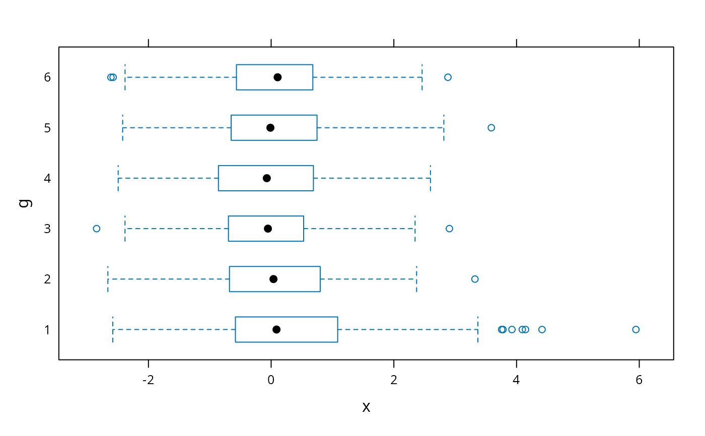
# default trellis box plot
require(lattice)
#> Loading required package: lattice
bwplot(g ~ x)
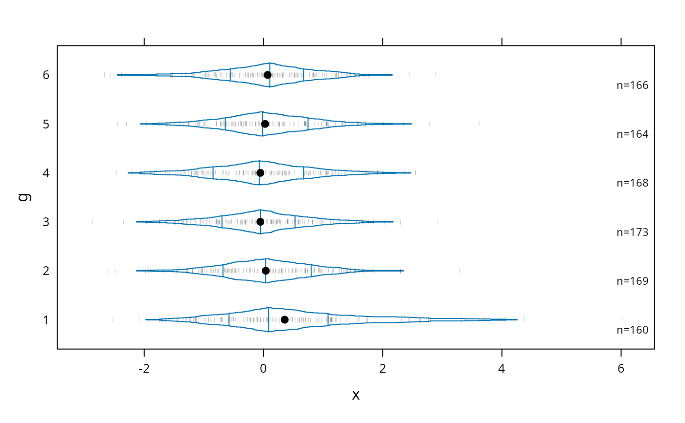
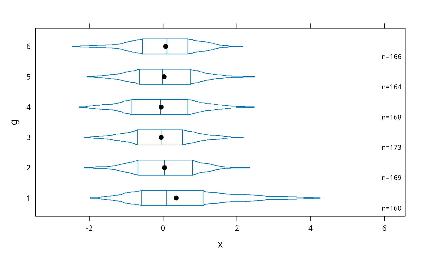
 # box-percentile plot with data density (rug plot)
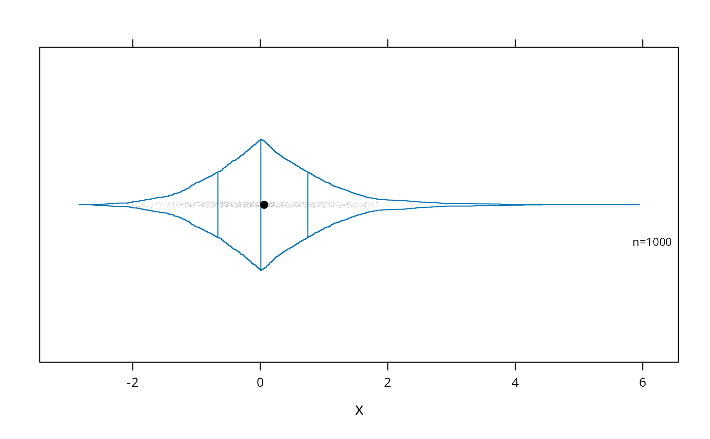
bwplot(g ~ x, panel=panel.bpplot, probs=seq(.01,.49,by=.01), datadensity=TRUE)
# box-percentile plot with data density (rug plot)
bwplot(g ~ x, panel=panel.bpplot, probs=seq(.01,.49,by=.01), datadensity=TRUE)
 # add ,scat1d.opts=list(tfrac=1) to make all tick marks the same size
# when a group has > 125 observations
# small dot for means, show only .05,.125,.25,.375,.625,.75,.875,.95 quantiles
bwplot(g ~ x, panel=panel.bpplot, cex.means=.3)
# add ,scat1d.opts=list(tfrac=1) to make all tick marks the same size
# when a group has > 125 observations
# small dot for means, show only .05,.125,.25,.375,.625,.75,.875,.95 quantiles
bwplot(g ~ x, panel=panel.bpplot, cex.means=.3)
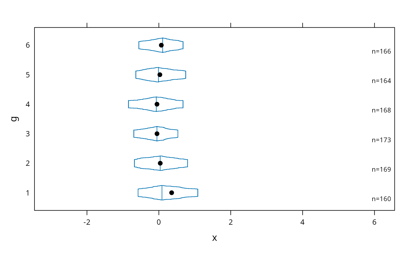
 # suppress means and reference lines for lower and upper quartiles
bwplot(g ~ x, panel=panel.bpplot, probs=c(.025,.1,.25), means=FALSE, qref=FALSE)
# suppress means and reference lines for lower and upper quartiles
bwplot(g ~ x, panel=panel.bpplot, probs=c(.025,.1,.25), means=FALSE, qref=FALSE)
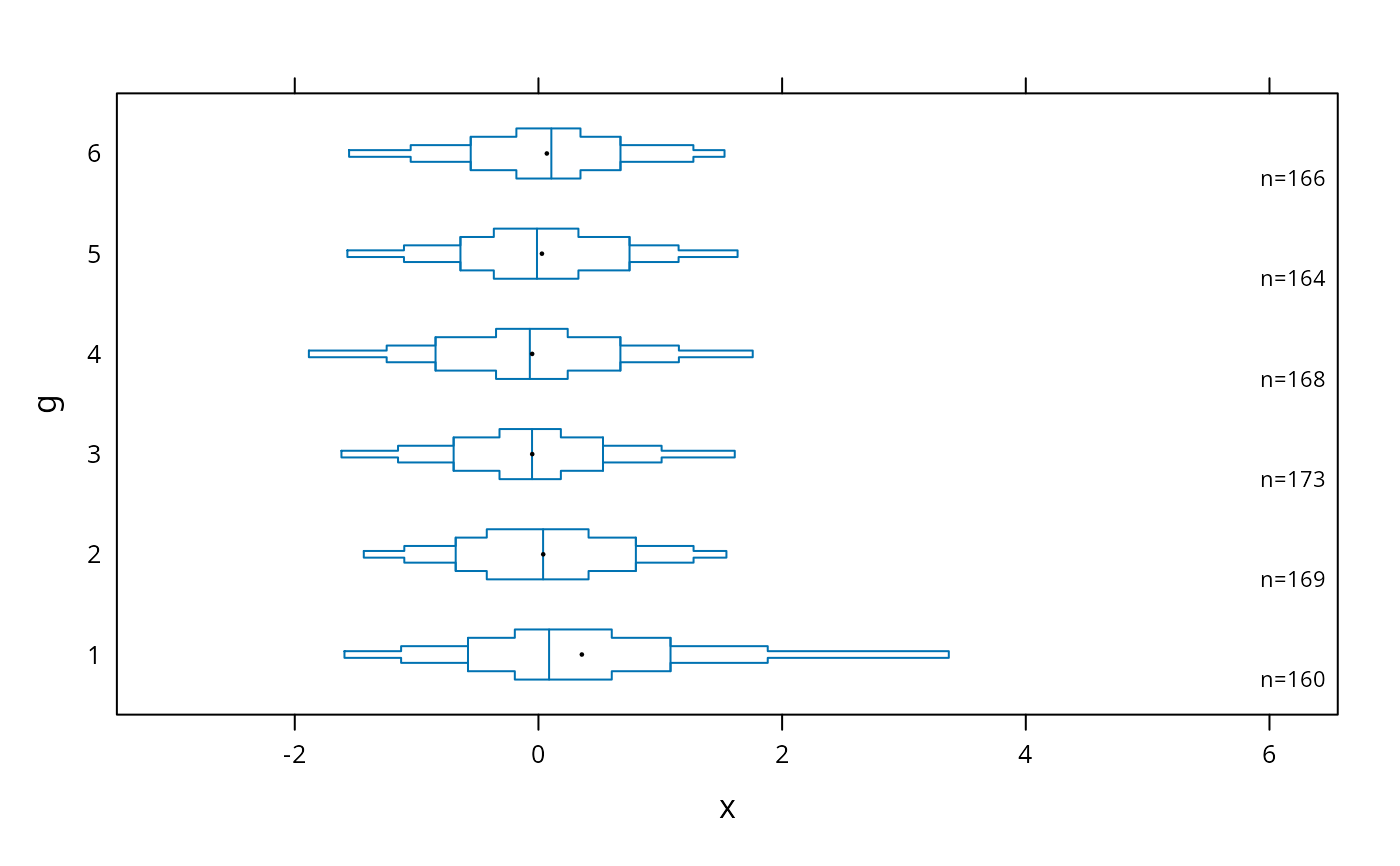
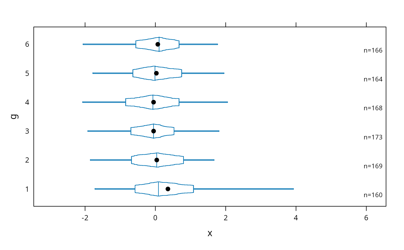
 # continuous plot up until quartiles ("Tootsie Roll plot")
bwplot(g ~ x, panel=panel.bpplot, probs=seq(.01,.25,by=.01))
# continuous plot up until quartiles ("Tootsie Roll plot")
bwplot(g ~ x, panel=panel.bpplot, probs=seq(.01,.25,by=.01))
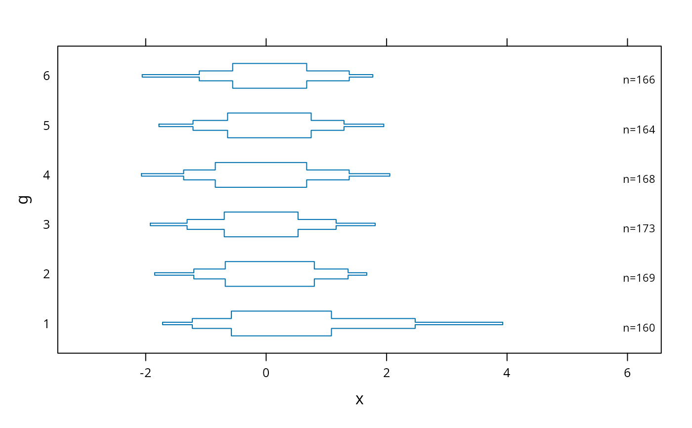
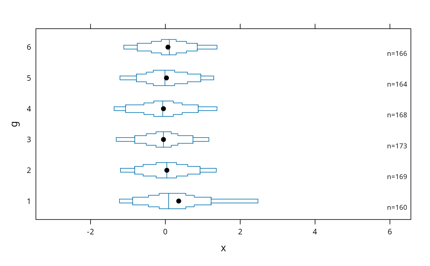
 # start at quartiles then make it continuous ("coffin plot")
bwplot(g ~ x, panel=panel.bpplot, probs=seq(.25,.49,by=.01))
# start at quartiles then make it continuous ("coffin plot")
bwplot(g ~ x, panel=panel.bpplot, probs=seq(.25,.49,by=.01))
 # same as previous but add a spike to give 0.95 interval
bwplot(g ~ x, panel=panel.bpplot, probs=c(.025,seq(.25,.49,by=.01)))
# same as previous but add a spike to give 0.95 interval
bwplot(g ~ x, panel=panel.bpplot, probs=c(.025,seq(.25,.49,by=.01)))
 # decile plot with reference lines at outer quintiles and median
bwplot(g ~ x, panel=panel.bpplot, probs=c(.1,.2,.3,.4), qref=c(.5,.2,.8))
# decile plot with reference lines at outer quintiles and median
bwplot(g ~ x, panel=panel.bpplot, probs=c(.1,.2,.3,.4), qref=c(.5,.2,.8))
 # default plot with tick marks showing all observations outside the outer
# box (.05 and .95 quantiles), with very small ticks
bwplot(g ~ x, panel=panel.bpplot, nout=.05, scat1d.opts=list(frac=.01))
# default plot with tick marks showing all observations outside the outer
# box (.05 and .95 quantiles), with very small ticks
bwplot(g ~ x, panel=panel.bpplot, nout=.05, scat1d.opts=list(frac=.01))
 # show 5 smallest and 5 largest observations
bwplot(g ~ x, panel=panel.bpplot, nout=5)
# show 5 smallest and 5 largest observations
bwplot(g ~ x, panel=panel.bpplot, nout=5)
 # Use a scat1d option (preserve=TRUE) to ensure that the right peak extends
# to the same position as the extreme scat1d
bwplot(~x , panel=panel.bpplot, probs=seq(.00,.5,by=.001),
datadensity=TRUE, scat1d.opt=list(preserve=TRUE))
# Use a scat1d option (preserve=TRUE) to ensure that the right peak extends
# to the same position as the extreme scat1d
bwplot(~x , panel=panel.bpplot, probs=seq(.00,.5,by=.001),
datadensity=TRUE, scat1d.opt=list(preserve=TRUE))
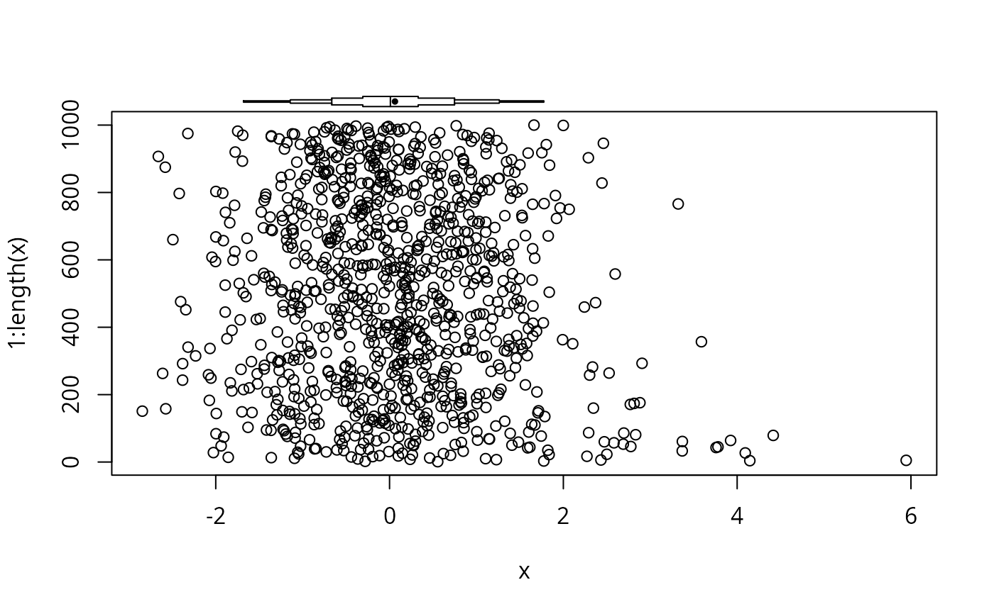
 # Add an extended box plot to an existing base graphics plot
plot(x, 1:length(x))
panel.bpplot(x, 1070, nogrid=TRUE, pch=19, height=15, cex.means=.5)
# Add an extended box plot to an existing base graphics plot
plot(x, 1:length(x))
panel.bpplot(x, 1070, nogrid=TRUE, pch=19, height=15, cex.means=.5)
 # Draw a prototype showing how to interpret the plots
bpplt()
# Draw a prototype showing how to interpret the plots
bpplt()
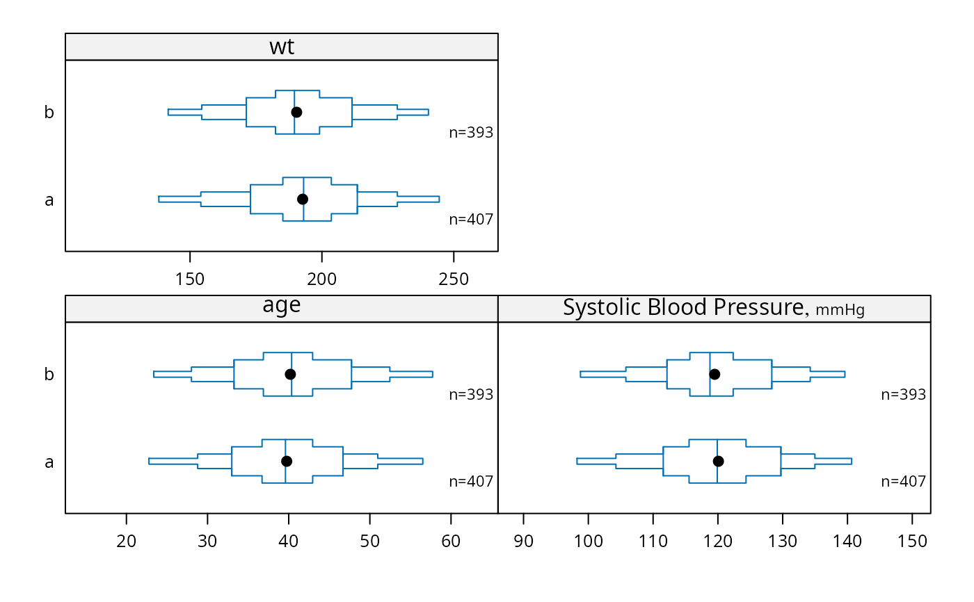
 # Example for bpplotM
set.seed(1)
n <- 800
d <- data.frame(treatment=sample(c('a','b'), n, TRUE),
sex=sample(c('female','male'), n, TRUE),
age=rnorm(n, 40, 10),
bp =rnorm(n, 120, 12),
wt =rnorm(n, 190, 30))
label(d$bp) <- 'Systolic Blood Pressure'
units(d$bp) <- 'mmHg'
bpplotM(age + bp + wt ~ treatment, data=d)
# Example for bpplotM
set.seed(1)
n <- 800
d <- data.frame(treatment=sample(c('a','b'), n, TRUE),
sex=sample(c('female','male'), n, TRUE),
age=rnorm(n, 40, 10),
bp =rnorm(n, 120, 12),
wt =rnorm(n, 190, 30))
label(d$bp) <- 'Systolic Blood Pressure'
units(d$bp) <- 'mmHg'
bpplotM(age + bp + wt ~ treatment, data=d)
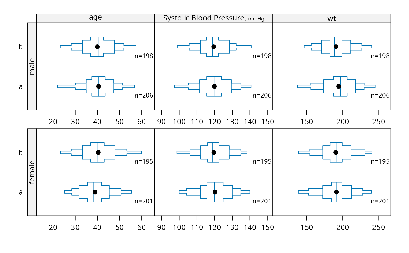
 bpplotM(age + bp + wt ~ treatment * sex, data=d, cex.strip=.8)
 bpplotM(age + bp + wt ~ treatment*sex, data=d,
violin=TRUE,
violin.opts=list(col=adjustcolor('blue', alpha.f=.15),
border=FALSE))
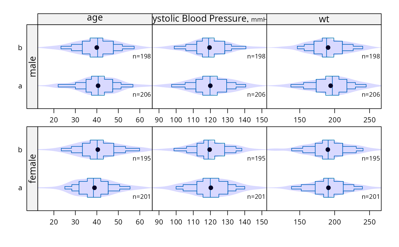
bpplotM(age + bp + wt ~ treatment*sex, data=d,
violin=TRUE,
violin.opts=list(col=adjustcolor('blue', alpha.f=.15),
border=FALSE))
 bpplotM(c('age', 'bp', 'wt'), groups='treatment', data=d)
 # Can use Hmisc Cs function, e.g. Cs(age, bp, wt)
bpplotM(age + bp + wt ~ treatment, data=d, nloc='left')
# Can use Hmisc Cs function, e.g. Cs(age, bp, wt)
bpplotM(age + bp + wt ~ treatment, data=d, nloc='left')
 # Without treatment: bpplotM(age + bp + wt ~ 1, data=d)
if (FALSE) { # \dontrun{
# Automatically find all variables that appear to be continuous
getHdata(support)
bpplotM(data=support, group='dzgroup',
cex.strip=.4, cex.means=.3, cex.n=.45)
# Separate displays for categorical vs. continuous baseline variables
getHdata(pbc)
pbc <- upData(pbc, moveUnits=TRUE)
s <- summaryM(stage + sex + spiders ~ drug, data=pbc)
plot(s)
Key(0, .5)
s <- summaryP(stage + sex + spiders ~ drug, data=pbc)
plot(s, val ~ freq | var, groups='drug', pch=1:3, col=1:3,
key=list(x=.6, y=.8))
bpplotM(bili + albumin + protime + age ~ drug, data=pbc)
} # }
# Without treatment: bpplotM(age + bp + wt ~ 1, data=d)
if (FALSE) { # \dontrun{
# Automatically find all variables that appear to be continuous
getHdata(support)
bpplotM(data=support, group='dzgroup',
cex.strip=.4, cex.means=.3, cex.n=.45)
# Separate displays for categorical vs. continuous baseline variables
getHdata(pbc)
pbc <- upData(pbc, moveUnits=TRUE)
s <- summaryM(stage + sex + spiders ~ drug, data=pbc)
plot(s)
Key(0, .5)
s <- summaryP(stage + sex + spiders ~ drug, data=pbc)
plot(s, val ~ freq | var, groups='drug', pch=1:3, col=1:3,
key=list(x=.6, y=.8))
bpplotM(bili + albumin + protime + age ~ drug, data=pbc)
} # }