One-Dimensional Scatter Diagram, Spike Histogram, or Density
scat1d.Rdscat1d adds tick marks (bar codes. rug plot) on any of the four
sides of an existing plot, corresponding with non-missing values of a
vector x. This is used to show the data density. Can also
place the tick marks along a curve by specifying y-coordinates to go
along with the x values.
If any two values of x are within \(\code{eps}*w\) of
each other, where eps defaults to .001 and w is the span
of the intended axis, values of x are jittered by adding a
value uniformly distributed in \([-\code{jitfrac}*w,
\code{jitfrac}*w]\), where jitfrac defaults to
.008. Specifying preserve=TRUE invokes jitter2 with a
different logic of jittering. Allows plotting random sub-segments to
handle very large x vectors (seetfrac).
jitter2 is a generic method for jittering, which does not add
random noise. It retains unique values and ranks, and randomly spreads
duplicate values at equidistant positions within limits of enclosing
values. jitter2 is especially useful for numeric variables with
discrete values, like rating scales. Missing values are allowed and
are returned. Currently implemented methods are jitter2.default
for vectors and jitter2.data.frame which returns a data.frame
with each numeric column jittered.
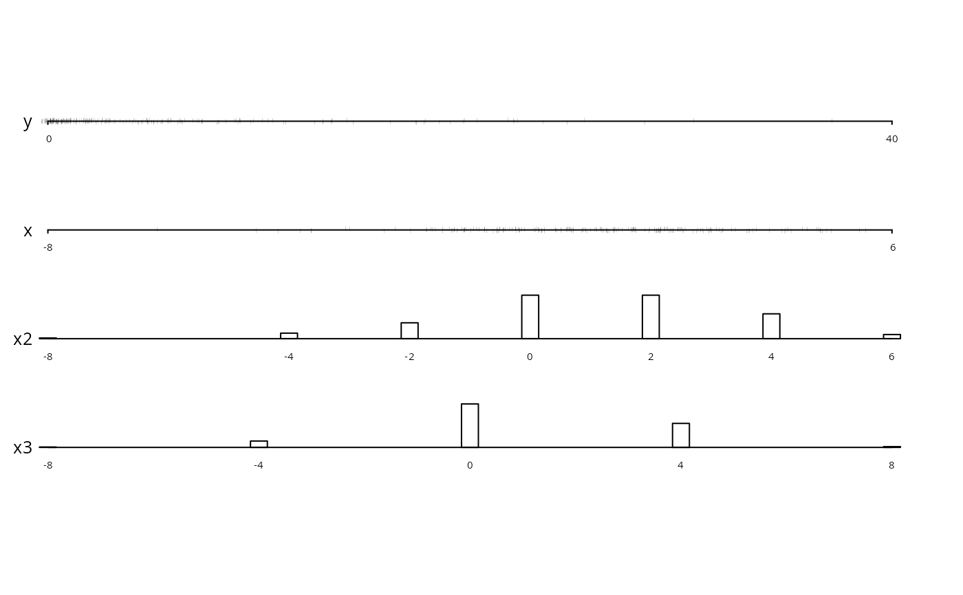
datadensity is a generic method used to show data densities in
more complex situations. Here, another datadensity method is
defined for data frames. Depending on the which argument, some
or all of the variables in a data frame will be displayed, with
scat1d used to display continuous variables and, by default,
bars used to display frequencies of categorical, character, or
discrete numeric variables. For such variables, when the total length
of value labels exceeds 200, only the first few characters from each
level are used. By default, datadensity.data.frame will
construct one axis (i.e., one strip) per variable in the data frame.
Variable names appear to the left of the axes, and the number of
missing values (if greater than zero) appear to the right of the axes.
An optional group variable can be used for stratification,
where the different strata are depicted using different colors. If
the q vector is specified, the desired quantiles (over all
groups) are displayed with solid triangles below each axis.
When the sample size exceeds 2000 (this value may be modified using
the nhistSpike argument, datadensity calls
histSpike instead of scat1d to show the data density for
numeric variables. This results in a histogram-like display that
makes the resulting graphics file much smaller. In this case,
datadensity uses the minf argument (see below) so that
very infrequent data values will not be lost on the variable's axis,
although this will slightly distortthe histogram.
histSpike is another method for showing a high-resolution data
distribution that is particularly good for very large datasets (say
\(\code{n} > 1000\)). By default, histSpike bins the
continuous x variable into 100 equal-width bins and then
computes the frequency counts within bins (if n does not exceed
10, no binning is done). If add=FALSE (the default), the
function displays either proportions or frequencies as in a vertical
histogram. Instead of bars, spikes are used to depict the
frequencies. If add=FALSE, the function assumes you are adding
small density displays that are intended to take up a small amount of
space in the margins of the overall plot. The frac argument is
used as with scat1d to determine the relative length of the
whole plot that is used to represent the maximum frequency. No
jittering is done by histSpike.
histSpike can also graph a kernel density estimate for
x, or add a small density curve to any of 4 sides of an
existing plot. When y or curve is specified, the
density or spikes are drawn with respect to the curve rather than the
x-axis.
histSpikeg is similar to histSpike but is for adding layers
to a ggplot2 graphics object or traces to a plotly
object.
histSpikeg can also add lowess curves to the plot.
ecdfpM makes a plotly graph or series of graphs showing
possibly superposed empirical cumulative distribution functions.
Usage
scat1d(x, side=3, frac=0.02, jitfrac=0.008, tfrac,
       eps=ifelse(preserve,0,.001),
       lwd=0.1, col=par("col"),
       y=NULL, curve=NULL,
       bottom.align=FALSE,
       preserve=FALSE, fill=1/3, limit=TRUE, nhistSpike=2000, nint=100,
       type=c('proportion','count','density'), grid=FALSE, ...)

jitter2(x, ...)

# Default S3 method
jitter2(x, fill=1/3, limit=TRUE, eps=0,
        presorted=FALSE, ...)

# S3 method for class 'data.frame'
jitter2(x, ...)

datadensity(object, ...)

# S3 method for class 'data.frame'
datadensity(object, group,
            which=c("all","continuous","categorical"),
            method.cat=c("bar","freq"),
            col.group=1:10,
            n.unique=10, show.na=TRUE, nint=1, naxes,
            q, bottom.align=nint>1,
            cex.axis=sc(.5,.3), cex.var=sc(.8,.3),
            lmgp=NULL, tck=sc(-.009,-.002),
            ranges=NULL, labels=NULL, ...)
# sc(a,b) means default to a if number of axes <= 3, b if >=50, use
# linear interpolation within 3-50

histSpike(x, side=1, nint=100, bins=NULL, frac=.05, minf=NULL, mult.width=1,
          type=c('proportion','count','density'),
          xlim=range(x), ylim=c(0,max(f)), xlab=deparse(substitute(x)),
          ylab=switch(type,proportion='Proportion',
                           count     ='Frequency',
                           density   ='Density'),
          y=NULL, curve=NULL, add=FALSE, minimal=FALSE,
          bottom.align=type=='density', col=par('col'), lwd=par('lwd'),
          grid=FALSE, ...)

histSpikeg(formula=NULL, predictions=NULL, data, plotly=NULL,
           lowess=FALSE, xlim=NULL, ylim=NULL,
           side=1, nint=100,
           frac=function(f) 0.01 + 0.02*sqrt(f-1)/sqrt(max(f,2)-1),
           span=3/4, histcol='black', showlegend=TRUE)

ecdfpM(x, group=NULL, what=c('F','1-F','f','1-f'), q=NULL,
       extra=c(0.025, 0.025), xlab=NULL, ylab=NULL, height=NULL, width=NULL,
       colors=NULL, nrows=NULL, ncols=NULL, ...)
Arguments
- x
a vector of numeric data, or a data frame (for
jitter2orecdfpM)- object
a data frame or list (even with unequal number of observations per variable, as long as
groupis notspecified)- side
axis side to use (1=bottom (default for
histSpike), 2=left, 3=top (default forscat1d), 4=right)- frac
fraction of smaller of vertical and horizontal axes for tick mark lengths. Can be negative to move tick marks outside of plot. For
histSpike, this is the relative y-direction length to be used for the largest frequency. Whenscat1dcallshistSpike, it multiplies itsfracargument by 2.5. ForhistSpikeg,fracis a function off, the vector of all frequencies. The default function scales tick marks so that they are between 0.01 and 0.03 of the y range, linearly scaled in the square root of the frequency less one.- jitfrac
fraction of axis for jittering. If \(\code{jitfrac} \le 0\), no jittering is done. If
preserve=TRUE, the amount of jittering is independent of jitfrac.- tfrac
Fraction of tick mark to actually draw. If \(\code{tfrac}<1\), will draw a random fraction
tfracof the line segment at each point. This is useful for very large samples or ones with some very dense points. The default value is 1 if the number of non-missing observationsnis less than 125, and \(\max{(.1, 125/n)}\) otherwise.- eps
fraction of axis for determining overlapping points in
x. Forpreserve=TRUEthe default is 0 and original unique values are retained, bigger values of eps tends to bias observations from dense to sparse regions, but ranks are still preserved.- lwd
line width for tick marks, passed to
segments- col
color for tick marks, passed to
segments- y
specify a vector the same length as
xto draw tick marks along a curve instead of by one of the axes. Theyvalues are often predicted values from a model. Thesideargument is ignored whenyis given. If the curve is already represented as a table look-up, you may specify it using thecurveargument instead.ymay be a scalar to use a constant verticalplacement.- curve
a list containing elements
xandyfor which linear interpolation is used to deriveyvalues corresponding to values ofx. This results in tick marks being drawn along the curve. ForhistSpike, interpolatedyvalues are derived for binmidpoints.- minimal
for
histSpikesetminimal=TRUEto draw a minimalist spike histogram with no y-axis. This works best when produce graphics images that are short, e.g., have a height of two inches.addis forced to beFALSEin this case so that a standalone graph is produced. Only base graphics are used.- bottom.align
set to
TRUEto have the bottoms of tick marks (forside=1orside=3) aligned at the y-coordinate. The default behavior is to center the tick marks. Fordatadensity.data.frame,bottom.aligndefaults toTRUEifnint>1. In other words, if you are only labeling the first and last axis tick mark, thescat1dtick marks are centered on the variable's axis.- preserve
set to
TRUEto invokejitter2- fill
maximum fraction of the axis filled by jittered values. If
dare duplicated values between a lower value l and upper value u, then d will be spread within \(\pm \code{fill}*\min{(u-d,d-l)}/2\).- limit
specifies a limit for maximum shift in jittered values. Duplicate values will be spread within \(\pm\code{fill}*\min{(u-d,d-l)}/2\). The default
TRUErestricts jittering to the smallest \(\min{(u-d,d-l)}/2\) observed and results in equal amount of jittering for all d. Setting toFALSEallows for locally different amount of jittering, using maximum space available.- nhistSpike
If the number of observations exceeds or equals
nhistSpike,scat1dwill automatically callhistSpiketo draw the data density, to prevent the graphics file from being too large.- type
used by or passed to
histSpike. Set to"count"to display frequency counts rather than relative frequencies, or"density"to display a kernel density estimate computed using thedensityfunction.- grid
set to
TRUEif the Rgridpackage is in effect for the current plot- nint
number of intervals to divide each continuous variable's axis for
datadensity. ForhistSpike, is the number of equal-width intervals for which to binx, and if insteadnintis a character string (e.g.,nint="all"), the frequency tabulation is done with no binning. In other words, frequencies for all unique values ofxare derived and plotted. ForhistSpikeg, ifxhas no more thannintunique values, all observed values are used, otherwise the data are rounded before tabulation so that there are no more thannintintervals. ForhistSpike,nintis ignored ifbinsis given.- bins
for
histSpikespecifies the actual cutpoints to use for binningx. The default is to usenintin conjunction withxlim.- ...
optional arguments passed to
scat1dfromdatadensityor tohistSpikefromscat1d. ForhistSpikepare passed to thelineslist toadd_trace. ForecdfpMthese arguments are passed toadd_lines.- presorted
set to
TRUEto prevent from sorting for determining the order \(l<d<u\). This is usefull if an existing meaningfull local order would be destroyed by sorting, as in \(\sin{(\pi*\code{sort}(\code{round}(\code{runif}(1000,0,10),1)))}\).- group
an optional stratification variable, which is converted to a
factorvector if it is not one already- which
set
which="continuous"to only plot continuous variables, orwhich="categorical"to only plot categorical, character, or discrete numeric ones. By default, all types of variables are depicted.- method.cat
set
method.cat="freq"to depict frequencies of categorical variables with digits representing the cell frequencies, with size proportional to the square root of the frequency. By default, vertical bars are used.- col.group
colors representing the
groupstrata. The vector of colors is recycled to be the same length as the levels ofgroup.- n.unique
number of unique values a numeric variable must have before it is considered to be a continuous variable
- show.na
set to
FALSEto suppress drawing the number ofNAs to the right of each axis- naxes
number of axes to draw on each page before starting a new plot. You can set
naxeslarger than the number of variables in the data frame if you want to compress the plot vertically.- q
a vector of quantiles to display. By default, quantiles are not shown.
- extra
a two-vector specifying the fraction of the x range to add on the left and the fraction to add on the right
- cex.axis
character size for draw labels for axis tick marks
- cex.var
character size for variable names and frequence of
NAs- lmgp
spacing between numeric axis labels and axis (see
parformgp)- tck
see
tckunderpar- ranges
a list containing ranges for some or all of the numeric variables. If
rangesis not given or if a certain variable is not found in the list, the empirical range, modified bypretty, is used. Example:ranges=list(age=c(10,100), pressure=c(50,150)).- labels
a vector of labels to use in labeling the axes for
datadensity.data.frame. Default is to use the names of the variable in the input data frame. Note: margin widths computed for setting aside names of variables use the names, and not these labels.- minf
For
histSpike, ifminfis specified low bin frequencies are set to a minimum value ofminftimes the maximum bin frequency, so that rare data points will remain visible. A good choice ofminfis 0.075.datadensity.data.framepassesminf=0.075toscat1dto pass tohistSpike. Note that specifyingminfwill cause the shape of the histogram to be distorted somewhat.- mult.width
multiplier for the smoothing window width computed by
histSpikewhentype="density"- xlim
a 2-vector specifying the outer limits of
xfor binning (and plotting, ifadd=FALSEandnintis a number). ForhistSpikeg, observations outside thexlimrange are ignored.- ylim
y-axis range for plotting (if
add=FALSE). Often needed forhistSpikegto help scale the tick mark line segments.- xlab
x-axis label (
add=FALSEor forecdfpM); default is name of input argument, or forecdfpMcomes fromlabelandunitsattributes of the analysis variable. ForecdfpMxlabmay be a vector if there is more than one analysis variable.- ylab
y-axis label (
add=FALSEor forecdfpM)- add
set to
TRUEto add the spike-histogram to an existing plot, to show marginal data densities- formula
a formula of the form
y ~ x1ory ~ x1 + ...whereyis the name of they-axis variable being plotted withggplot,x1is the name of thex-axis variable, and optional ... are variables used byggplotto produce multiple curves on a panel and/or facets.- predictions
the data frame being plotted by
ggplot, containingxandycoordinates of curves. If omitted, spike histograms are drawn at the bottom (default) or top of the plot according toside.- data
for
histSpikegis a mandatory data frame containing raw data whose frequency distribution is to be summarized, using variables informula.- plotly
an existing
plotlyobject. If notNULL,histSpikegusesplotlyinstead ofggplot.- lowess
set to
TRUEto havehistSpikegadd ageom_linelayer to theggplot2graphic, containinglowess()nonparametric smoothers. This causes the returned value ofhistSpikegto be a list with two components:"hist"and"lowess"each containing a layer. Fortunately,ggplot2plots both layers automatically. If the dependent variable is binary,iter=0is passed tolowessso that outlier detection is turned off; otherwiseiter=3is passed.- span
passed to
lowessas thefargument- histcol
color of line segments (tick marks) for
histSpikeg. Default is black. Set to any color or to"default"to use the prevailing colors for the graphic.- showlegend
set to
FALSEtoo have the addedplotlytraces not have entries in the plot legend- what
set to
"1-F"to plot 1 minus the ECDF instead of the ECDF,"f"to plot cumulative frequency, or"1-f"to plot the inverse cumulative frequency- height,width
passed to
plot_ly- colors
a vector of colors to pas to
add_lines- nrows,ncols
passed to
plotly::subplot
Value
histSpike returns the actual range of x used in its binning.
histSpikeg returns a list of ggplot2 layers that ggplot2
will easily add with +.
Side Effects
scat1d adds line segments to plot.
datadensity.data.frame draws a complete plot. histSpike
draws a complete plot or adds to an existing plot.
Details
For scat1d the length of line segments used is
frac*min(par()$pin)/par()$uin[opp] data units, where
opp is the index of the opposite axis and frac defaults
to .02. Assumes that plot has already been called. Current
par("usr") is used to determine the range of data for the axis
of the current plot. This range is used in jittering and in
constructing line segments.
Author
Frank Harrell
Department of Biostatistics
Vanderbilt University
Nashville TN, USA
fh@fharrell.com
Martin Maechler (improved scat1d)
Seminar fuer Statistik
ETH Zurich SWITZERLAND
maechler@stat.math.ethz.ch
Jens Oehlschlaegel-Akiyoshi (wrote jitter2)
Center for Psychotherapy Research
Christian-Belser-Strasse 79a
D-70597 Stuttgart Germany
oehl@psyres-stuttgart.de
Examples
plot(x <- rnorm(50), y <- 3*x + rnorm(50)/2 )
scat1d(x) # density bars on top of graph
scat1d(y, 4) # density bars at right
histSpike(x, add=TRUE) # histogram instead, 100 bins
histSpike(y, 4, add=TRUE)
histSpike(x, type='density', add=TRUE) # smooth density at bottom
histSpike(y, 4, type='density', add=TRUE)
smooth <- lowess(x, y) # add nonparametric regression curve
lines(smooth) # Note: plsmo() does this
scat1d(x, y=approx(smooth, xout=x)$y) # data density on curve
scat1d(x, curve=smooth) # same effect as previous command
histSpike(x, curve=smooth, add=TRUE) # same as previous but with histogram
histSpike(x, curve=smooth, type='density', add=TRUE)
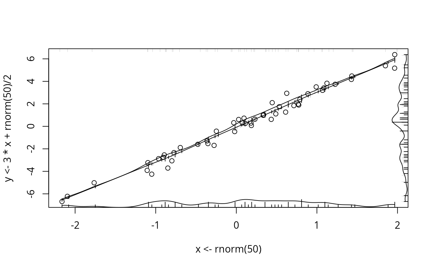 # same but smooth density over curve
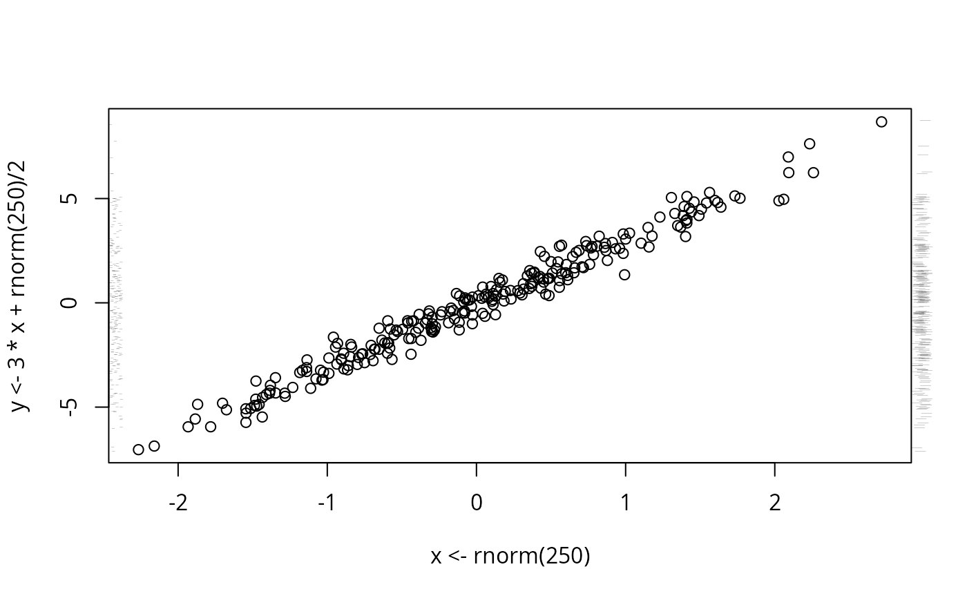
plot(x <- rnorm(250), y <- 3*x + rnorm(250)/2)
scat1d(x, tfrac=0) # dots randomly spaced from axis
scat1d(y, 4, frac=-.03) # bars outside axis
scat1d(y, 2, tfrac=.2) # same bars with smaller random fraction
# same but smooth density over curve
plot(x <- rnorm(250), y <- 3*x + rnorm(250)/2)
scat1d(x, tfrac=0) # dots randomly spaced from axis
scat1d(y, 4, frac=-.03) # bars outside axis
scat1d(y, 2, tfrac=.2) # same bars with smaller random fraction
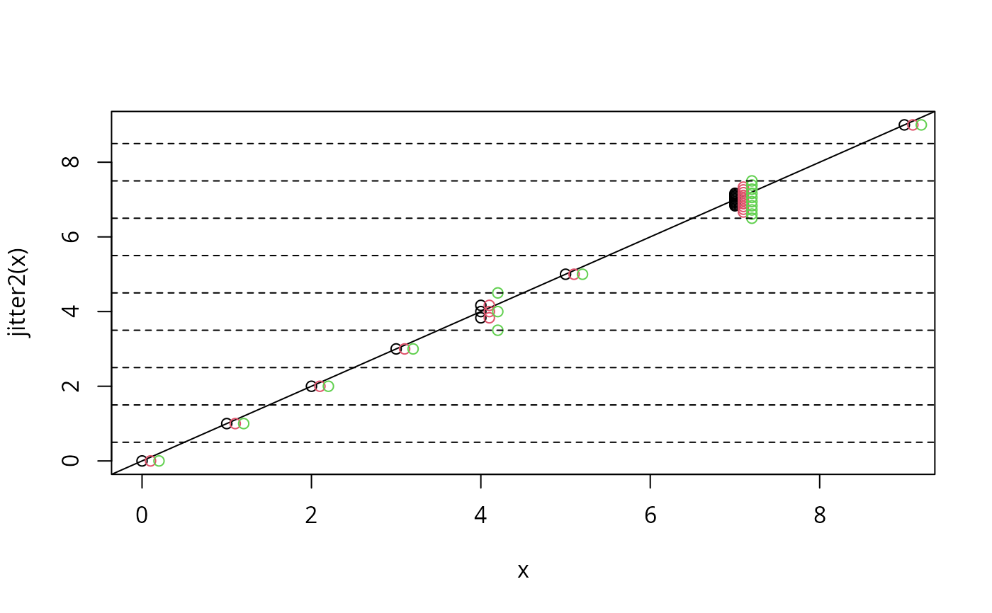
 x <- c(0:3,rep(4,3),5,rep(7,10),9)
plot(x, jitter2(x)) # original versus jittered values
abline(0,1) # unique values unjittered on abline
points(x+0.1, jitter2(x, limit=FALSE), col=2)
# allow locally maximum jittering
points(x+0.2, jitter2(x, fill=1), col=3); abline(h=seq(0.5,9,1), lty=2)
x <- c(0:3,rep(4,3),5,rep(7,10),9)
plot(x, jitter2(x)) # original versus jittered values
abline(0,1) # unique values unjittered on abline
points(x+0.1, jitter2(x, limit=FALSE), col=2)
# allow locally maximum jittering
points(x+0.2, jitter2(x, fill=1), col=3); abline(h=seq(0.5,9,1), lty=2)
 # fill 3/3 instead of 1/3
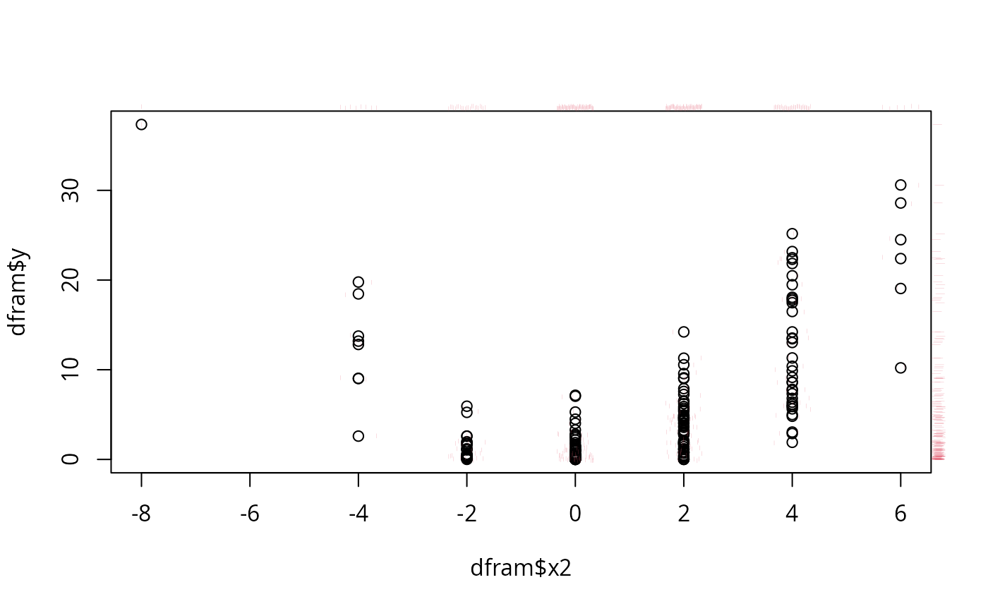
x <- rnorm(200,0,2)+1; y <- x^2
x2 <- round((x+rnorm(200))/2)*2
x3 <- round((x+rnorm(200))/4)*4
dfram <- data.frame(y,x,x2,x3)
plot(dfram$x2, dfram$y) # jitter2 via scat1d
scat1d(dfram$x2, y=dfram$y, preserve=TRUE, col=2)
scat1d(dfram$x2, preserve=TRUE, frac=-0.02, col=2)
scat1d(dfram$y, 4, preserve=TRUE, frac=-0.02, col=2)
# fill 3/3 instead of 1/3
x <- rnorm(200,0,2)+1; y <- x^2
x2 <- round((x+rnorm(200))/2)*2
x3 <- round((x+rnorm(200))/4)*4
dfram <- data.frame(y,x,x2,x3)
plot(dfram$x2, dfram$y) # jitter2 via scat1d
scat1d(dfram$x2, y=dfram$y, preserve=TRUE, col=2)
scat1d(dfram$x2, preserve=TRUE, frac=-0.02, col=2)
scat1d(dfram$y, 4, preserve=TRUE, frac=-0.02, col=2)
 pairs(jitter2(dfram)) # pairs for jittered data.frame
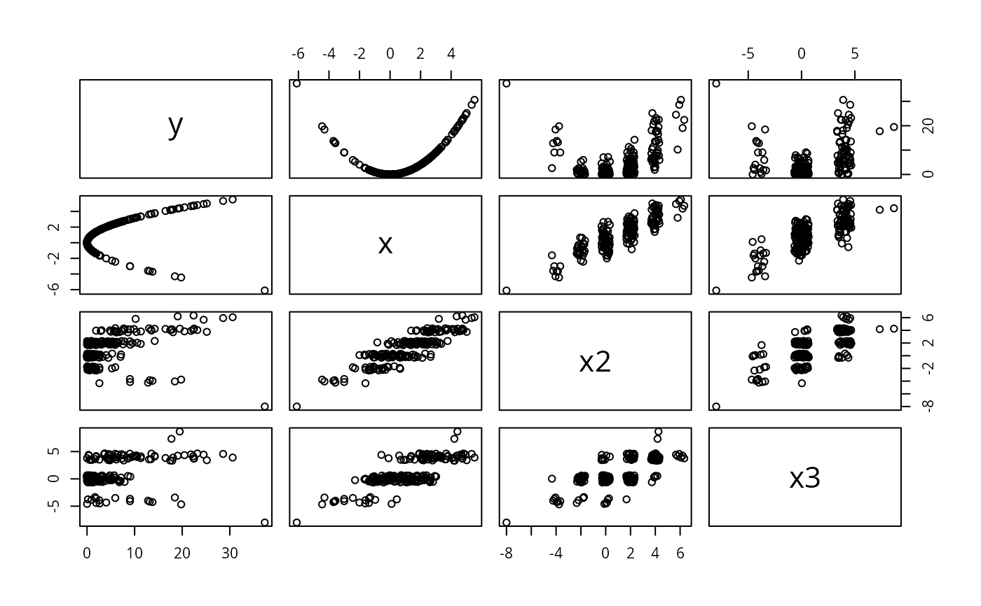 # This gets reasonable pairwise scatter plots for all combinations of
# variables where
#
# - continuous variables (with unique values) are not jittered at all, thus
# all relations between continuous variables are shown as they are,
# extreme values have exact positions.
#
# - discrete variables get a reasonable amount of jittering, whether they
# have 2, 3, 5, 10, 20 \dots levels
#
# - different from adding noise, jitter2() will use the available space
# optimally and no value will randomly mask another
#
# If you want a scatterplot with lowess smooths on the *exact* values and
# the point clouds shown jittered, you just need
#
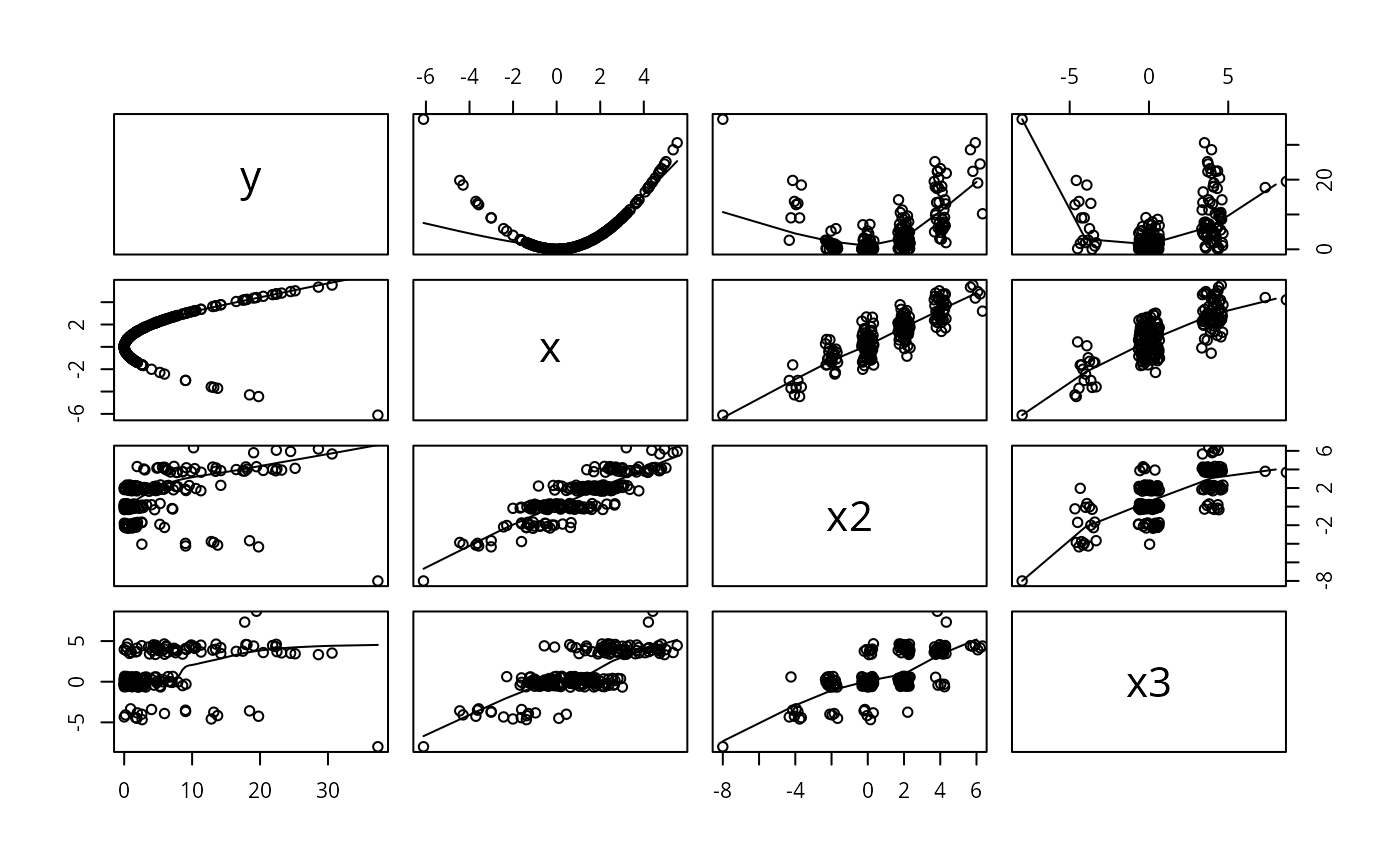
pairs( dfram ,panel=function(x,y) { points(jitter2(x),jitter2(y))
lines(lowess(x,y)) } )
# This gets reasonable pairwise scatter plots for all combinations of
# variables where
#
# - continuous variables (with unique values) are not jittered at all, thus
# all relations between continuous variables are shown as they are,
# extreme values have exact positions.
#
# - discrete variables get a reasonable amount of jittering, whether they
# have 2, 3, 5, 10, 20 \dots levels
#
# - different from adding noise, jitter2() will use the available space
# optimally and no value will randomly mask another
#
# If you want a scatterplot with lowess smooths on the *exact* values and
# the point clouds shown jittered, you just need
#
pairs( dfram ,panel=function(x,y) { points(jitter2(x),jitter2(y))
lines(lowess(x,y)) } )
 datadensity(dfram) # graphical snapshot of entire data frame
 datadensity(dfram, group=cut2(dfram$x2,g=3))
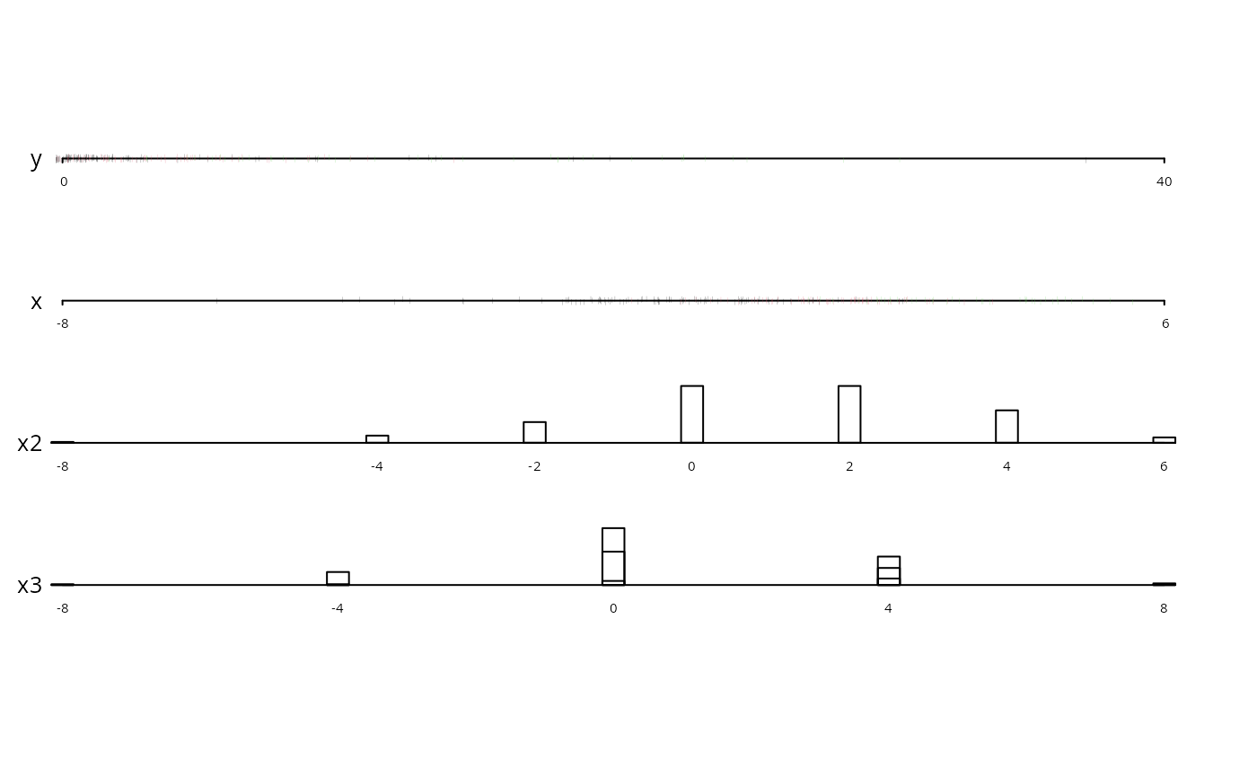 # stratify points and frequencies by
# x2 tertiles and use 3 colors
# datadensity.data.frame(split(x, grouping.variable))
# need to explicitly invoke datadensity.data.frame when the
# first argument is a list
if (FALSE) { # \dontrun{
require(rms)
require(ggplot2)
f <- lrm(y ~ blood.pressure + sex * (age + rcs(cholesterol,4)),
data=d)
p <- Predict(f, cholesterol, sex)
g <- ggplot(p, aes(x=cholesterol, y=yhat, color=sex)) + geom_line() +
xlab(xl2) + ylim(-1, 1)
g <- g + geom_ribbon(data=p, aes(ymin=lower, ymax=upper), alpha=0.2,
linetype=0, show_guide=FALSE)
g + histSpikeg(yhat ~ cholesterol + sex, p, d)
# colors <- c('red', 'blue')
# p <- plot_ly(x=x, y=y, color=g, colors=colors, mode='markers')
# histSpikep(p, x, y, z, color=g, colors=colors)
w <- data.frame(x1=rnorm(100), x2=exp(rnorm(100)))
g <- c(rep('a', 50), rep('b', 50))
ecdfpM(w, group=g, ncols=2)
} # }
# stratify points and frequencies by
# x2 tertiles and use 3 colors
# datadensity.data.frame(split(x, grouping.variable))
# need to explicitly invoke datadensity.data.frame when the
# first argument is a list
if (FALSE) { # \dontrun{
require(rms)
require(ggplot2)
f <- lrm(y ~ blood.pressure + sex * (age + rcs(cholesterol,4)),
data=d)
p <- Predict(f, cholesterol, sex)
g <- ggplot(p, aes(x=cholesterol, y=yhat, color=sex)) + geom_line() +
xlab(xl2) + ylim(-1, 1)
g <- g + geom_ribbon(data=p, aes(ymin=lower, ymax=upper), alpha=0.2,
linetype=0, show_guide=FALSE)
g + histSpikeg(yhat ~ cholesterol + sex, p, d)
# colors <- c('red', 'blue')
# p <- plot_ly(x=x, y=y, color=g, colors=colors, mode='markers')
# histSpikep(p, x, y, z, color=g, colors=colors)
w <- data.frame(x1=rnorm(100), x2=exp(rnorm(100)))
g <- c(rep('a', 50), rep('b', 50))
ecdfpM(w, group=g, ncols=2)
} # }