Multi-way Summary of Proportions
summaryP.RdsummaryP produces a tall and thin data frame containing
numerators (freq) and denominators (denom) after
stratifying the data by a series of variables. A special capability
to group a series of related yes/no variables is included through the
use of the ynbind function, for which the user specials a final
argument label used to label the panel created for that group
of related variables.
If options(grType='plotly') is not in effect,
the plot method for summaryP displays proportions as a
multi-panel dot chart using the lattice package's dotplot
function with a special panel function. Numerators and
denominators of proportions are also included as text, in the same
colors as used by an optional groups variable. The
formula argument used in the dotplot call is constructed,
but the user can easily reorder the variables by specifying
formula, with elements named val (category levels),
var (classification variable name), freq (calculated
result) plus the overall cross-classification variables excluding
groups. If options(grType='plotly') is in effect, the
plot method makes an entirely different display using
Hmisc::dotchartpl with plotly if marginVal is
specified, whereby a stratification
variable causes more finely stratified estimates to be shown slightly
below the lines, with smaller and translucent symbols if data
has been run through addMarginal. The marginal summaries are
shown as the main estimates and the user can turn off display of the
stratified estimates, or view their details with hover text.
The ggplot method for summaryP does not draw numerators
and denominators but the chart is more compact than using the
plot method with base graphics because ggplot2
does not repeat category names the same way as lattice does.
Variable names that are too long to fit in panel strips are renamed
(1), (2), etc. and an attribute "fnvar" is added to the result;
this attribute is a character string defining the abbreviations,
useful in a figure caption. The ggplot2 object has
labels for points plotted, used by plotly::ggplotly as
hover text (see example).
The latex method produces one or more LaTeX tabulars
containing a table representation of the result, with optional
side-by-side display if groups is specified. Multiple
tabulars result from the presence of non-group stratification
factors.
Usage
summaryP(formula, data = NULL, subset = NULL,
         na.action = na.retain, sort=TRUE,
         asna = c("unknown", "unspecified"), ...)
# S3 method for class 'summaryP'
plot(x, formula=NULL, groups=NULL,
         marginVal=NULL, marginLabel=marginVal,
         refgroup=NULL, exclude1=TRUE,  xlim = c(-.05, 1.05),
         text.at=NULL, cex.values = 0.5,
         key = list(columns = length(groupslevels), x = 0.75,
                    y = -0.04, cex = 0.9,
                    col = lattice::trellis.par.get('superpose.symbol')$col,
                    corner=c(0,1)),
         outerlabels=TRUE, autoarrange=TRUE,
         col=colorspace::rainbow_hcl, ...)
# S3 method for class 'summaryP'
ggplot(data, mapping, groups=NULL, exclude1=TRUE,
           xlim=c(0, 1), col=NULL, shape=NULL, size=function(n) n ^ (1/4),
           sizerange=NULL, abblen=5, autoarrange=TRUE, addlayer=NULL,
           ..., environment)
# S3 method for class 'summaryP'
latex(object, groups=NULL, exclude1=TRUE, file='', round=3,
                           size=NULL, append=TRUE, ...)
Arguments
- formula
a formula with the variables for whose levels proportions are computed on the left hand side, and major classification variables on the right. The formula need to include any variable later used as
groups, as the data summarization does not distinguish between superpositioning and paneling. For the plot method,formulacan provide an overall to the default formula fordotplot().- data
an optional data frame. For
ggplot.summaryPdatais the result ofsummaryP.- subset
an optional subsetting expression or vector
- na.action
function specifying how to handle
NAs. The default is to keep allNAs in the analysis frame.- sort
set to
FALSEto not sort category levels in descending order of global proportions- asna
character vector specifying level names to consider the same as
NA. Setasna=NULLto not consider any.- x
an object produced by
summaryP- groups
a character string containing the name of a superpositioning variable for obtaining further stratification within a horizontal line in the dot chart.
- marginVal
if
options(grType='plotly')is in effect and the data given tosummaryPwere run throughaddMarginal, specifies the category name that represents marginal summaries (usually"All").- marginLabel
specifies a different character string to use than the value of
marginVal. For example, if marginal proportions were computed over allregions, one may specifymarginVal="All", marginLabel="All Regions".marginLabelis only used for formatting graphical output.- refgroup
used when doing a
plotlychart and a two-level group variable was used, resulting in the half-width confidence interval for the difference in two proportions to be shown, and the actual confidence limits and the difference added to hover text. Seedotchartplfor more details.- exclude1
By default,
ggplot,plot, andlatexmethods forsummaryPremove redundant entries from tables for variables with only two levels. For example, if you print the proportion of females, you don't need to print the proportion of males. To override this, setexclude1=FALSE.- xlim
x-axis limits. Default isc(0,1).- text.at
specify to leave unused space to the right of each panel to prevent numerators and denominators from touching data points.
text.atis the upper limit for scaling panels'x-axes but tick marks are only labeled up tomax(xlim).- cex.values
character size to use for plotting numerators and denominators
- key
a list to pass to the
auto.keyargument ofdotplot. To place a key above the entire chart useauto.key=list(columns=2)for example.- outerlabels
by default if there are two conditioning variables besides
groups, thelatticeExtrapackage'suseOuterStripsfunction is used to put strip labels in the margins, usually resulting in a much prettier chart. Set toFALSEto prevent usage ofuseOuterStrips.- autoarrange
If
TRUE, the formula is re-arranged so that if there are two conditioning (paneling) variables, the variable with the most levels is taken as the vertical condition.- col
a vector of colors to use to override defaults in
ggplot. Whenoptions(grType='plotly'), seedotchartpl.- shape
a vector of plotting symbols to override
ggplotdefaults- mapping, environment
not used; needed because of rules for generics
- size
for
ggplot, a function that transforms denominators into metrics used for thesizeaesthetic. Default is the fourth root function so that the area of symbols is proportional to the square root of sample size. SpecifyNULLto not vary point sizes.size=sqrtis a reasonable alternative. Setsizeto an integer to categorize the denominators intosizequantile groups usingcut2. Unlesssizeis an integer, the legend for sizes uses the minimum and maximum denominators and 6-tiles usingquantile(..., type=1)so that actually occurring sample sizes are used as labels.sizeis overridden toNULLif the range in denominators is less than 10 or the ratio of the maximum to the minimum is less than 1.2. Forlatex,sizeis an optional font size such as"small"- sizerange
a 2-vector specifying the
rangeargument to theggplot2scale_size_...function, which is the range of sizes allowed for the points according to the denominator. The default issizerange=c(.7, 3.25)but the lower limit is increased according to the ratio of maximum to minimum sample sizes.- abblen
labels of variables having only one level and having their name longer than
abblencharacters are abbreviated and documented infnvar(described elsewhere here). The defaultabblen=5is good for labels plotted vertically. If labels are rotated usingthemea better value would be 12.- ...
used only for
plotlygraphics and these arguments are passed todotchartpl- object
an object produced by
summaryP- file
file name, defaults to writing to console
- round
number of digits to the right of the decimal place for proportions
- append
set to
FALSEto start output over- addlayer
a
ggplotlayer to add to the plot object
Value
summaryP produces a data frame of class
"summaryP". The plot method produces a lattice
object of class "trellis". The latex method produces an
object of class "latex" with an additional attribute
ngrouplevels specifying the number of levels of any
groups variable and an attribute nstrata specifying the
number of strata.
Author
Frank Harrell
Department of Biostatistics
Vanderbilt University
fh@fharrell.com
Examples
n <- 100
f <- function(na=FALSE) {
x <- sample(c('N', 'Y'), n, TRUE)
if(na) x[runif(100) < .1] <- NA
x
}
set.seed(1)
d <- data.frame(x1=f(), x2=f(), x3=f(), x4=f(), x5=f(), x6=f(), x7=f(TRUE),
age=rnorm(n, 50, 10),
race=sample(c('Asian', 'Black/AA', 'White'), n, TRUE),
sex=sample(c('Female', 'Male'), n, TRUE),
treat=sample(c('A', 'B'), n, TRUE),
region=sample(c('North America','Europe'), n, TRUE))
d <- upData(d, labels=c(x1='MI', x2='Stroke', x3='AKI', x4='Migraines',
x5='Pregnant', x6='Other event', x7='MD withdrawal',
race='Race', sex='Sex'))
#> Input object size: 13016 bytes; 12 variables 100 observations
#> New object size: 17800 bytes; 12 variables 100 observations
dasna <- subset(d, region=='North America')
with(dasna, table(race, treat))
#> treat
#> race A B
#> Asian 8 10
#> Black/AA 13 6
#> White 4 10
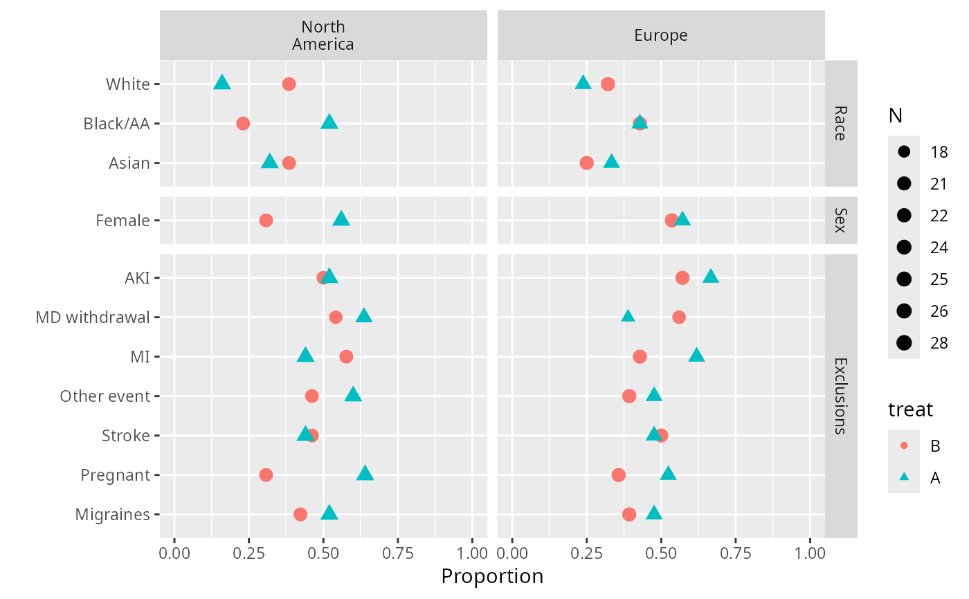
s <- summaryP(race + sex + ynbind(x1, x2, x3, x4, x5, x6, x7, label='Exclusions') ~
region + treat, data=d)
# add exclude1=FALSE below to include female category
plot(s, groups='treat')
 require(ggplot2)
ggplot(s, groups='treat')
require(ggplot2)
ggplot(s, groups='treat')
 plot(s, val ~ freq | region * var, groups='treat', outerlabels=FALSE)
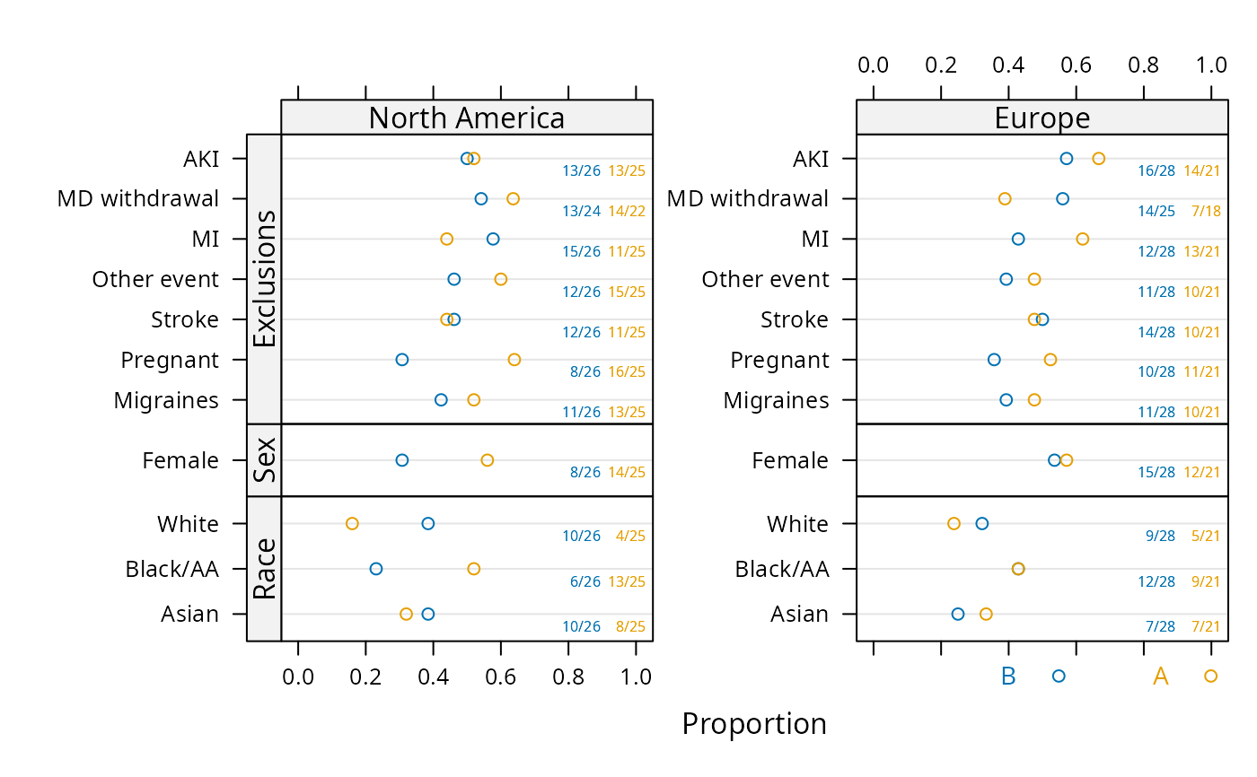 # Much better looking if omit outerlabels=FALSE; see output at
# https://hbiostat.org/R/Hmisc/summaryFuns.pdf
# See more examples under bpplotM
## For plotly interactive graphic that does not handle variable size
## panels well:
## require(plotly)
## g <- ggplot(s, groups='treat')
## ggplotly(g, tooltip='text')
## For nice plotly interactive graphic:
## options(grType='plotly')
## s <- summaryP(race + sex + ynbind(x1, x2, x3, x4, x5, x6, x7,
## label='Exclusions') ~
## treat, data=subset(d, region='Europe'))
##
## plot(s, groups='treat', refgroup='A') # refgroup='A' does B-A differences
# Make a chart where there is a block of variables that
# are only analyzed for males. Keep redundant sex in block for demo.
# Leave extra space for numerators, denominators
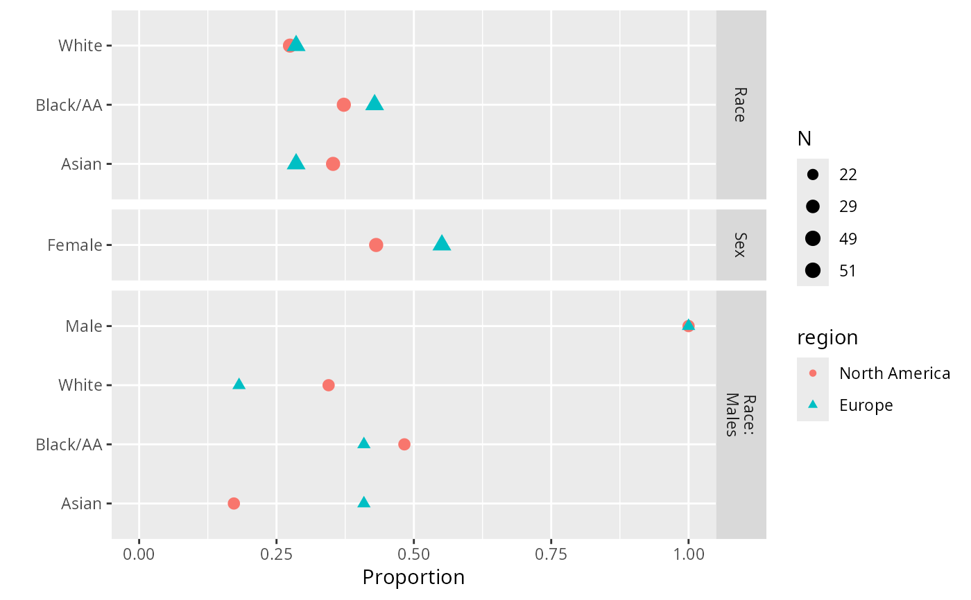
sb <- summaryP(race + sex +
pBlock(race, sex, label='Race: Males', subset=sex=='Male') ~
region, data=d)
plot(sb, text.at=1.3)
# Much better looking if omit outerlabels=FALSE; see output at
# https://hbiostat.org/R/Hmisc/summaryFuns.pdf
# See more examples under bpplotM
## For plotly interactive graphic that does not handle variable size
## panels well:
## require(plotly)
## g <- ggplot(s, groups='treat')
## ggplotly(g, tooltip='text')
## For nice plotly interactive graphic:
## options(grType='plotly')
## s <- summaryP(race + sex + ynbind(x1, x2, x3, x4, x5, x6, x7,
## label='Exclusions') ~
## treat, data=subset(d, region='Europe'))
##
## plot(s, groups='treat', refgroup='A') # refgroup='A' does B-A differences
# Make a chart where there is a block of variables that
# are only analyzed for males. Keep redundant sex in block for demo.
# Leave extra space for numerators, denominators
sb <- summaryP(race + sex +
pBlock(race, sex, label='Race: Males', subset=sex=='Male') ~
region, data=d)
plot(sb, text.at=1.3)
 plot(sb, groups='region', layout=c(1,3), key=list(space='top'),
text.at=1.15)
plot(sb, groups='region', layout=c(1,3), key=list(space='top'),
text.at=1.15)
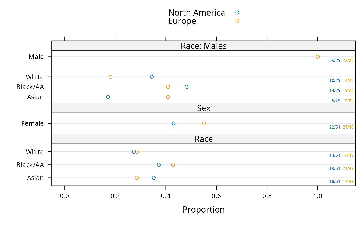 ggplot(sb, groups='region')
 if (FALSE) { # \dontrun{
plot(s, groups='treat')
# plot(s, groups='treat', outerlabels=FALSE) for standard lattice output
plot(s, groups='region', key=list(columns=2, space='bottom'))
require(ggplot2)
colorFacet(ggplot(s))
plot(summaryP(race + sex ~ region, data=d), exclude1=FALSE, col='green')
require(lattice)
# Make your own plot using data frame created by summaryP
useOuterStrips(dotplot(val ~ freq | region * var, groups=treat, data=s,
xlim=c(0,1), scales=list(y='free', rot=0), xlab='Fraction',
panel=function(x, y, subscripts, ...) {
denom <- s$denom[subscripts]
x <- x / denom
panel.dotplot(x=x, y=y, subscripts=subscripts, ...) }))
# Show marginal summary for all regions combined
s <- summaryP(race + sex ~ region, data=addMarginal(d, region))
plot(s, groups='region', key=list(space='top'), layout=c(1,2))
# Show marginal summaries for both race and sex
s <- summaryP(ynbind(x1, x2, x3, x4, label='Exclusions', sort=FALSE) ~
race + sex, data=addMarginal(d, race, sex))
plot(s, val ~ freq | sex*race)
} # }
if (FALSE) { # \dontrun{
plot(s, groups='treat')
# plot(s, groups='treat', outerlabels=FALSE) for standard lattice output
plot(s, groups='region', key=list(columns=2, space='bottom'))
require(ggplot2)
colorFacet(ggplot(s))
plot(summaryP(race + sex ~ region, data=d), exclude1=FALSE, col='green')
require(lattice)
# Make your own plot using data frame created by summaryP
useOuterStrips(dotplot(val ~ freq | region * var, groups=treat, data=s,
xlim=c(0,1), scales=list(y='free', rot=0), xlab='Fraction',
panel=function(x, y, subscripts, ...) {
denom <- s$denom[subscripts]
x <- x / denom
panel.dotplot(x=x, y=y, subscripts=subscripts, ...) }))
# Show marginal summary for all regions combined
s <- summaryP(race + sex ~ region, data=addMarginal(d, region))
plot(s, groups='region', key=list(space='top'), layout=c(1,2))
# Show marginal summaries for both race and sex
s <- summaryP(ynbind(x1, x2, x3, x4, label='Exclusions', sort=FALSE) ~
race + sex, data=addMarginal(d, race, sex))
plot(s, val ~ freq | sex*race)
} # }