Enhanced Version of dotchart Function
dotchart3.RdThese are adaptations of the R dotchart function that sorts categories
top to bottom, adds auxdata and auxtitle arguments to put
extra information in the right margin, and for dotchart3 adds
arguments cex.labels, cex.group.labels, and
groupfont. By default, group headings are in a larger, bold
font. dotchart3 also cuts a bit of white space from the top and
bottom of the chart. The most significant change, however, is in how
x is interpreted. Columns of x no longer provide an
alternate way to define groups. Instead, they define superpositioned
values. This is useful for showing three quartiles, for example. Going
along with this change, for dotchart3 pch can now be a
vector specifying symbols to use going across columns of x.
x was changed in this way because to put multiple points on a
line (e.g., quartiles) and keeping track of par() parameters when
dotchart2 was called with add=TRUE was cumbersome.
dotchart3 changes the margins to account for horizontal labels.
dotchartp is a version of dotchart3 for making the chart
with the plotly package.
summaryD creates aggregate data using summarize and
calls dotchart3 with suitable arguments to summarize data by
major and minor categories. If options(grType='plotly') is in
effect and the plotly package is installed, summaryD uses
dotchartp instead of dotchart3.
summaryDp is a streamlined summaryD-like function that
uses the dotchartpl function to render a plotly graphic.
It is used to compute summary statistics stratified separately by a
series of variables.
Usage
dotchart3(x, labels = NULL, groups = NULL, gdata = NULL,
          cex = par("cex"), pch = 21, gpch = pch, bg = par("bg"),
          color = par("fg"), gcolor = par("fg"), lcolor = "gray",
          xlim = range(c(x, gdata), na.rm=TRUE), main = NULL, xlab = NULL,
          ylab = NULL, auxdata = NULL, auxtitle = NULL, auxgdata=NULL,
          axisat=NULL, axislabels=NULL,
          cex.labels = cex, cex.group.labels = cex.labels * 1.25,
          cex.auxdata=cex, groupfont = 2,
          auxwhere=NULL, height=NULL, width=NULL, ...)

dotchartp(x, labels = NULL, groups = NULL, gdata = NULL,
            xlim = range(c(x, gdata), na.rm=TRUE), main=NULL,
            xlab = NULL, ylab = '', auxdata=NULL, auxtitle=NULL,
            auxgdata=NULL, auxwhere=c('right', 'hover'),
            symbol='circle', col=colorspace::rainbow_hcl,
            legendgroup=NULL,
            axisat=NULL, axislabels=NULL, sort=TRUE, digits=4, dec=NULL,
            height=NULL, width=700, layoutattr=FALSE, showlegend=TRUE, ...)

summaryD(formula, data=NULL, fun=mean, funm=fun,
         groupsummary=TRUE, auxvar=NULL, auxtitle='',
         auxwhere=c('hover', 'right'),
         vals=length(auxvar) > 0, fmtvals=format,
         symbol=if(use.plotly) 'circle' else 21,
         col=if(use.plotly) colorspace::rainbow_hcl else 1:10,
         legendgroup=NULL,
         cex.auxdata=.7, xlab=v[1], ylab=NULL,
         gridevery=NULL, gridcol=gray(.95), sort=TRUE, ...)

summaryDp(formula,
          fun=function(x) c(Mean=mean(x, na.rm=TRUE),
                            N=sum(! is.na(x))),
          overall=TRUE, xlim=NULL, xlab=NULL,
          data=NULL, subset=NULL, na.action=na.retain,
          ncharsmax=c(50, 30),
          digits=4, ...)
Arguments
- x
a numeric vector or matrix
- labels
labels for categories corresponding to rows of
x. If not specified these are taken from row names ofx.- groups,gdata,cex,pch,gpch,bg,color,gcolor,lcolor,xlim,main,xlab,ylab
see
dotchart- auxdata
a vector of information to be put in the right margin, in the same order as
x. May be numeric, character, or a vector of expressions containingplotmathmarkup. Fordotchartp,auxdatamay be a matrix to go along with the numeric x-axis variable, to result in point-specific hover text.- auxtitle
a column heading for
auxdata- auxgdata
similar to
auxdatabut corresponding to thegdataargument. These usually represent overall sample sizes for each group of lines.- axisat
a vector of tick mark locations to pass to
axis. Useful if transforming the data axis- axislabels
a vector of strings specifying axis tick mark labels. Useful if transforming the data axis
- digits
number of significant digits for formatting numeric data in hover text for
dotchartpandsummaryDp- dec
for
dotchartponly, overridesdigitsto specify the argument toround()for rounding values for hover labels- cex.labels
cexfor labels- cex.group.labels
cexfor group labels- cex.auxdata
cexforauxdata- groupfont
font number for group headings
- auxwhere
for
summaryDanddotchartpspecifies whetherauxdataandauxgdataare to be placed on the far right of the chart, or should appear as pop-up tooltips when hovering the mouse over the ordinaryxdata points on the chart. Ignored fordotchart3.- ...
other arguments passed to some of the graphics functions, or to
dotchart3ordotchartpfromsummaryD. Theauxwhere='hover'option is a useful argument to pass fromsummaryDtodotchartp. Also used to pass other arguments todotchartplfromsummaryDp.- layoutattr
set to
TRUEto putplotly::layoutinformation in a list as an attributelayoutof the returnedplotlyobject instead of running theplotlyobject through thelayoutfunction. This is useful if runningdotchartpmultiple times to later put together usingplotly::subplotand only then running the result throughplotly::layout.- showlegend
set to
FALSEto suppress theplotlylegend withdotchartp- formula
a formula with one variable on the left hand side (the variable to compute summary statistics on), and one or two variables on the right hand side. If there are two variables, the first is taken as the major grouping variable. If the left hand side variable is a matrix it has to be a legal R variable name, not an expression, and
funneeds to be able to process a matrix. ForsummaryDpthere may be more than two right-hand-side variables.- data
a data frame or list used to find the variables in
formula. If omitted, the parent environment is used.- fun
a summarization function creating a single number from a vector. Default is the mean. For
summaryDp,funproduces a named vector of summary statistics, with the default computing theMeanandN(number of non-missing values).- funm
applies if there are two right hand variables and
groupsummary=TRUEand the marginal summaries over just the firstxvariable need to be computed differently than the summaries that are cross-classified by both variables.funmdefaults tofunand should have the same structure asfun.- groupsummary
By default, when there are two right-hand variables,
summarize(..., fun)is called a second time without the use of the second variable, to obtain marginal summaries for the major grouping variable and display the results as a dot (and optionally in the right margin). Setgroupsummary=FALSEto suppress this information.- auxvar
when
funreturns more than one statistic and the user names the elements in the returned vector, you can specifyauxvaras a single character string naming one of them. This will cause the named element to be written in the right margin, and that element to be deleted when plotting the statistics.- vals
set to
TRUEto show data values (dot locations) in the right margin. Defaults toTRUEifauxvaris specified.- fmtvals
an optional function to format values before putting them in the right margin. Default is the
formatfunction.- symbol
a scalar or vector of
pchvalues for ordinary graphics or a character vector or scalar ofplotlysymbols. These correspond to columns ofxor elements produced byfun.- col
a function or vector of colors to assign to multiple points plotted in one line. If a function it will be evaluated with an argument equal to the number of groups/columns.
- legendgroup
see
plotlydocumentation; corresponds to column names/funoutput forplotlygraphs only- gridevery
specify a positive number to draw very faint vertical grid lines every
grideveryx-axis units; for non-plotlycharts- gridcol
color for grid lines; default is very faint gray scale
- sort
specify
sort=FALSEto plot data in the original order, from top to bottom on the dot chart. Fordotchartp, setsortto'descending'to sort in descending order of the first column ofx, or'ascending'to do the reverse. These do not make sense ifgroupsis present.- height,width
height and width in pixels for
dotchartpif not usingplotlydefaults. Ignored fordotchart3. If set to"auto"the height is computed usingHmisc::plotlyHeightDotchart.- overall
set to
FALSEto suppress plotting of unstratified estimates- subset
an observation subsetting expression
- na.action
an
NAaction function- ncharsmax
a 2-vector specifying the number of characters after which an html new line character should be placed, respectively for the x-axis label and the stratification variable levels
Examples
set.seed(135)
maj <- factor(c(rep('North',13),rep('South',13)))
g <- paste('Category',rep(letters[1:13],2))
n <- sample(1:15000, 26, replace=TRUE)
y1 <- runif(26)
y2 <- pmax(0, y1 - runif(26, 0, .1))
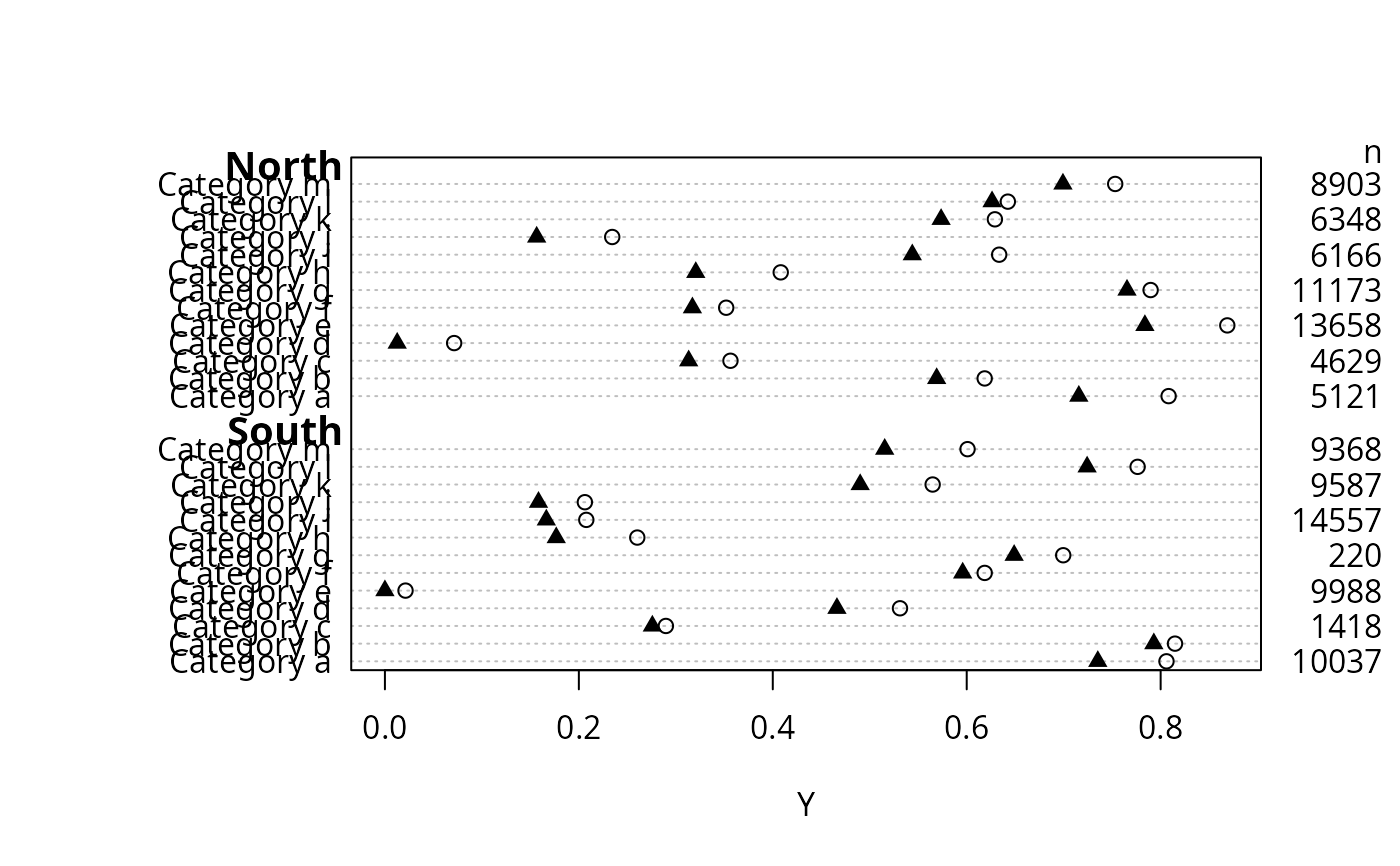
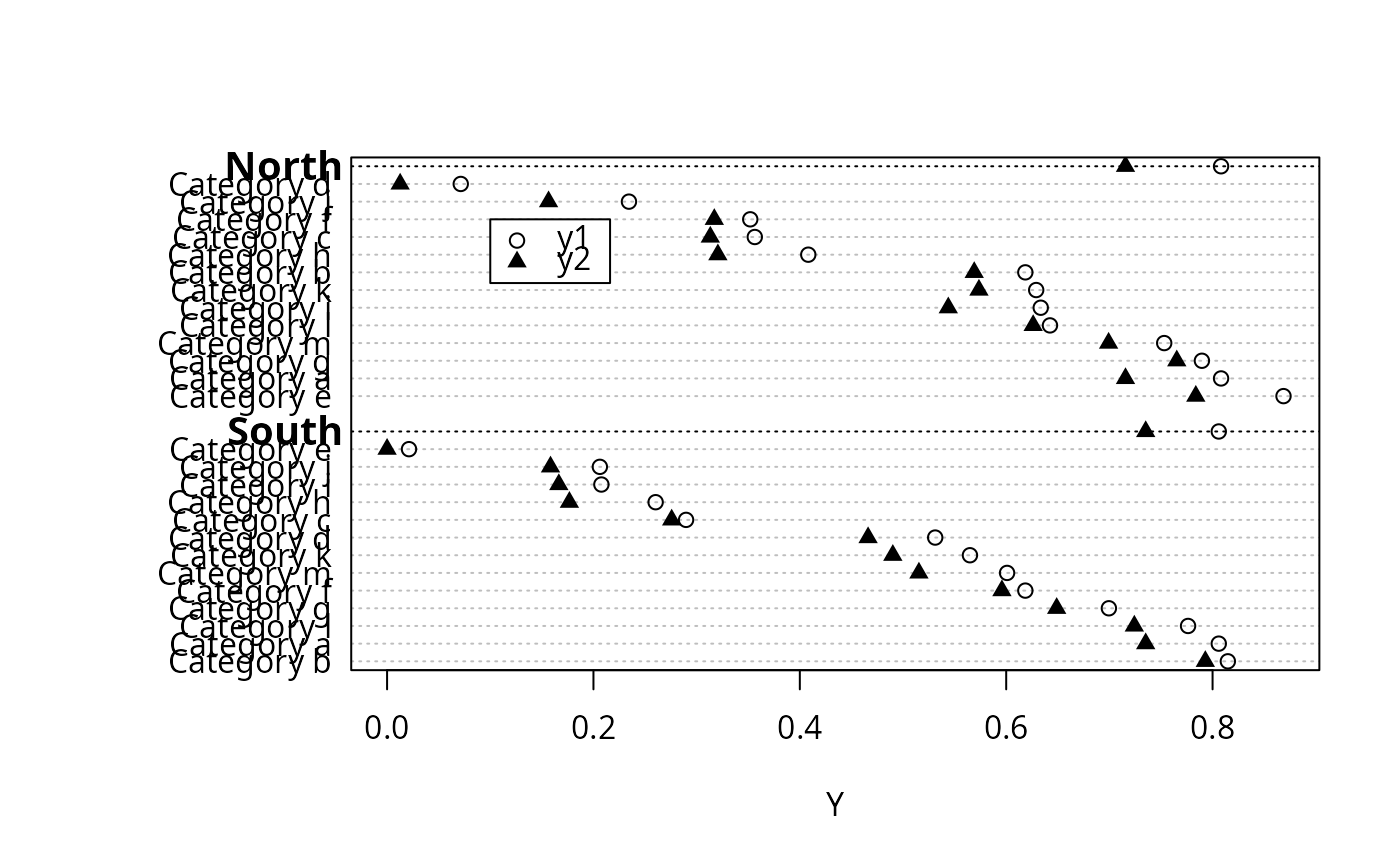
dotchart3(cbind(y1,y2), g, groups=maj, auxdata=n, auxtitle='n',
xlab='Y', pch=c(1,17))
 ## Compare with dotchart function (no superpositioning or auxdata allowed):
## dotchart(y1, g, groups=maj, xlab='Y')
if (FALSE) { # \dontrun{
dotchartp(cbind(y1, y2), g, groups=maj, auxdata=n, auxtitle='n',
xlab='Y', gdata=cbind(c(0,.1), c(.23,.44)), auxgdata=c(-1,-2),
symbol=c('circle', 'line-ns-open'))
summaryDp(sbp ~ region + sex + race + cut2(age, g=5), data=mydata)
} # }
## Put options(grType='plotly') to have the following use dotchartp
## (rlegend will not apply)
## Add argument auxwhere='hover' to summaryD or dotchartp to put
## aux info in hover text instead of right margin
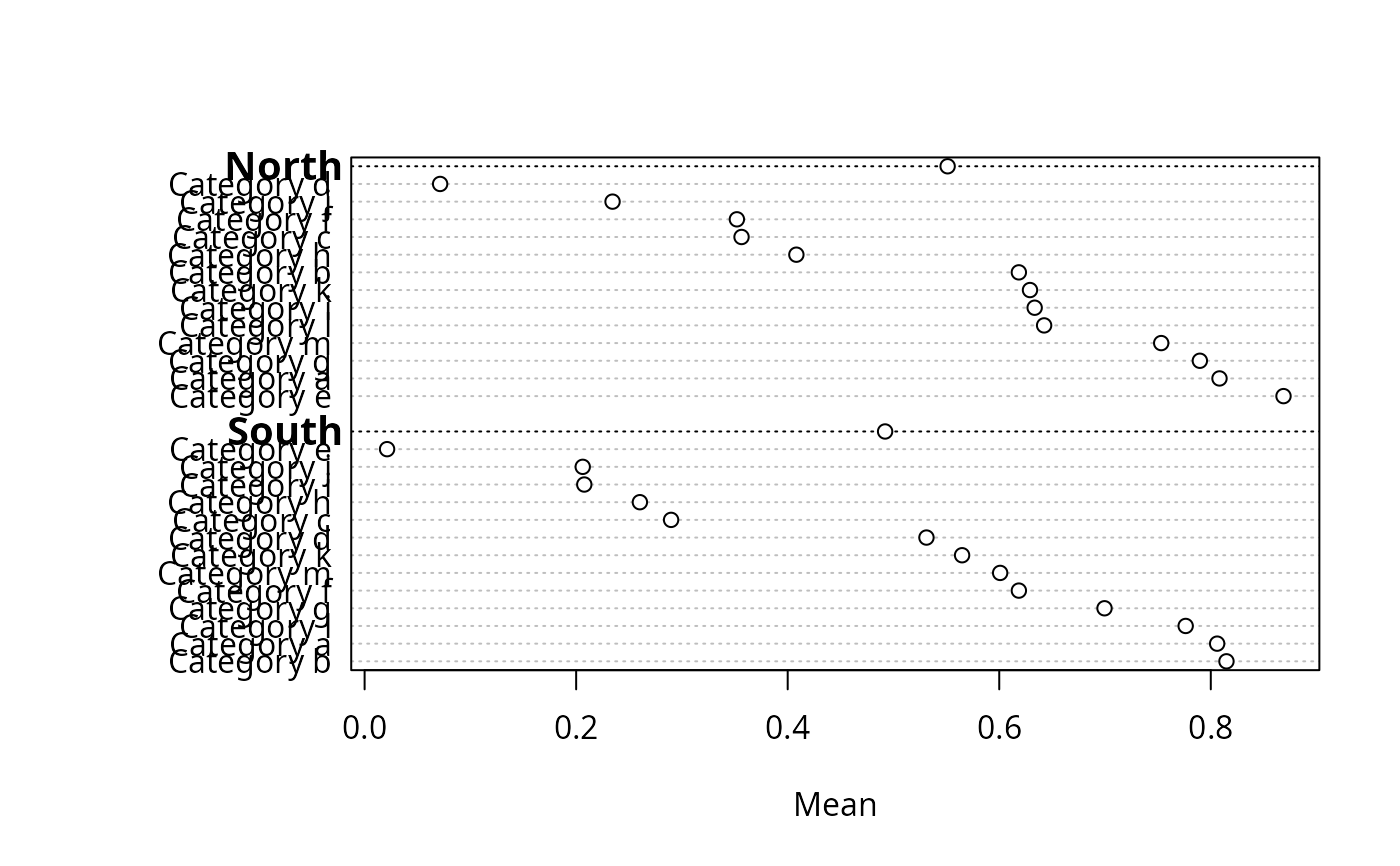
summaryD(y1 ~ maj + g, xlab='Mean')
## Compare with dotchart function (no superpositioning or auxdata allowed):
## dotchart(y1, g, groups=maj, xlab='Y')
if (FALSE) { # \dontrun{
dotchartp(cbind(y1, y2), g, groups=maj, auxdata=n, auxtitle='n',
xlab='Y', gdata=cbind(c(0,.1), c(.23,.44)), auxgdata=c(-1,-2),
symbol=c('circle', 'line-ns-open'))
summaryDp(sbp ~ region + sex + race + cut2(age, g=5), data=mydata)
} # }
## Put options(grType='plotly') to have the following use dotchartp
## (rlegend will not apply)
## Add argument auxwhere='hover' to summaryD or dotchartp to put
## aux info in hover text instead of right margin
summaryD(y1 ~ maj + g, xlab='Mean')
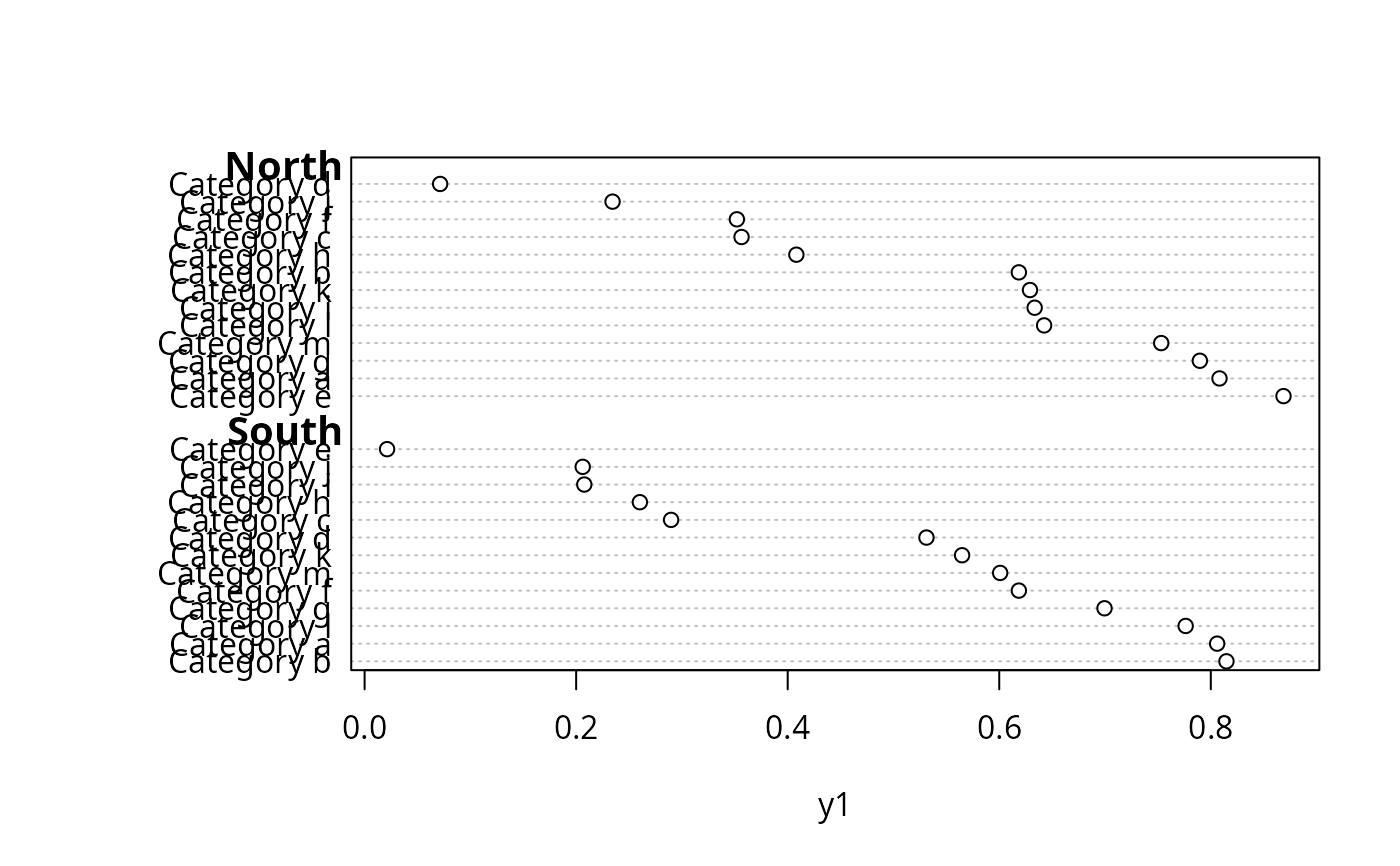
 summaryD(y1 ~ maj + g, groupsummary=FALSE)
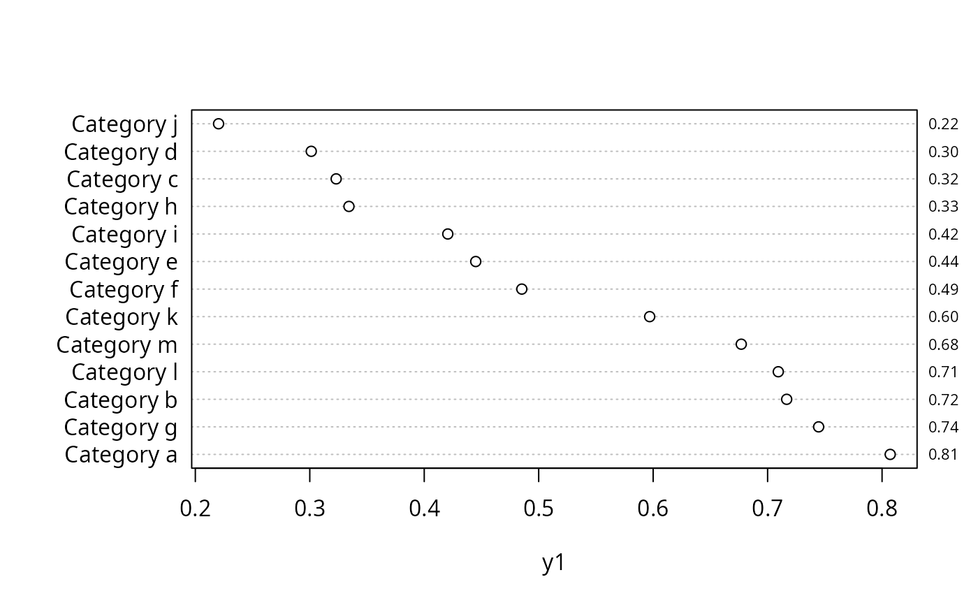
 summaryD(y1 ~ g, fmtvals=function(x) sprintf('%4.2f', x))
 Y <- cbind(y1, y2) # summaryD cannot handle cbind(...) ~ ...
summaryD(Y ~ maj + g, fun=function(y) y[1,], symbol=c(1,17))
rlegend(.1, 26, c('y1','y2'), pch=c(1,17))
Y <- cbind(y1, y2) # summaryD cannot handle cbind(...) ~ ...
summaryD(Y ~ maj + g, fun=function(y) y[1,], symbol=c(1,17))
rlegend(.1, 26, c('y1','y2'), pch=c(1,17))
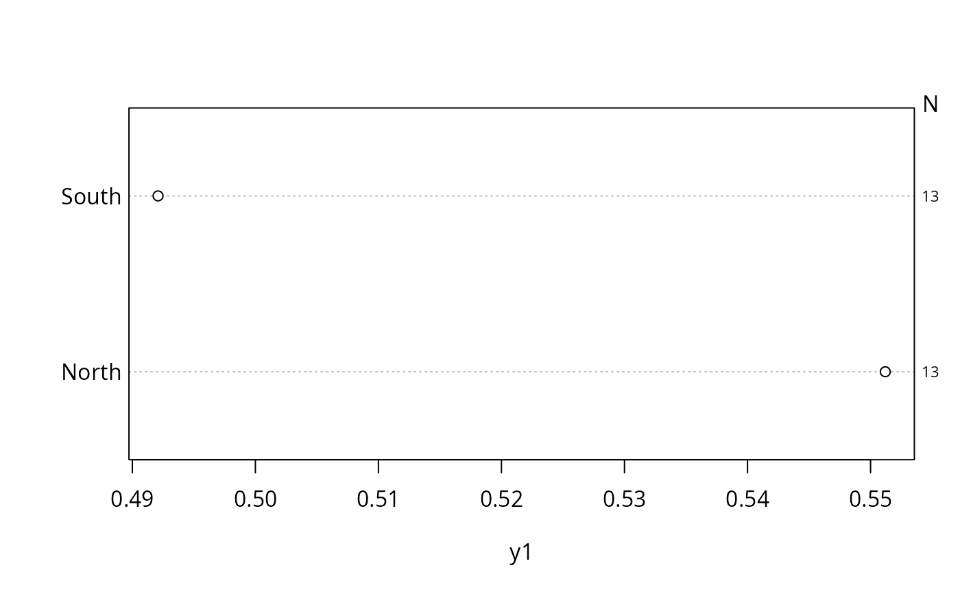
 summaryD(y1 ~ maj, fun=function(y) c(Mean=mean(y), n=length(y)),
auxvar='n', auxtitle='N')
summaryD(y1 ~ maj, fun=function(y) c(Mean=mean(y), n=length(y)),
auxvar='n', auxtitle='N')