ggformula/lattice Comparison
Nicholas Horton (nhorton@amherst.edu)
2026-06-04
Source:vignettes/web-only/ggformula-lattice.Rmd
ggformula-lattice.RmdIntroduction
This document is intended to help users of the mosaic
package migrate their lattice package graphics to
ggformula. The mosaic package provides a simplified and
systematic introduction to the core functionality related to descriptive
statistics, visualization, modeling, and simulation-based inference
required in first and second courses in statistics.
Originally, the mosaic package used lattice
graphics but now support is also available for the improved
ggformula system. Going forward, ggformula
will be the preferred graphics package for Project MOSAIC.
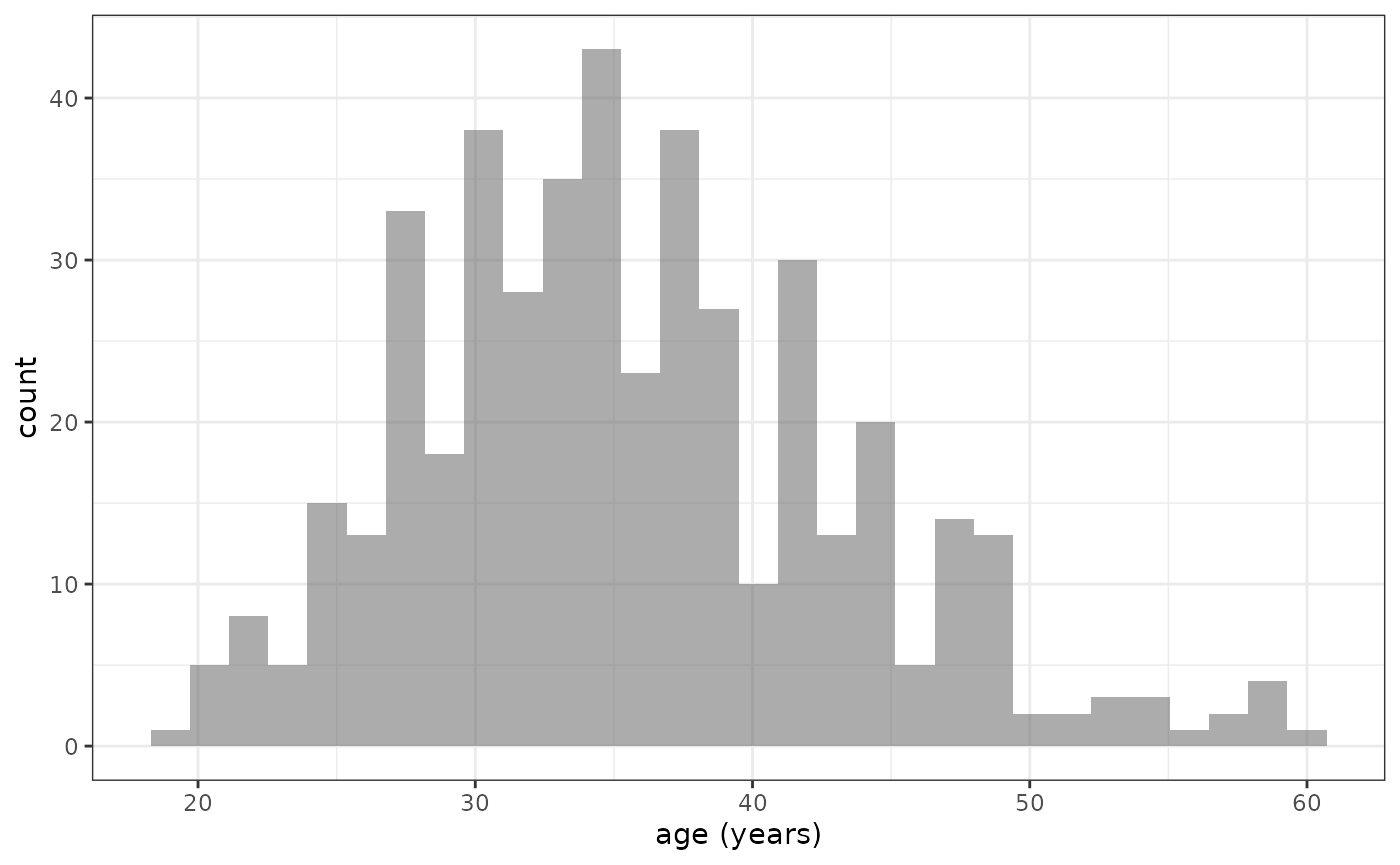
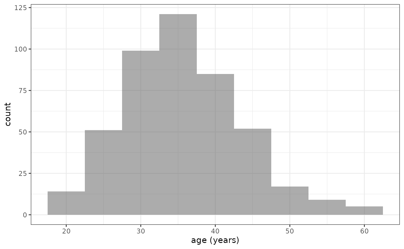
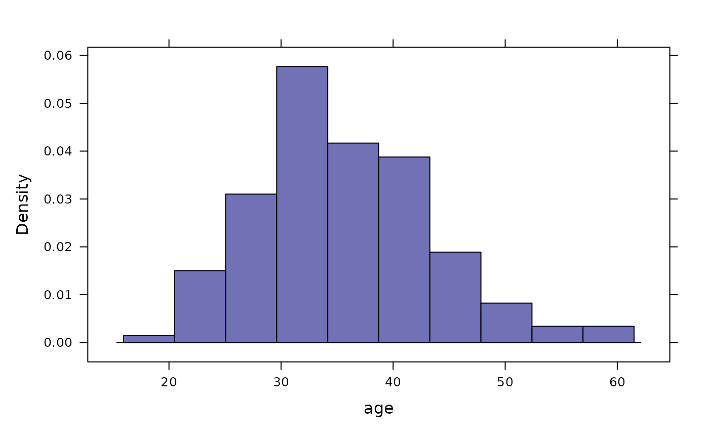
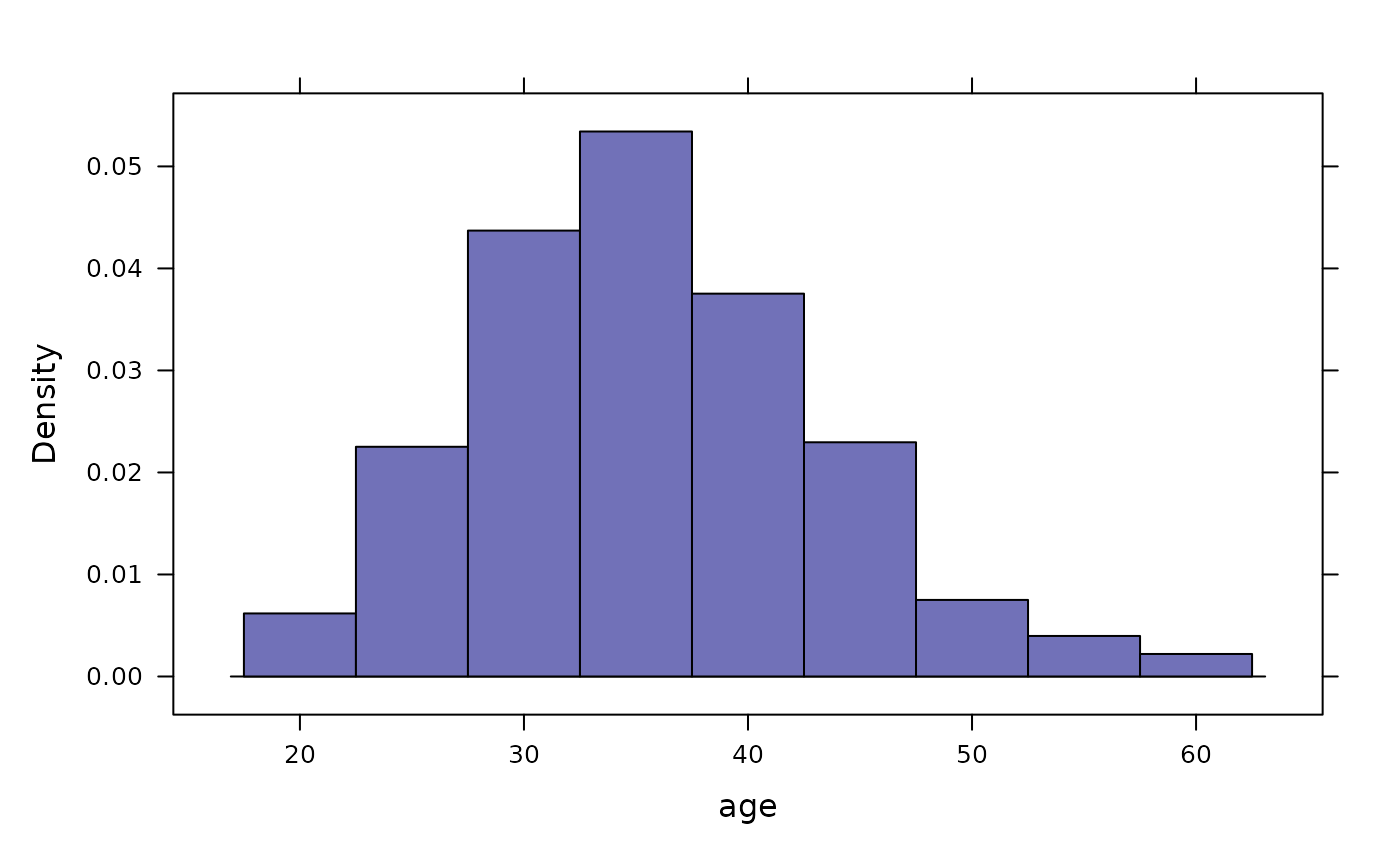
Density Plots
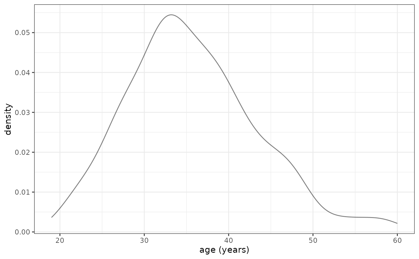
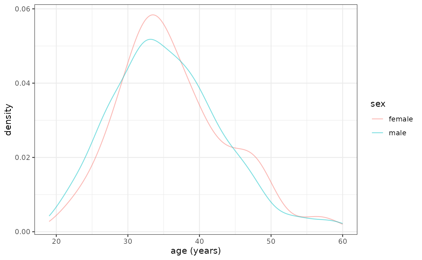
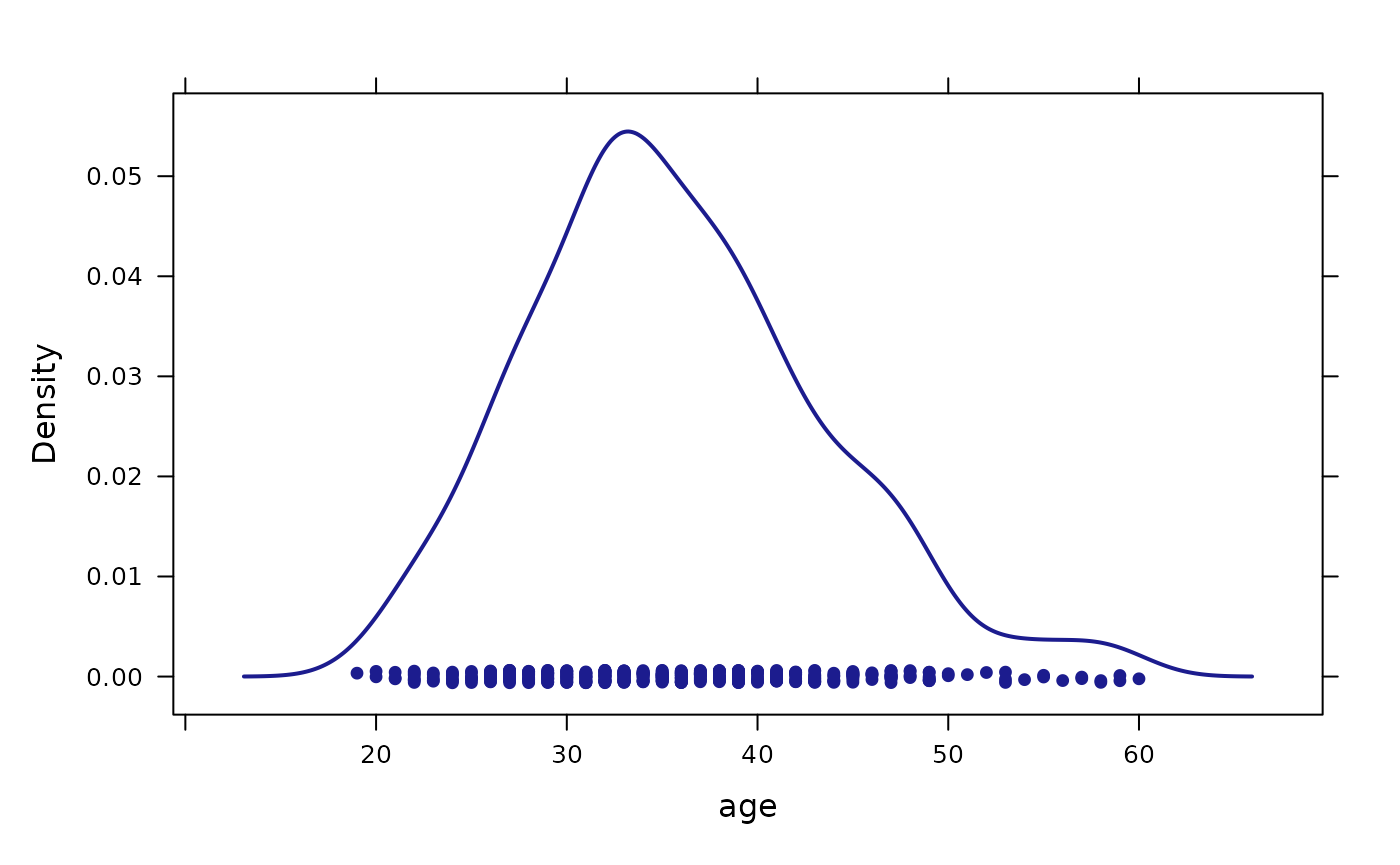
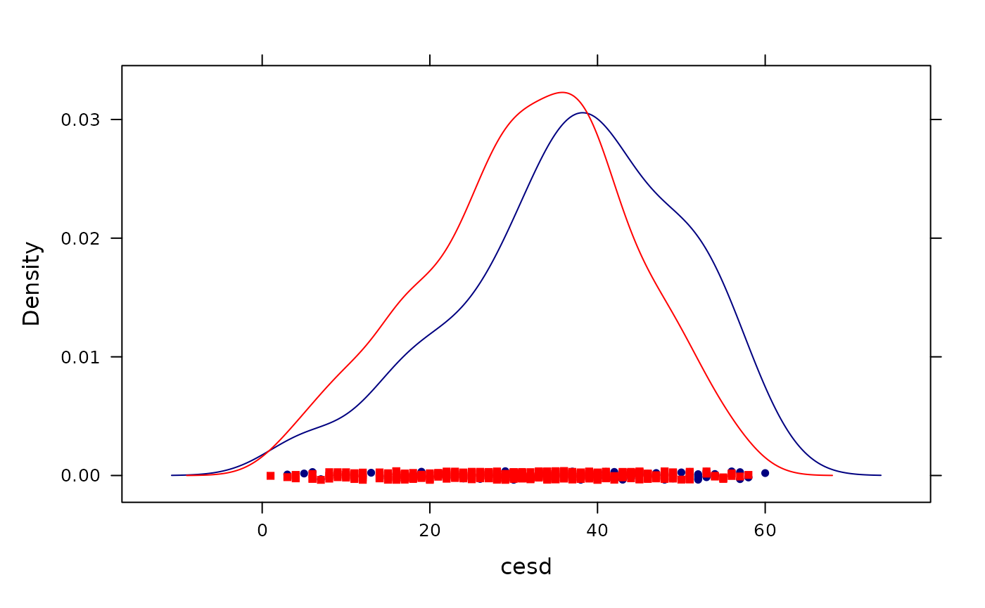
Overlaid density plots (lattice)
densityplot(~ age, data = HELPrct,
groups = sex, auto.key = TRUE)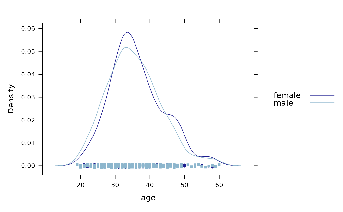 ### Density over histograms (lattice)
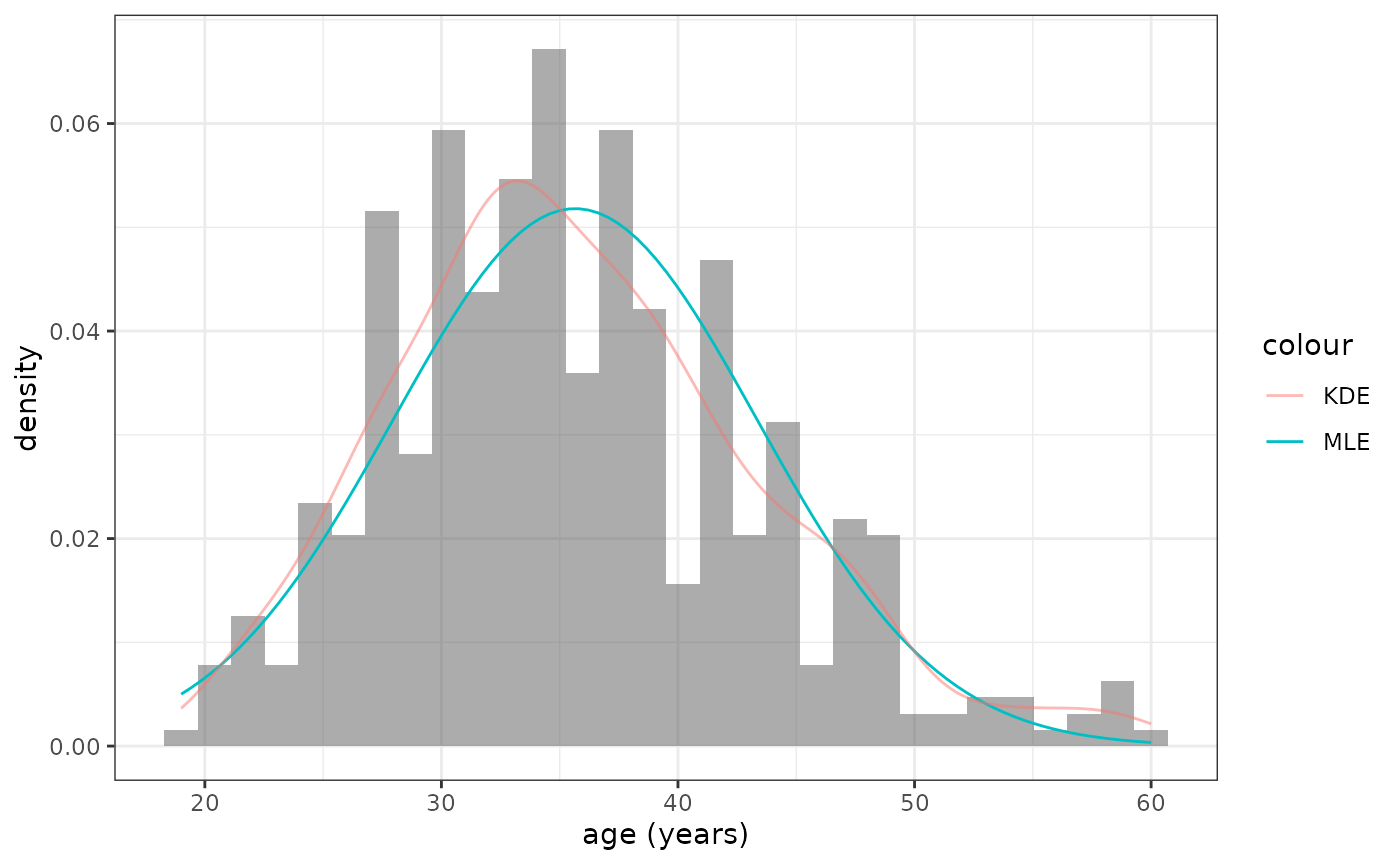
mosaic makes it easy to add a fitted distribution to a
histogram.
histogram(~ age, data = HELPrct,
          fit = "normal", dcol = "red")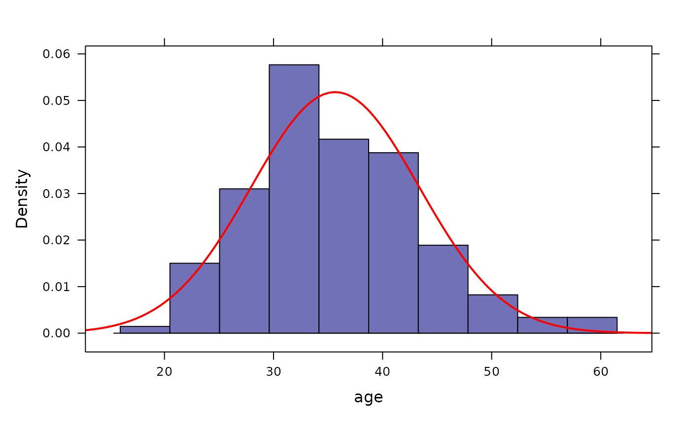
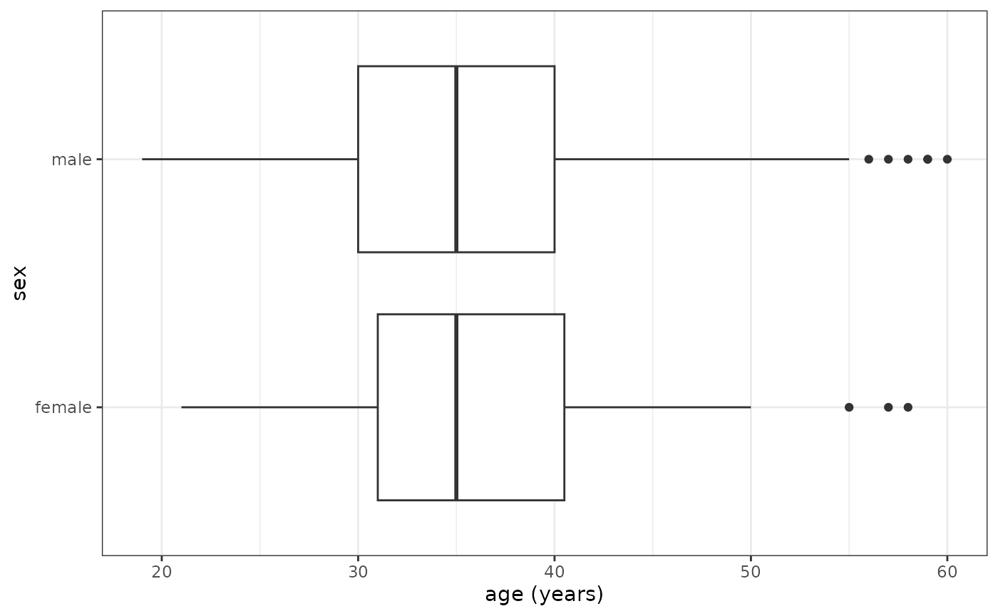
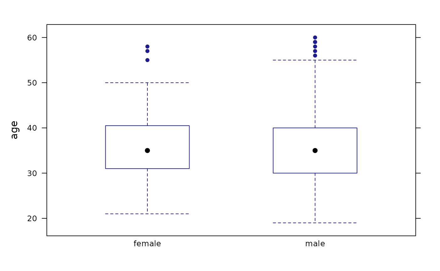
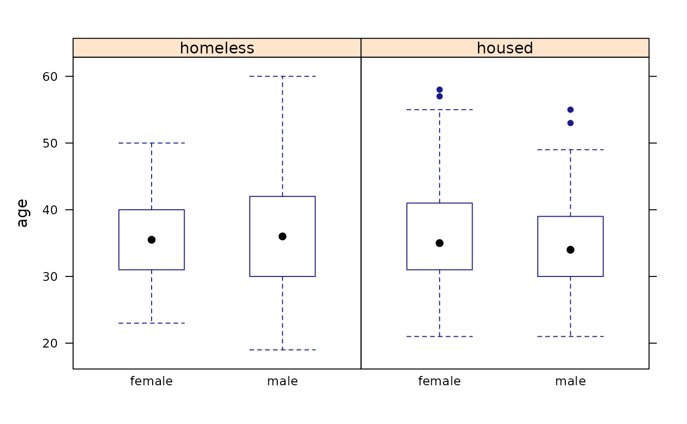
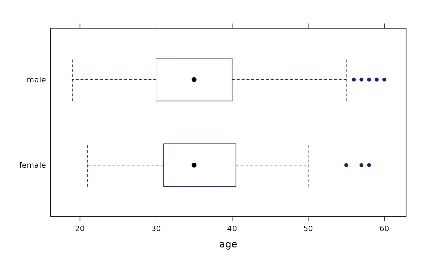
Scatterplots
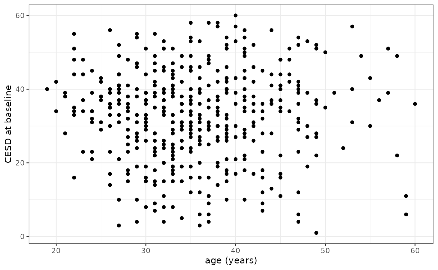
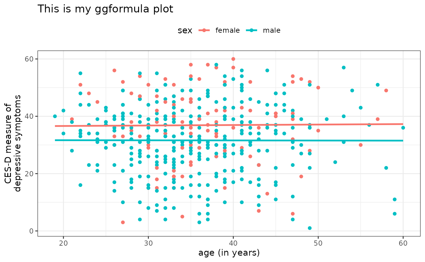
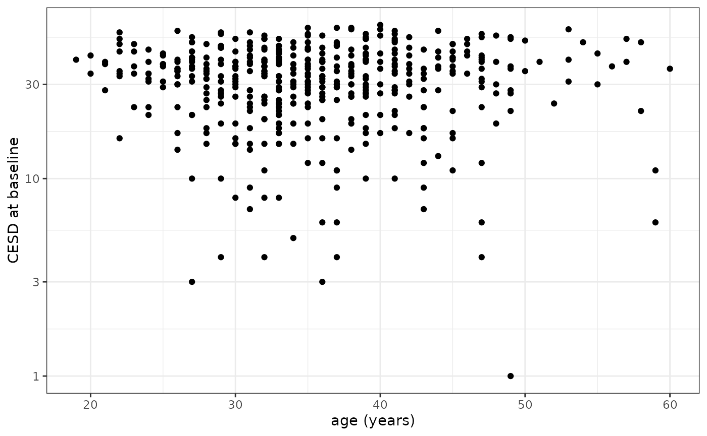
Overlaid scatterplot with linear fit (ggformula)
gf_point(cesd ~ age, data = HELPrct,
         color = ~ sex) %>%
  gf_lm()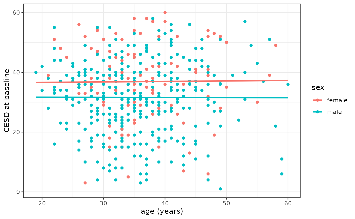
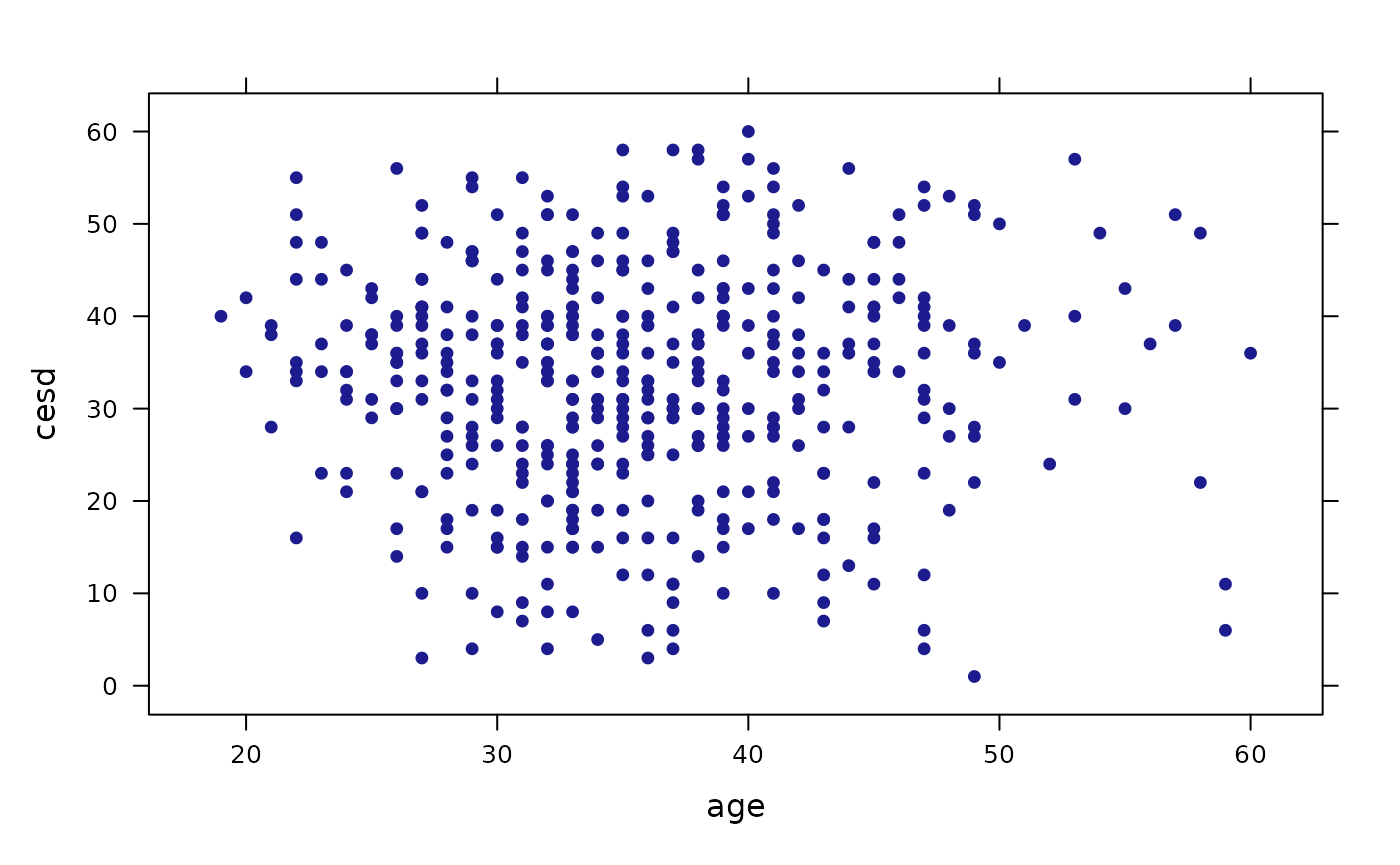
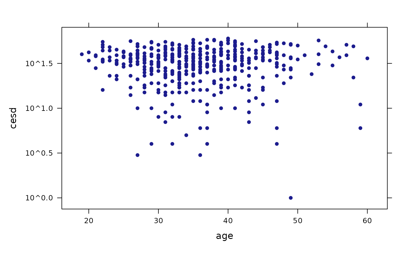
Overlaid scatterplot with linear fit (lattice)
xyplot(cesd ~ age,  data = HELPrct,
       groups = sex,
       type = c("p", "r"),
auto.key = TRUE) 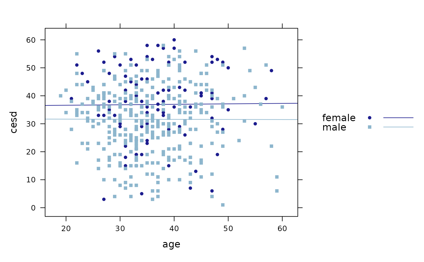
Faceted scatterplot with smooth fit (ggformula)
gf_point(cesd ~ age | sex,
         data = HELPrct) %>%
  gf_smooth(se = FALSE)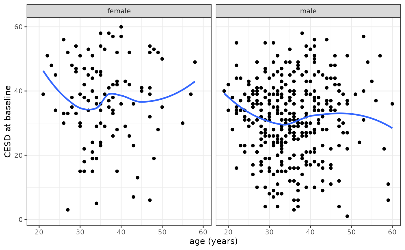
Faceted scatterplot with smooth fit (lattice)
xyplot(cesd ~ age | sex,  data = HELPrct,
       type = c("p", "smooth"),
auto.key = TRUE) 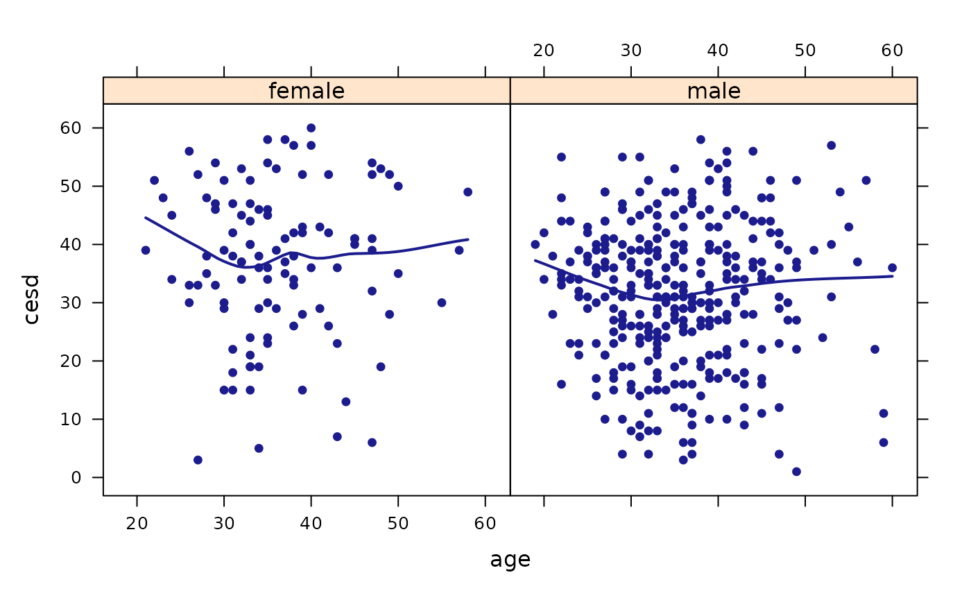
More options for scatterplot with linear fit (lattice)
xyplot(cesd ~ age, groups = sex,
       type = c("p", "r"),
       auto.key = TRUE,
       main = "This is my lattice plot",
       xlab = "age (in years)",
       ylab = "CES-D measure of
depressive symptoms",
       data = HELPrct)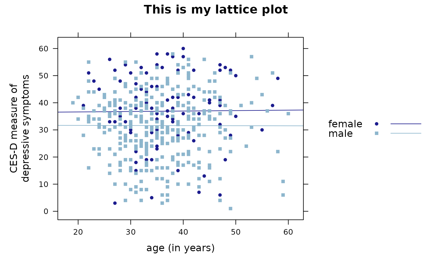
Refining graphs
Custom Colors (ggformula)
gf_dens(
  ~ cesd, data = HELPrct,
  color = ~ sex) %>%
  gf_rug(
    0 ~ cesd,
    position = position_jitter(height = 0)
  ) %>%
  gf_refine(
    scale_color_manual(
values = c("navy", "red"))) 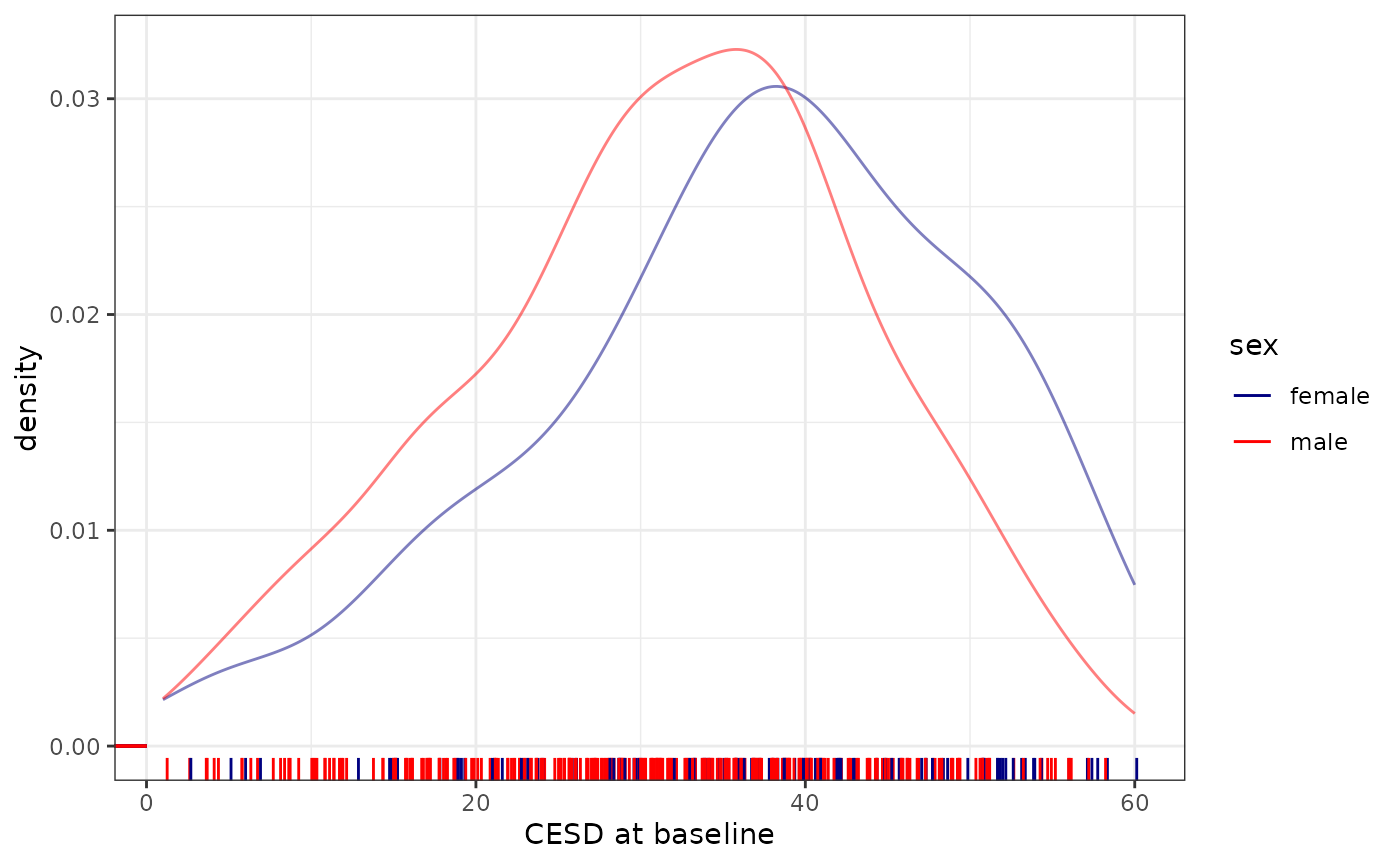
Want to explore more?
Within RStudio, after loading the mosaic package, try
running the command mplot(ds) where ds is a
dataframe. This will open up an interactive visualizer that will output
the code to generate the figure (using lattice,
ggplot2, or ggformula) when you click on
Show Expression.
References
More information about ggformula can be found at https://www.mosaic-web.org/ggformula.
More information regarding Project MOSAIC (Kaplan, Pruim, and Horton)
can be found at http://www.mosaic-web.org/. Further information
regarding the mosaic package can be found at https://www.mosaic-web.org/mosaic/ and https://journal.r-project.org/articles/RJ-2017-024/index.html.
Examples of how to bring multidimensional graphics into day one of an introductory statistics course can be found at https://escholarship.org/uc/item/84v3774z.