This function draws a rank-abundance curve for community data. You can optionally add labels for a selected number of species.
If you wish to draw multiple rank-abundance curves for selected samples use racurves.
Usage
racurve(
  matrix,
  main = "Rank-abundance diagram",
  nlab = 0,
  ylog = FALSE,
  frequency = FALSE,
  ylim = NULL,
  xlim = NULL
)
Arguments
- matrix
Community data, a matrix-like object with samples in rows.
- main
The main title (optional).
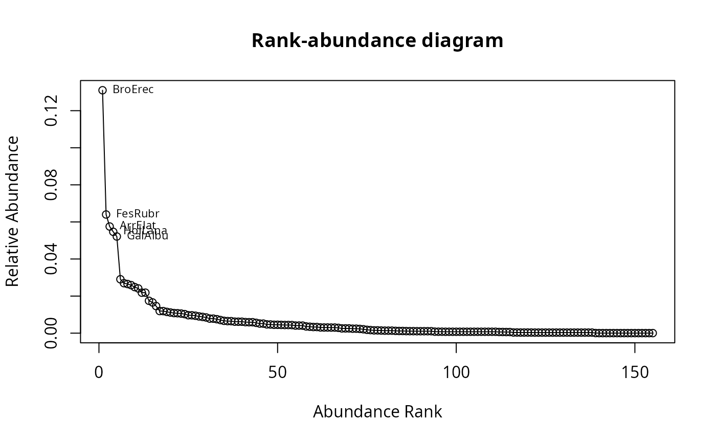
- nlab
Number of labeled species (default = 0). Species are labeled in decreasing order beginning from the highest relative abundance.
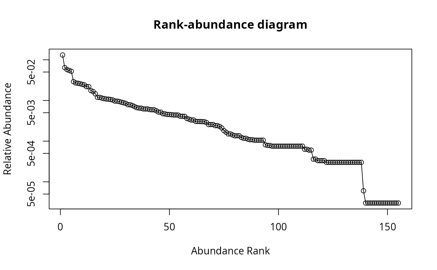
- ylog
If set on
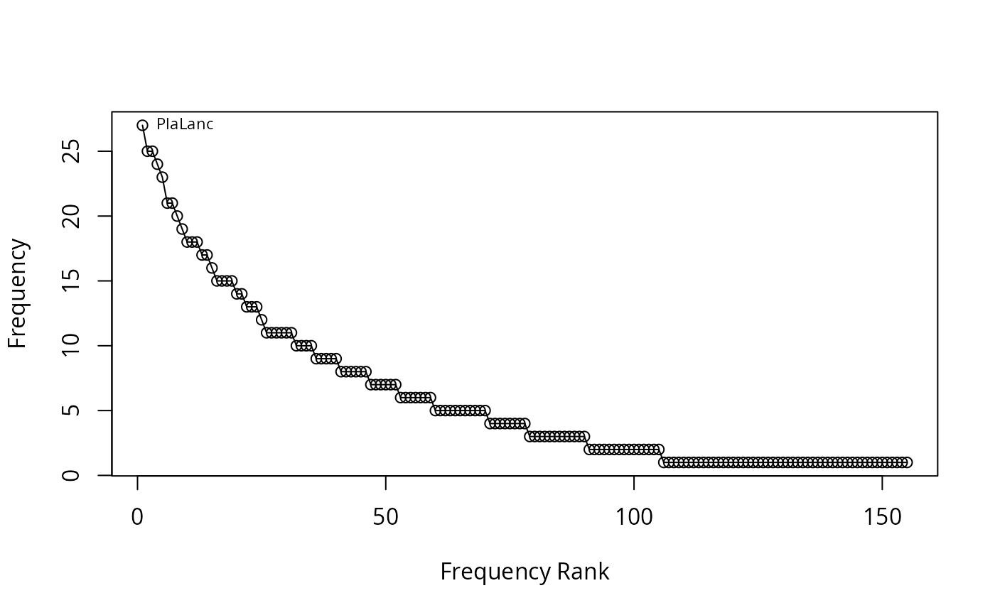
TRUEthe y-axis is displayed on a log-scale.- frequency
If set on
TRUEfrequencies of species are calculated instead of relative abundances.- xlim, ylim
Define axis limits
Value
Returns an (invisible) list composed of:
abundabundances of each species (in decreasing order)
rel.abundrelative abundances of each species (in decreasing order)
freqfrequency of each species (in decreasing order)
Details
Rank abundance curves or Whittaker plots (see Whittaker 1965) are used to display relative species abundance as biodiversity component. They are a means to visualize species richness and species evenness.
References
Whittaker, R. H. (1965). Dominance and Diversity in Land Plant Communities: Numerical relations of species express the importance of competition in community function and evolution. Science 147 : 250-260. doi:10.1126/science.147.3655.250
See also
racurves for multiple curves and rankabundance from package BiodiversityR for a more sophisticated function
Examples
## Draw rank-abundance curve
racurve(schedenveg)
## Draw rank-abundance curve and label first 5 species
racurve(schedenveg, nlab = 5)
 ## Draw rank-abundance curve with log-scaled axis
racurve(schedenveg, ylog = TRUE)
## Draw rank-abundance curve with log-scaled axis
racurve(schedenveg, ylog = TRUE)
 ## Draw rank-abundance curve with frequencies and no main title
racurve(schedenveg, frequency = TRUE, nlab = 1, main = "")
## Draw rank-abundance curve with frequencies and no main title
racurve(schedenveg, frequency = TRUE, nlab = 1, main = "")