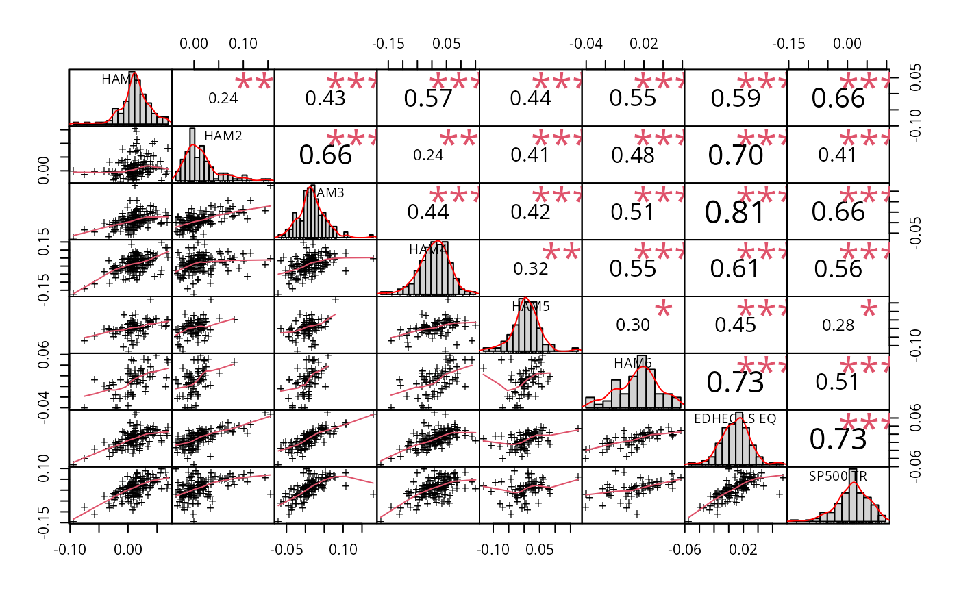
Visualization of a Correlation Matrix. On top the (absolute) value of the correlation plus the result of the cor.test as stars. On bottom, the bivariate scatterplots, with a fitted line
chart.Correlation(
  R,
  histogram = TRUE,
  method = c("pearson", "kendall", "spearman"),
  pch = 1,
  ...
)
Arguments
- R
data for the x axis, can take matrix,vector, or timeseries
- histogram
TRUE/FALSE whether or not to display a histogram
- method
a character string indicating which correlation coefficient (or covariance) is to be computed. One of "pearson" (default), "kendall", or "spearman", can be abbreviated.
- pch
See
par- ...
any other passthru parameters into
pairs
Note
based on plot at originally found at addictedtor.free.fr/graphiques/sources/source_137.R
See also
Examples
data(managers)
chart.Correlation(managers[,1:8], histogram=TRUE, pch="+")