Plot Mean X vs. Ordinal Y
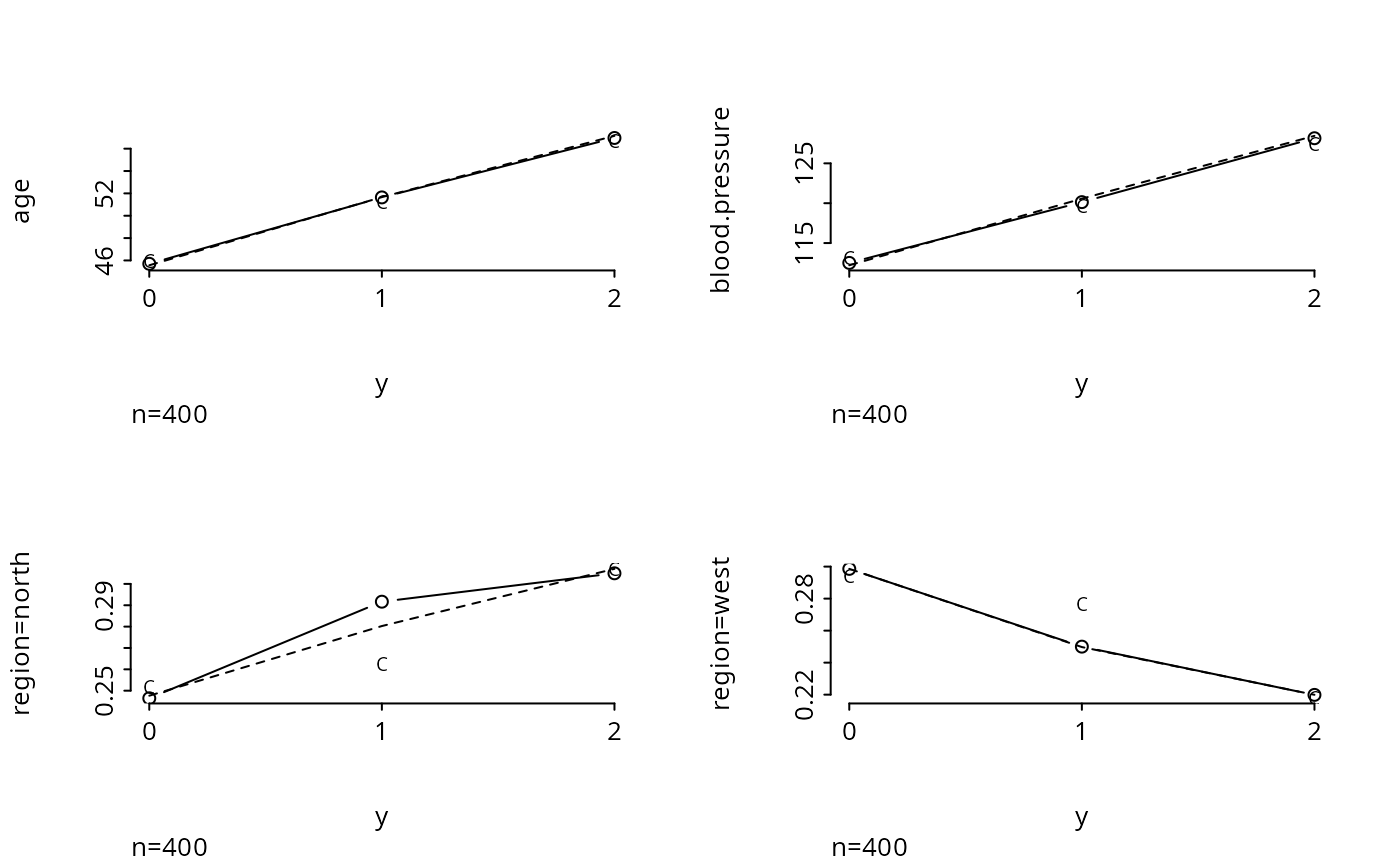
plot.xmean.ordinaly.RdSeparately for each predictor variable \(X\) in a formula, plots the mean of \(X\) vs. levels of \(Y\). Then under the proportional odds assumption, the expected value of the predictor for each \(Y\) value is also plotted (as a dotted line). This plot is useful for assessing the ordinality assumption for \(Y\) separately for each \(X\), and for assessing the proportional odds assumption in a simple univariable way. If several predictors do not distinguish adjacent categories of \(Y\), those levels may need to be pooled. This display assumes that each predictor is linearly related to the log odds of each event in the proportional odds model. There is also an option to plot the expected means assuming a forward continuation ratio model.
Usage
# S3 method for class 'xmean.ordinaly'
plot(x, data, subset, na.action, subn=TRUE,
                    cr=FALSE, topcats=1, cex.points=.75, ...)
Arguments
- x
an S formula. Response variable is treated as ordinal. For categorical predictors, a binary version of the variable is substituted, specifying whether or not the variable equals the modal category. Interactions or non-linear effects are not allowed.
- data
a data frame or frame number
- subset
vector of subscripts or logical vector describing subset of data to analyze
- na.action
defaults to
na.keepso all NAs are initially retained. Then NAs are deleted only for each predictor currently being plotted. Specifyna.action=na.deleteto remove observations that are missing on any of the predictors (or the response).- subn
set to
FALSEto suppress a left bottom subtitle specifying the sample size used in constructing each plot- cr
set to
TRUEto plot expected values by levels of the response, assuming a forward continuation ratio model holds. The function is fairly slow when this option is specified.- topcats
When a predictor is categorical, by default only the proportion of observations in the overall most frequent category will be plotted against response variable strata. Specify a higher value of
topcatsto make separate plots for the proportion in thekmost frequent predictor categories, wherekismin(ncat-1, topcats)andncatis the number of unique values of the predictor.- cex.points
if
crisTRUE, specifies the size of the"C"that is plotted. Default is 0.75.- ...
other arguments passed to
plotandlines
References
Harrell FE et al. (1998): Development of a clinical prediction model for an ordinal outcome. Stat in Med 17:909–44.
Examples
# Simulate data from a population proportional odds model
set.seed(1)
n <- 400
age <- rnorm(n, 50, 10)
blood.pressure <- rnorm(n, 120, 15)
region <- factor(sample(c('north','south','east','west'), n, replace=TRUE))
L <- .2*(age-50) + .1*(blood.pressure-120)
p12 <- plogis(L)    # Pr(Y>=1)
p2  <- plogis(L-1)  # Pr(Y=2)
p   <- cbind(1-p12, p12-p2, p2)   # individual class probabilites
# Cumulative probabilities:
cp  <- matrix(cumsum(t(p)) - rep(0:(n-1), rep(3,n)), byrow=TRUE, ncol=3)
y   <- (cp < runif(n)) %*% rep(1,3)
# Thanks to Dave Krantz <dhk@paradox.psych.columbia.edu> for this trick

par(mfrow=c(2,2))
plot.xmean.ordinaly(y ~ age + blood.pressure + region, cr=TRUE, topcats=2)

par(mfrow=c(1,1))
# Note that for unimportant predictors we don't care very much about the
# shapes of these plots.  Use the Hmisc chiSquare function to compute
# Pearson chi-square statistics to rank the variables by unadjusted
# importance without assuming any ordering of the response:
chiSquare(y ~ age + blood.pressure + region, g=3)
#>
#> Pearson Chi-square Tests    Response variable:y
#>
#>                chisquare df chisquare-df      P   n
#> age               104.47  4       100.47 0.0000 400
#> blood.pressure     72.28  4        68.28 0.0000 400
#> region              3.47  6        -2.53 0.7485 400
chiSquare(y ~ age + blood.pressure + region, g=5)
#>
#> Pearson Chi-square Tests    Response variable:y
#>
#>                chisquare df chisquare-df      P   n
#> age               117.46  8       109.46 0.0000 400
#> blood.pressure     90.87  8        82.87 0.0000 400
#> region              3.47  6        -2.53 0.7485 400
par(mfrow=c(1,1))
# Note that for unimportant predictors we don't care very much about the
# shapes of these plots. Use the Hmisc chiSquare function to compute
# Pearson chi-square statistics to rank the variables by unadjusted
# importance without assuming any ordering of the response:
chiSquare(y ~ age + blood.pressure + region, g=3)
#>
#> Pearson Chi-square Tests Response variable:y
#>
#> chisquare df chisquare-df P n
#> age 104.47 4 100.47 0.0000 400
#> blood.pressure 72.28 4 68.28 0.0000 400
#> region 3.47 6 -2.53 0.7485 400
chiSquare(y ~ age + blood.pressure + region, g=5)
#>
#> Pearson Chi-square Tests Response variable:y
#>
#> chisquare df chisquare-df P n
#> age 117.46 8 109.46 0.0000 400
#> blood.pressure 90.87 8 82.87 0.0000 400
#> region 3.47 6 -2.53 0.7485 400