Create a line plot.
Usage
ggline(
  data,
  x,
  y,
  group = 1,
  numeric.x.axis = FALSE,
  combine = FALSE,
  merge = FALSE,
  color = "black",
  palette = NULL,
  linetype = "solid",
  plot_type = c("b", "l", "p"),
  size = NULL,
  linewidth = NULL,
  shape = 19,
  stroke = NULL,
  point.size = linewidth,
  point.color = color,
  title = NULL,
  xlab = NULL,
  ylab = NULL,
  facet.by = NULL,
  panel.labs = NULL,
  short.panel.labs = TRUE,
  select = NULL,
  remove = NULL,
  order = NULL,
  add = "none",
  add.params = list(),
  error.plot = "errorbar",
  label = NULL,
  font.label = list(size = 11, color = "black"),
  label.select = NULL,
  repel = FALSE,
  label.rectangle = FALSE,
  show.line.label = FALSE,
  position = "identity",
  ggtheme = theme_pubr(),
  ...
)
Arguments
- data
a data frame
- x, y
x and y variables for drawing.
- group
grouping variable to connect points by line. Allowed values are 1 (for one line, one group) or a character vector specifying the name of the grouping variable (case of multiple lines).
- numeric.x.axis
logical. If TRUE, x axis will be treated as numeric. Default is FALSE.
- combine
logical value. Default is FALSE. Used only when y is a vector containing multiple variables to plot. If TRUE, create a multi-panel plot by combining the plot of y variables.
- merge
logical or character value. Default is FALSE. Used only when y is a vector containing multiple variables to plot. If TRUE, merge multiple y variables in the same plotting area. Allowed values include also "asis" (TRUE) and "flip". If merge = "flip", then y variables are used as x tick labels and the x variable is used as grouping variable.
- color
line colors.
- palette
the color palette to be used for coloring or filling by groups. Allowed values include "grey" for grey color palettes; brewer palettes e.g. "RdBu", "Blues", ...; or custom color palette e.g. c("blue", "red"); and scientific journal palettes from ggsci R package, e.g.: "npg", "aaas", "lancet", "jco", "ucscgb", "uchicago", "simpsons" and "rickandmorty".
- linetype
line type.
- plot_type
plot type. Allowed values are one of "b" for both line and point; "l" for line only; and "p" for point only. Default is "b".
- size
line size. Deprecated in ggplot2 v >= 3.4.0, use
linewidthinstead.- linewidth
line width. Default is 0.5. Recommended parameter for ggplot2 version >= 3.4.0. If both
sizeandlinewidthare specified, an error is thrown.- shape
point shapes.
- stroke
point stroke. Used only for shapes 21-24 to control the thickness of points border.
- point.size
point size.
- point.color
point color.
- title
plot main title.
- xlab
character vector specifying x axis labels. Use xlab = FALSE to hide xlab.
- ylab
character vector specifying y axis labels. Use ylab = FALSE to hide ylab.
- facet.by
character vector, of length 1 or 2, specifying grouping variables for faceting the plot into multiple panels. Should be in the data.
- panel.labs
a list of one or two character vectors to modify facet panel labels. For example, panel.labs = list(sex = c("Male", "Female")) specifies the labels for the "sex" variable. For two grouping variables, you can use for example panel.labs = list(sex = c("Male", "Female"), rx = c("Obs", "Lev", "Lev2") ).
- short.panel.labs
logical value. Default is TRUE. If TRUE, create short labels for panels by omitting variable names; in other words panels will be labelled only by variable grouping levels.
- select
character vector specifying which items to display.
- remove
character vector specifying which items to remove from the plot.
- order
character vector specifying the order of items.
- add
character vector for adding another plot element (e.g.: dot plot or error bars). Allowed values are one or the combination of: "none", "dotplot", "jitter", "boxplot", "point", "mean", "mean_se", "mean_sd", "mean_ci", "mean_range", "median", "median_iqr", "median_hilow", "median_q1q3", "median_mad", "median_range"; see ?desc_statby for more details.
- add.params
parameters (color, shape, size, fill, linetype) for the argument 'add'; e.g.: add.params = list(color = "red").
- error.plot
plot type used to visualize error. Allowed values are one of c("pointrange", "linerange", "crossbar", "errorbar", "upper_errorbar", "lower_errorbar", "upper_pointrange", "lower_pointrange", "upper_linerange", "lower_linerange"). Default value is "pointrange" or "errorbar". Used only when add != "none" and add contains one "mean_*" or "med_*" where "*" = sd, se, ....
- label
the name of the column containing point labels. Can be also a character vector with length = nrow(data).
- font.label
a list which can contain the combination of the following elements: the size (e.g.: 14), the style (e.g.: "plain", "bold", "italic", "bold.italic") and the color (e.g.: "red") of labels. For example font.label = list(size = 14, face = "bold", color ="red"). To specify only the size and the style, use font.label = list(size = 14, face = "plain").
- label.select
can be of two formats:
a character vector specifying some labels to show.
a list containing one or the combination of the following components:
top.upandtop.down: to display the labels of the top up/down points. For example,label.select = list(top.up = 10, top.down = 4).criteria: to filter, for example, by x and y variabes values, use this:label.select = list(criteria = "`y` > 2 & `y` < 5 & `x` %in% c('A', 'B')").
- repel
a logical value, whether to use ggrepel to avoid overplotting text labels or not.
- label.rectangle
logical value. If TRUE, add rectangle underneath the text, making it easier to read.
- show.line.label
logical value. If TRUE, shows line labels.
- position
A position adjustment to use on the data for this layer. This can be used in various ways, including to prevent overplotting and improving the display. The
positionargument accepts the following:The result of calling a position function, such as
position_jitter(). This method allows for passing extra arguments to the position.A string naming the position adjustment. To give the position as a string, strip the function name of the
position_prefix. For example, to useposition_jitter(), give the position as"jitter".For more information and other ways to specify the position, see the layer position documentation.
- ggtheme
function, ggplot2 theme name. Default value is theme_pubr(). Allowed values include ggplot2 official themes: theme_gray(), theme_bw(), theme_minimal(), theme_classic(), theme_void(), ....
- ...
other arguments to be passed to geom_dotplot.
Details
The plot can be easily customized using the function ggpar(). Read ?ggpar for changing:
main title and axis labels: main, xlab, ylab
axis limits: xlim, ylim (e.g.: ylim = c(0, 30))
axis scales: xscale, yscale (e.g.: yscale = "log2")
color palettes: palette = "Dark2" or palette = c("gray", "blue", "red")
legend title, labels and position: legend = "right"
plot orientation : orientation = c("vertical", "horizontal", "reverse")
Examples
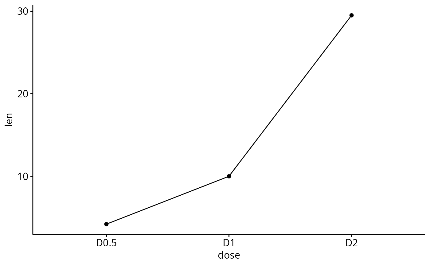
# Data
df <- data.frame(dose=c("D0.5", "D1", "D2"),
len=c(4.2, 10, 29.5))
print(df)
#> dose len
#> 1 D0.5 4.2
#> 2 D1 10.0
#> 3 D2 29.5
# Basic plot
# +++++++++++++++++++++++++++
ggline(df, x = "dose", y = "len")
 # Plot with multiple groups
# +++++++++++++++++++++
# Create some data
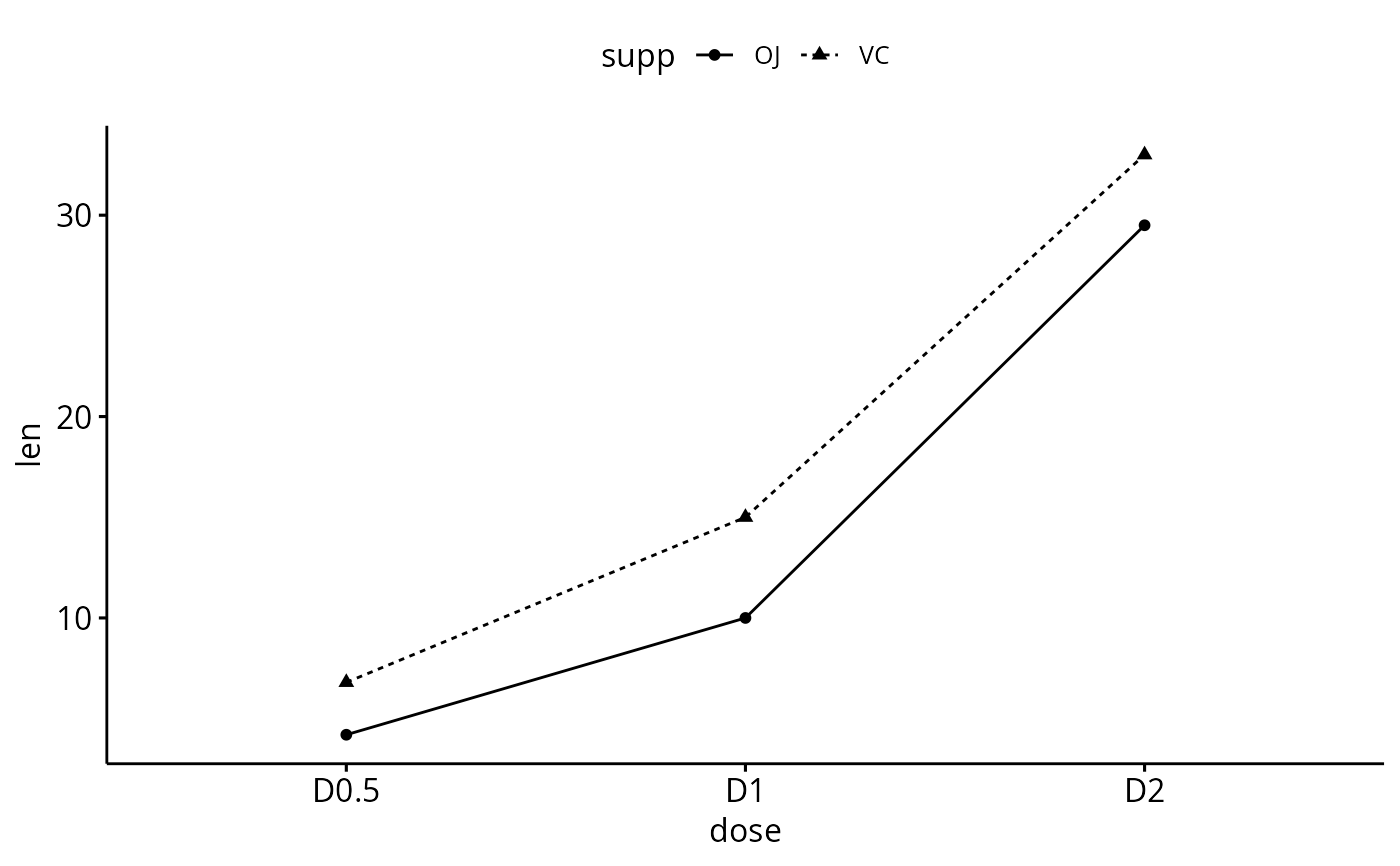
df2 <- data.frame(supp=rep(c("VC", "OJ"), each=3),
dose=rep(c("D0.5", "D1", "D2"),2),
len=c(6.8, 15, 33, 4.2, 10, 29.5))
print(df2)
#> supp dose len
#> 1 VC D0.5 6.8
#> 2 VC D1 15.0
#> 3 VC D2 33.0
#> 4 OJ D0.5 4.2
#> 5 OJ D1 10.0
#> 6 OJ D2 29.5
# Plot "len" by "dose" and
# Change line types and point shapes by a second groups: "supp"
ggline(df2, "dose", "len",
linetype = "supp", shape = "supp")
# Plot with multiple groups
# +++++++++++++++++++++
# Create some data
df2 <- data.frame(supp=rep(c("VC", "OJ"), each=3),
dose=rep(c("D0.5", "D1", "D2"),2),
len=c(6.8, 15, 33, 4.2, 10, 29.5))
print(df2)
#> supp dose len
#> 1 VC D0.5 6.8
#> 2 VC D1 15.0
#> 3 VC D2 33.0
#> 4 OJ D0.5 4.2
#> 5 OJ D1 10.0
#> 6 OJ D2 29.5
# Plot "len" by "dose" and
# Change line types and point shapes by a second groups: "supp"
ggline(df2, "dose", "len",
linetype = "supp", shape = "supp")
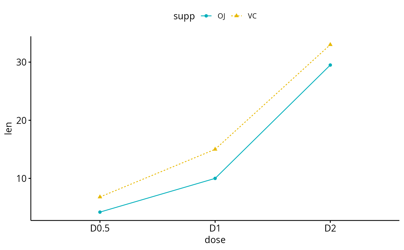
 # Change colors
# +++++++++++++++++++++
# Change color by group: "supp"
# Use custom color palette
ggline(df2, "dose", "len",
linetype = "supp", shape = "supp",
color = "supp", palette = c("#00AFBB", "#E7B800"))
# Change colors
# +++++++++++++++++++++
# Change color by group: "supp"
# Use custom color palette
ggline(df2, "dose", "len",
linetype = "supp", shape = "supp",
color = "supp", palette = c("#00AFBB", "#E7B800"))
 # Add points and errors
# ++++++++++++++++++++++++++
# Data: ToothGrowth data set we'll be used.
df3 <- ToothGrowth
head(df3, 10)
#> len supp dose
#> 1 4.2 VC 0.5
#> 2 11.5 VC 0.5
#> 3 7.3 VC 0.5
#> 4 5.8 VC 0.5
#> 5 6.4 VC 0.5
#> 6 10.0 VC 0.5
#> 7 11.2 VC 0.5
#> 8 11.2 VC 0.5
#> 9 5.2 VC 0.5
#> 10 7.0 VC 0.5
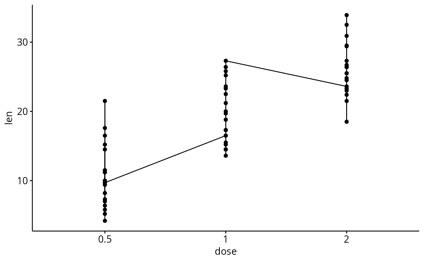
# It can be seen that for each group we have
# different values
ggline(df3, x = "dose", y = "len")
# Add points and errors
# ++++++++++++++++++++++++++
# Data: ToothGrowth data set we'll be used.
df3 <- ToothGrowth
head(df3, 10)
#> len supp dose
#> 1 4.2 VC 0.5
#> 2 11.5 VC 0.5
#> 3 7.3 VC 0.5
#> 4 5.8 VC 0.5
#> 5 6.4 VC 0.5
#> 6 10.0 VC 0.5
#> 7 11.2 VC 0.5
#> 8 11.2 VC 0.5
#> 9 5.2 VC 0.5
#> 10 7.0 VC 0.5
# It can be seen that for each group we have
# different values
ggline(df3, x = "dose", y = "len")
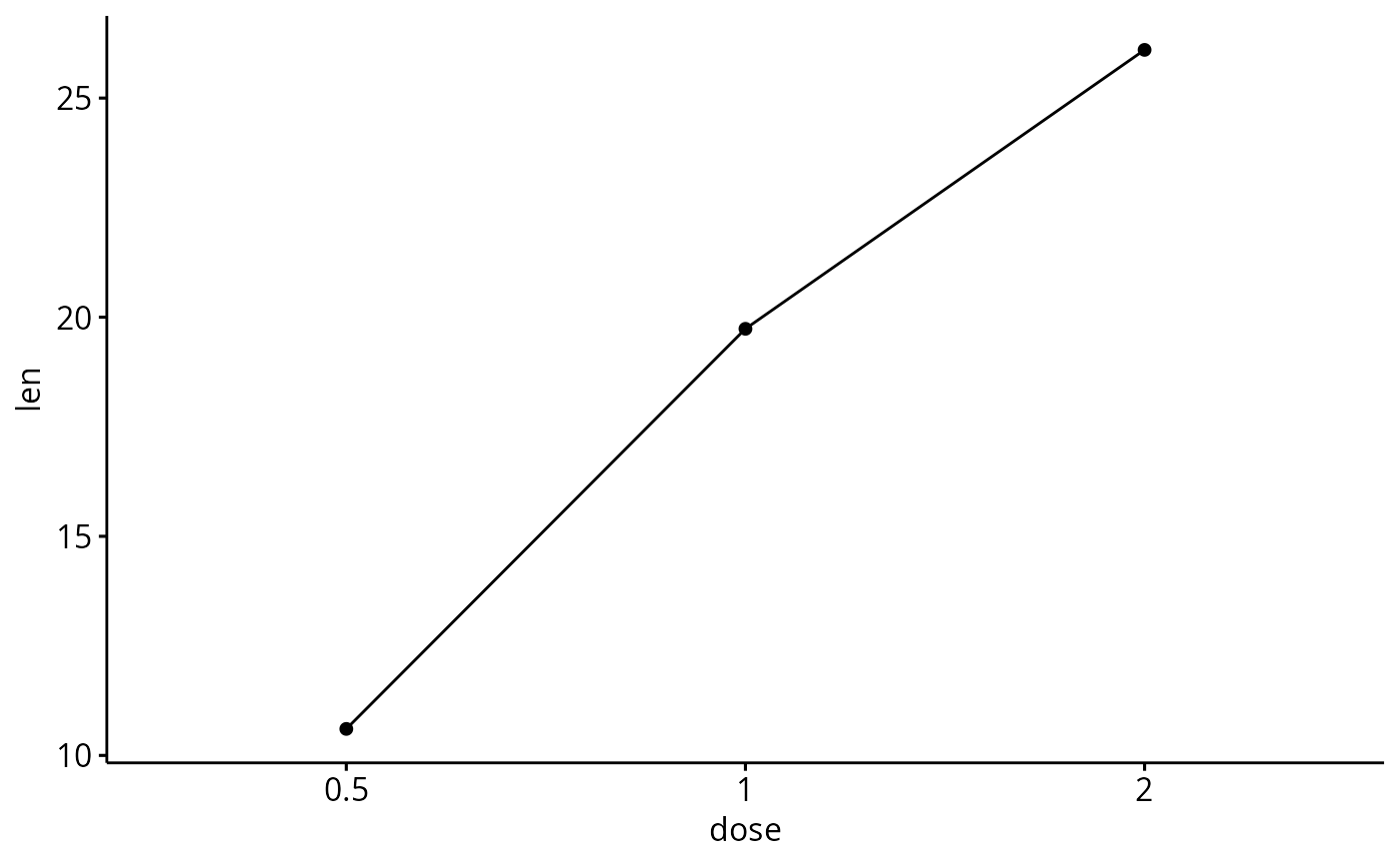
 # Visualize the mean of each group
ggline(df3, x = "dose", y = "len",
add = "mean")
# Visualize the mean of each group
ggline(df3, x = "dose", y = "len",
add = "mean")
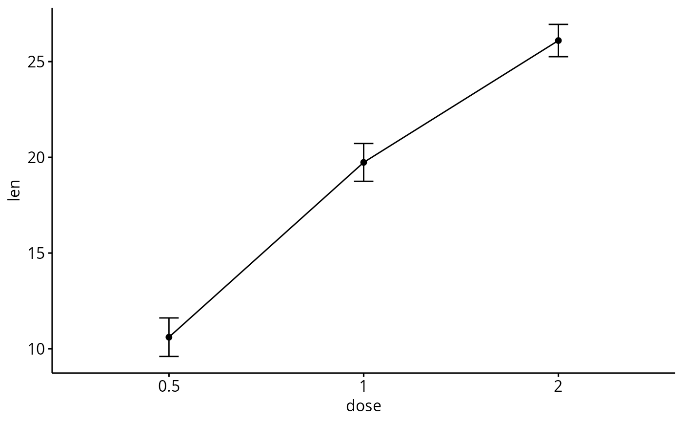
 # Add error bars: mean_se
# (other values include: mean_sd, mean_ci, median_iqr, ....)
# Add labels
ggline(df3, x = "dose", y = "len", add = "mean_se")
# Add error bars: mean_se
# (other values include: mean_sd, mean_ci, median_iqr, ....)
# Add labels
ggline(df3, x = "dose", y = "len", add = "mean_se")
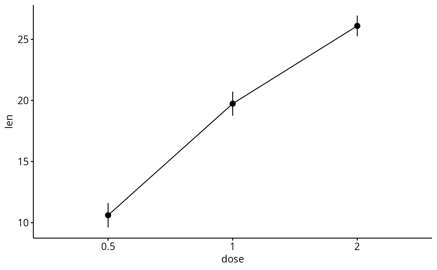
 # Change error.plot to "pointrange"
ggline(df3, x = "dose", y = "len",
add = "mean_se", error.plot = "pointrange")
# Change error.plot to "pointrange"
ggline(df3, x = "dose", y = "len",
add = "mean_se", error.plot = "pointrange")
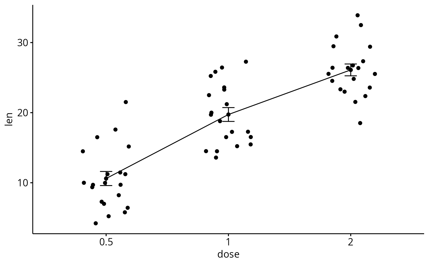
 # Add jitter points and errors (mean_se)
ggline(df3, x = "dose", y = "len",
add = c("mean_se", "jitter"))
# Add jitter points and errors (mean_se)
ggline(df3, x = "dose", y = "len",
add = c("mean_se", "jitter"))
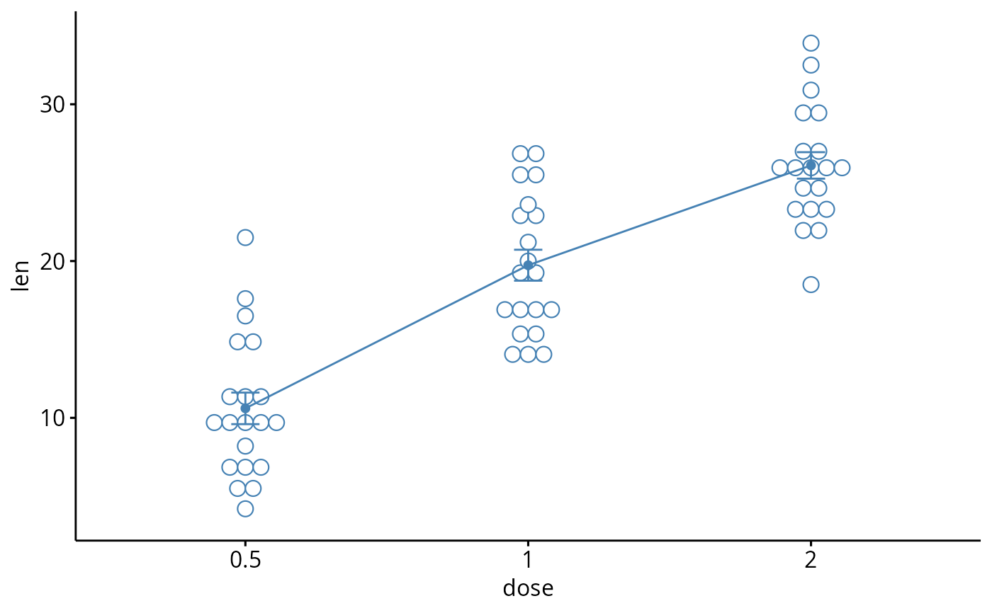
 # Add dot and errors (mean_se)
ggline(df3, x = "dose", y = "len",
add = c("mean_se", "dotplot"), color = "steelblue")
#> Bin width defaults to 1/30 of the range of the data. Pick better value with
#> `binwidth`.
# Add dot and errors (mean_se)
ggline(df3, x = "dose", y = "len",
add = c("mean_se", "dotplot"), color = "steelblue")
#> Bin width defaults to 1/30 of the range of the data. Pick better value with
#> `binwidth`.
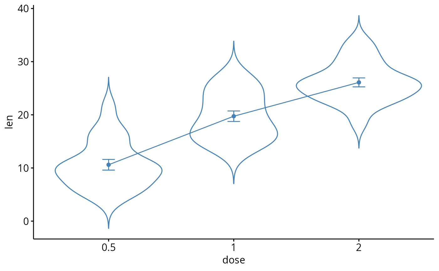
 # Add violin and errors (mean_se)
ggline(df3, x = "dose", y = "len",
add = c("mean_se", "violin"), color = "steelblue")
# Add violin and errors (mean_se)
ggline(df3, x = "dose", y = "len",
add = c("mean_se", "violin"), color = "steelblue")
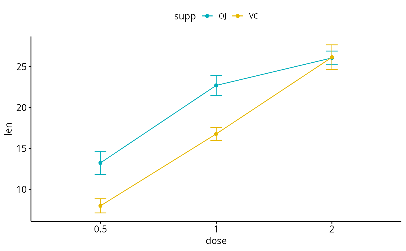
 # Multiple groups with error bars
# ++++++++++++++++++++++
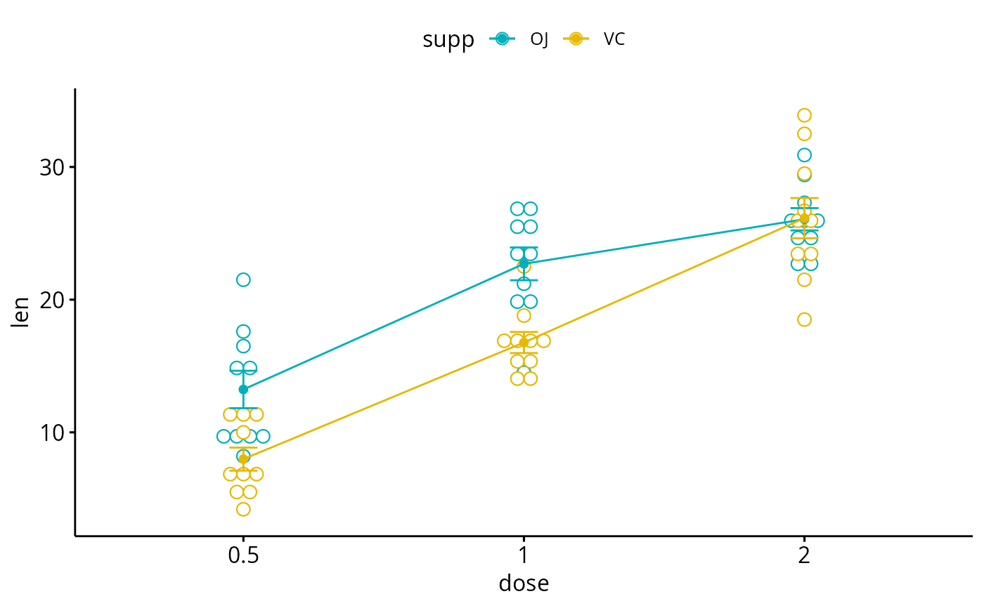
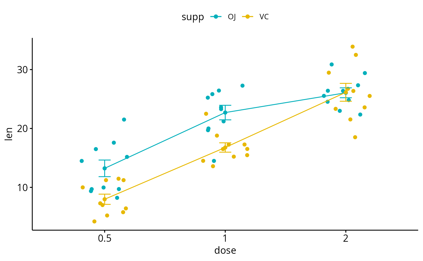
ggline(df3, x = "dose", y = "len", color = "supp",
add = "mean_se", palette = c("#00AFBB", "#E7B800"))
# Multiple groups with error bars
# ++++++++++++++++++++++
ggline(df3, x = "dose", y = "len", color = "supp",
add = "mean_se", palette = c("#00AFBB", "#E7B800"))
 # Add jitter
ggline(df3, x = "dose", y = "len", color = "supp",
add = c("mean_se", "jitter"), palette = c("#00AFBB", "#E7B800"))
# Add jitter
ggline(df3, x = "dose", y = "len", color = "supp",
add = c("mean_se", "jitter"), palette = c("#00AFBB", "#E7B800"))
 # Add dot plot
ggline(df3, x = "dose", y = "len", color = "supp",
add = c("mean_se", "dotplot"), palette = c("#00AFBB", "#E7B800"))
#> Bin width defaults to 1/30 of the range of the data. Pick better value with
#> `binwidth`.
# Add dot plot
ggline(df3, x = "dose", y = "len", color = "supp",
add = c("mean_se", "dotplot"), palette = c("#00AFBB", "#E7B800"))
#> Bin width defaults to 1/30 of the range of the data. Pick better value with
#> `binwidth`.