Draw a Manhattan plot for genome-wide association studies (GWAS) or any genome-indexed numeric score.
Usage
mhtplot(data, control = mht.control(), hcontrol = hmht.control(), ...)Arguments
- data
A matrix or data frame with at least three columns. The first three columns are interpreted as:
chromosome
position
value (typically p-value) Column names are ignored. Factors are automatically converted.
- control
A list produced by
mht.control()controlling plot behaviour.- hcontrol
A list produced by
hmht.control()defining highlighted markers or regions and labels.- ...
Additional graphical arguments passed to
graphics::plot()(e.g.pch,bg,xlab,ylab,ylim). Ifmaris supplied, the default margins are not modified.
Details
Produces a Manhattan plot in which genomic markers are arranged along the x-axis by chromosome and position.
By default the y-axis shows -log10(p), the standard GWAS significance
scale. Set logscale = FALSE in mht.control() to plot raw values instead.
Rows containing missing values are removed automatically before plotting.
Chromosome handling
Chromosomes may be numeric or character. The prefix "chr" is removed
automatically. Chromosomes are ordered numerically first, followed by
character chromosomes (e.g. X, Y, MT).
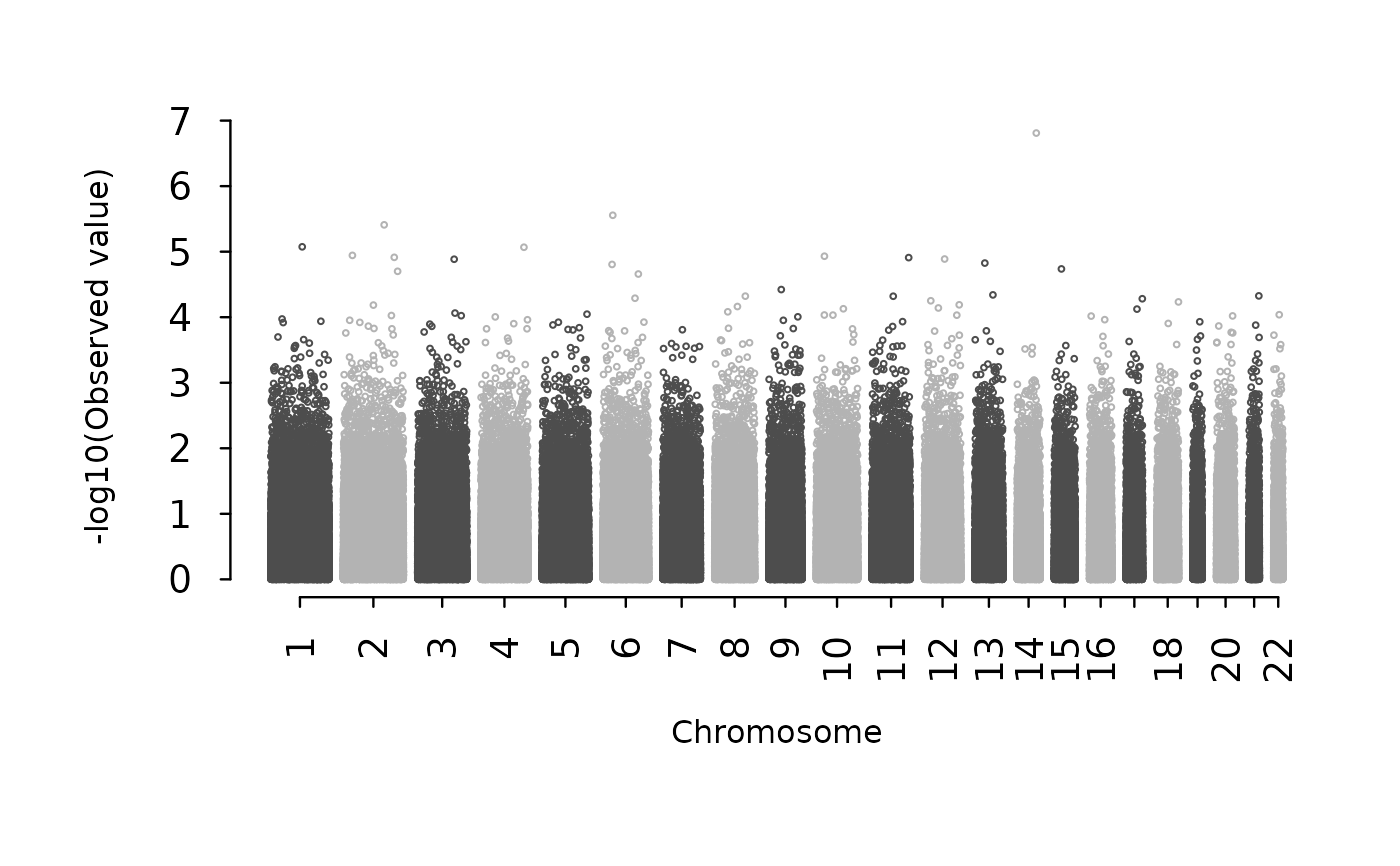
X-axis spacing
usepos = FALSE(default): markers are spaced evenly within chromosomes.usepos = TRUE: real chromosomal positions are used.gapinserts spacing between chromosomes when using real positions.
Colours
Chromosome colours alternate by default. Custom colours can be supplied via
colors in mht.control(); colours are recycled as needed.
Axis tuning
Axis appearance can be controlled using:
axis.cex— tick label sizeaxis.lwd— axis and tick thicknessaxis.tck— tick length and direction
These settings are particularly useful when exporting high-resolution figures.
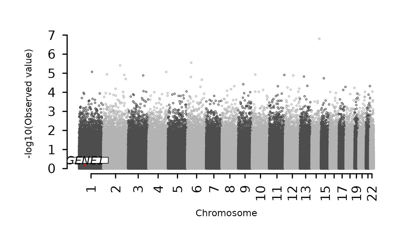
Highlighting regions
Highlighted regions are defined using hmht.control(). Matching markers are
recoloured, labelled, and optionally boxed. Matching is performed by
chromosome and position range.
Mathematical background
A Manhattan plot visualises genome-wide association statistics by mapping genetic markers to a two-dimensional coordinate system.
Y-axis transformation
P-values are transformed to improve visibility of small values:
$$y = -\log_{10}(p)$$
Small p-values therefore appear as large positive values and form the characteristic peaks used to identify strong associations.
Genome linearisation
Markers originate from multiple chromosomes and must be mapped onto a single continuous axis. For chromosome \(c\):
$$x_i = pos_i + offset_c$$
where the chromosome offset is
$$offset_c = \sum_{k < c} \max(pos_k)$$
This produces a continuous genome coordinate system in which chromosomes appear sequentially without overlap.
Chromosome label placement
Chromosome labels are positioned at the midpoint of each chromosome:
$$mid_c = (\min(x_c) + \max(x_c)) / 2$$
This centres labels regardless of chromosome length.
Plot limits
The plotting region is defined using axis tick locations so that ticks and plotting limits coincide exactly.
Conceptually, a Manhattan plot is defined by two transformations:
$$x = \text{linearised genome coordinate}$$ $$y = -\log_{10}(p)$$
All other elements (colouring, thresholds, highlighting) are visual annotations applied to these transformed coordinates.
Examples
# \donttest{
## -----------------------------------------------------------
## 1. Minimal example
## -----------------------------------------------------------
test <- matrix(c(
1,1,4,
1,1,6,
1,10,3,
2,1,5,
2,2,6,
2,4,8),
byrow=TRUE, ncol=3)
mhtplot(test)
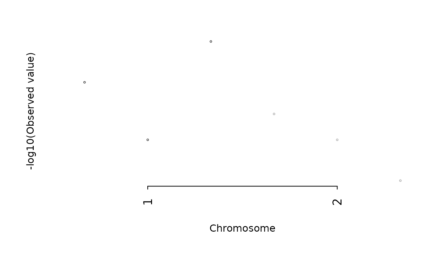 ## Raw values instead of -log10
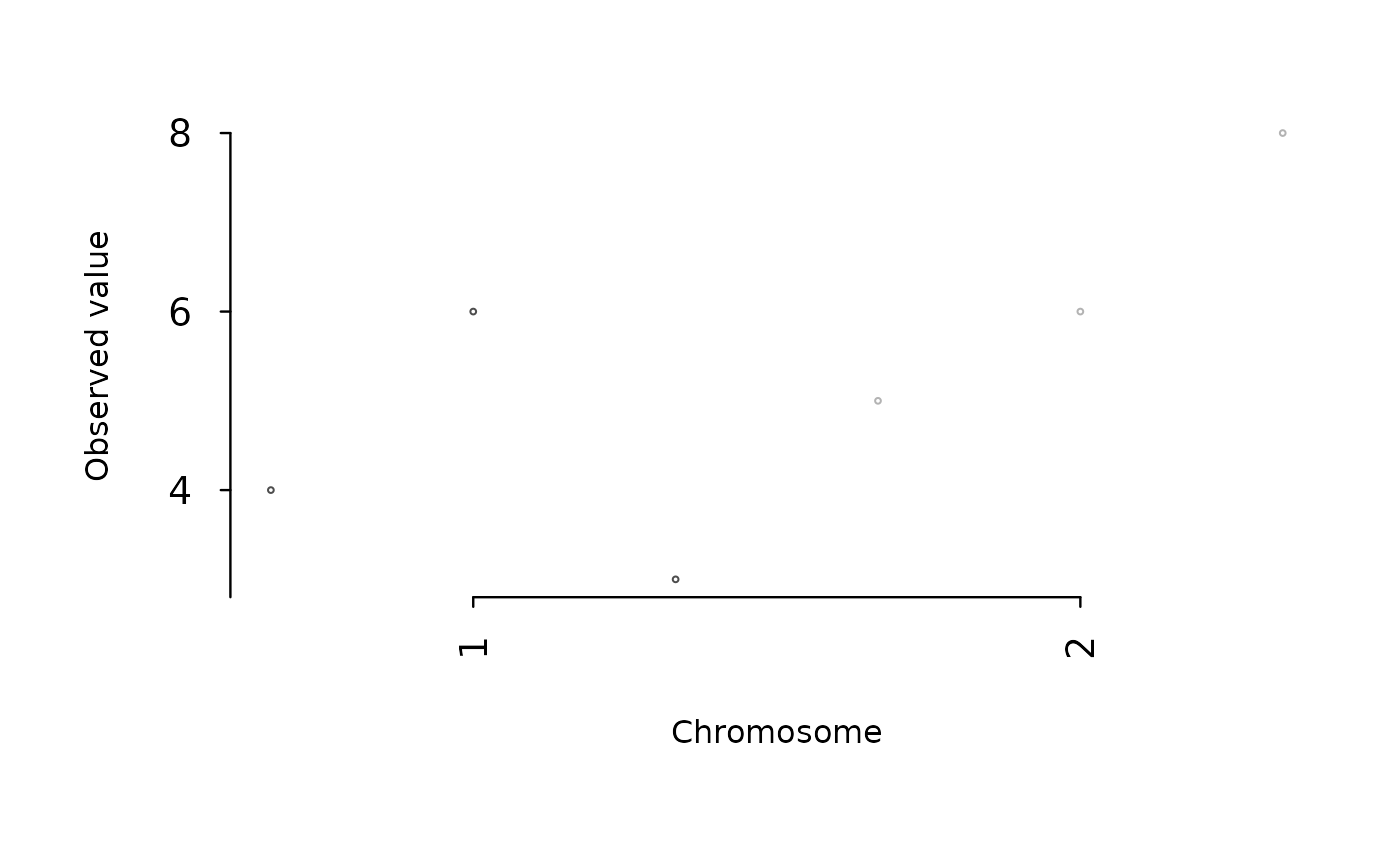
mhtplot(test, mht.control(logscale = FALSE))
## Raw values instead of -log10
mhtplot(test, mht.control(logscale = FALSE))
 ## -----------------------------------------------------------
## 2. Simulated GWAS dataset
## -----------------------------------------------------------
set.seed(1)
affy <- c(40220,41400,33801,32334,32056,31470,25835,27457,22864,
28501,26273,24954,19188,15721,14356,15309,11281,14881,
6399,12400,7125,6207)
n.markers <- sum(affy)
n.chr <- length(affy)
gwas <- data.frame(
chr = rep(1:n.chr, affy),
pos = 1:n.markers,
p = runif(n.markers)
)
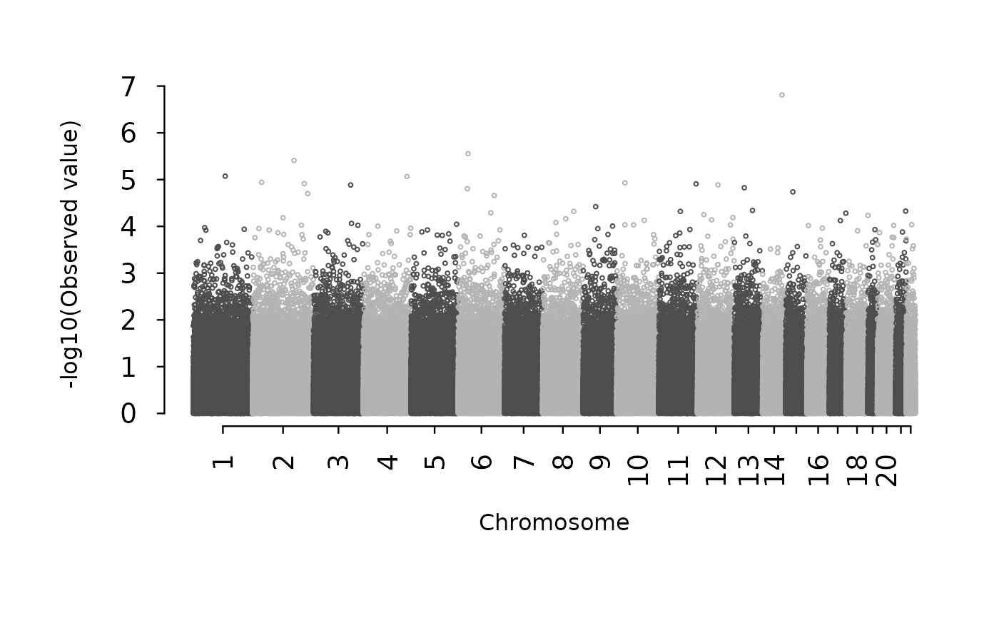
mhtplot(gwas)
## -----------------------------------------------------------
## 2. Simulated GWAS dataset
## -----------------------------------------------------------
set.seed(1)
affy <- c(40220,41400,33801,32334,32056,31470,25835,27457,22864,
28501,26273,24954,19188,15721,14356,15309,11281,14881,
6399,12400,7125,6207)
n.markers <- sum(affy)
n.chr <- length(affy)
gwas <- data.frame(
chr = rep(1:n.chr, affy),
pos = 1:n.markers,
p = runif(n.markers)
)
mhtplot(gwas)
 ## -----------------------------------------------------------
## 3. Publication-style figure
## -----------------------------------------------------------
ops <- mht.control(
axis.cex = 1.4,
axis.lwd = 2,
axis.tck = -0.03
)
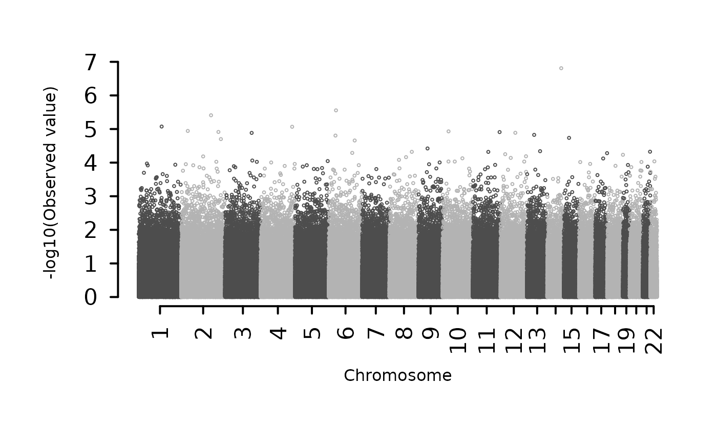
mhtplot(gwas, control = ops, pch = 19)
## -----------------------------------------------------------
## 3. Publication-style figure
## -----------------------------------------------------------
ops <- mht.control(
axis.cex = 1.4,
axis.lwd = 2,
axis.tck = -0.03
)
mhtplot(gwas, control = ops, pch = 19)
 ## -----------------------------------------------------------
## 4. Real positions + chromosome gaps
## -----------------------------------------------------------
ops2 <- mht.control(usepos = TRUE, gap = 10000)
mhtplot(gwas, control = ops2, pch = 19)
## -----------------------------------------------------------
## 4. Real positions + chromosome gaps
## -----------------------------------------------------------
ops2 <- mht.control(usepos = TRUE, gap = 10000)
mhtplot(gwas, control = ops2, pch = 19)
 ## -----------------------------------------------------------
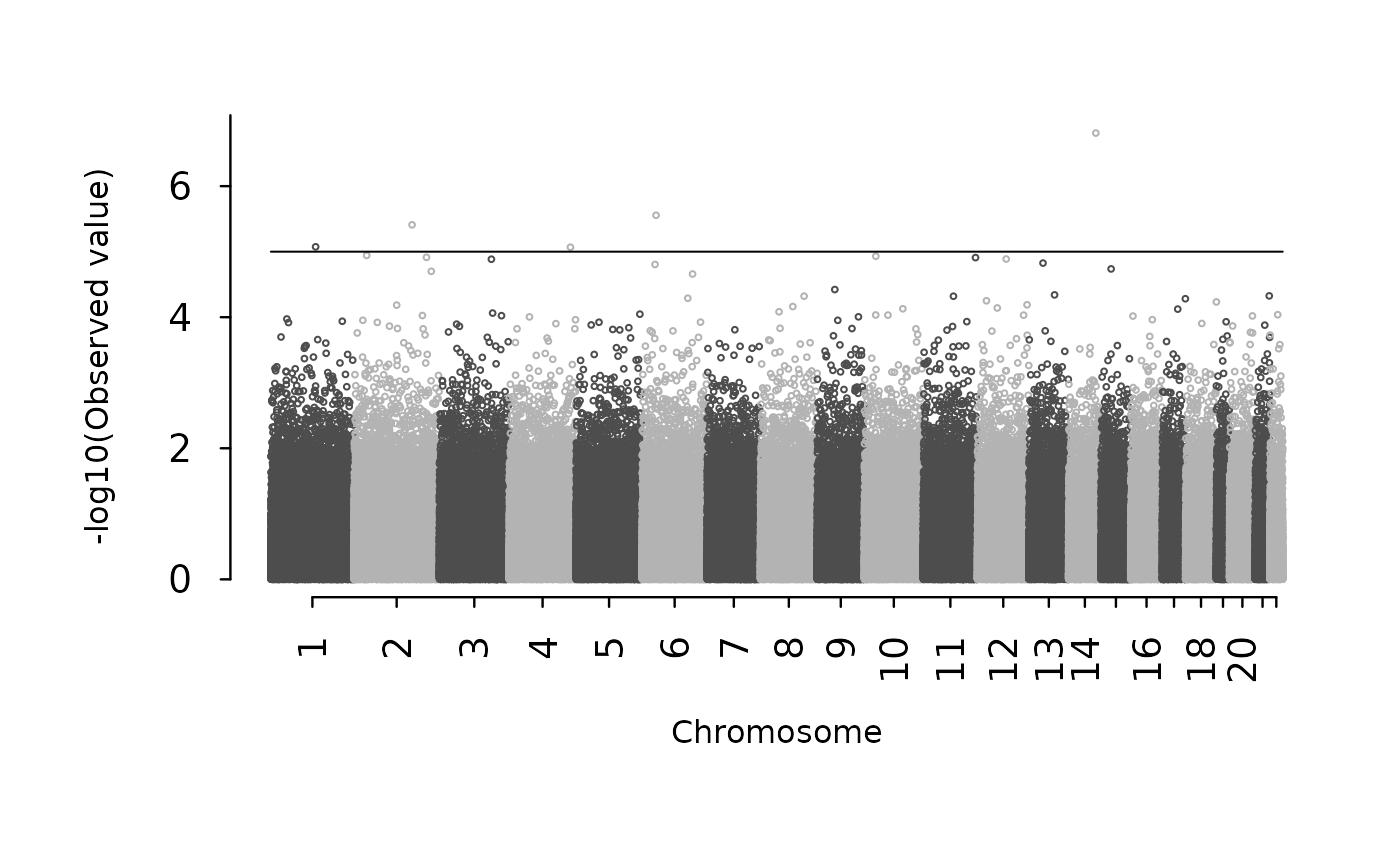
## 5. Genome-wide significance thresholds
## -----------------------------------------------------------
ops3 <- mht.control(cutoffs = c(5, 7.3))
mhtplot(gwas, control = ops3, pch = 19)
## -----------------------------------------------------------
## 5. Genome-wide significance thresholds
## -----------------------------------------------------------
ops3 <- mht.control(cutoffs = c(5, 7.3))
mhtplot(gwas, control = ops3, pch = 19)
 ## -----------------------------------------------------------
## 6. Highlight selected genes
## -----------------------------------------------------------
hdata <- data.frame(
chr = c(1,3,5),
pos = c(10000,50000,90000),
p = c(1e-8,1e-7,1e-9),
gene = c("GENE1","GENE2","GENE3")
)
hops <- hmht.control(
data = hdata,
colors = "red",
boxed = TRUE
)
mhtplot(gwas, control = ops, hcontrol = hops, pch = 19)
## -----------------------------------------------------------
## 6. Highlight selected genes
## -----------------------------------------------------------
hdata <- data.frame(
chr = c(1,3,5),
pos = c(10000,50000,90000),
p = c(1e-8,1e-7,1e-9),
gene = c("GENE1","GENE2","GENE3")
)
hops <- hmht.control(
data = hdata,
colors = "red",
boxed = TRUE
)
mhtplot(gwas, control = ops, hcontrol = hops, pch = 19)
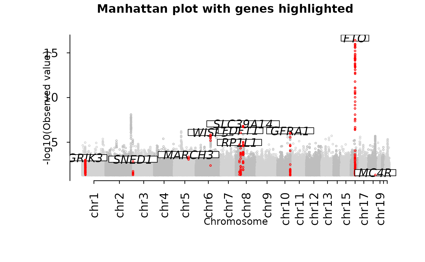
 ## A real study (data from gap.datasets package)
if (requireNamespace("gap.datasets", quietly = TRUE)) {
data("mhtdata", package = "gap.datasets")
data <- with(mhtdata, cbind(chr, pos, p))
glist <- c("IRS1","SPRY2","FTO","GRIK3","SNED1","HTR1A","MARCH3",
"WISP3","PPP1R3B","RP1L1","FDFT1","SLC39A14","GFRA1","MC4R")
hdata <- subset(mhtdata, gene %in% glist)[c("chr","pos","p","gene")]
ops <- mht.control(colors = rep(c("lightgray","gray"),11),
labels = paste("chr",1:22,sep=""),
yline = 1.5, xline = 3)
hops <- hmht.control(data = hdata, colors = "red", boxed = TRUE)
mhtplot(data, ops, hops, pch = 19)
title("Manhattan plot with genes highlighted")
}
## A real study (data from gap.datasets package)
if (requireNamespace("gap.datasets", quietly = TRUE)) {
data("mhtdata", package = "gap.datasets")
data <- with(mhtdata, cbind(chr, pos, p))
glist <- c("IRS1","SPRY2","FTO","GRIK3","SNED1","HTR1A","MARCH3",
"WISP3","PPP1R3B","RP1L1","FDFT1","SLC39A14","GFRA1","MC4R")
hdata <- subset(mhtdata, gene %in% glist)[c("chr","pos","p","gene")]
ops <- mht.control(colors = rep(c("lightgray","gray"),11),
labels = paste("chr",1:22,sep=""),
yline = 1.5, xline = 3)
hops <- hmht.control(data = hdata, colors = "red", boxed = TRUE)
mhtplot(data, ops, hops, pch = 19)
title("Manhattan plot with genes highlighted")
}
 ## -----------------------------------------------------------
## 7. Export high-resolution PNG
## -----------------------------------------------------------
f <- tempfile(fileext = ".png")
png(f, height = 3600, width = 6000, res = 600)
opar <- par()
par(cex = 0.7)
mhtplot(gwas, control = ops, pch = 19)
par(opar)
#> Warning: graphical parameter "cin" cannot be set
#> Warning: graphical parameter "cra" cannot be set
#> Warning: graphical parameter "csi" cannot be set
#> Warning: graphical parameter "cxy" cannot be set
#> Warning: graphical parameter "din" cannot be set
#> Warning: graphical parameter "page" cannot be set
dev.off()
#> agg_record_435030e2bd8d
#> 2
## -----------------------------------------------------------
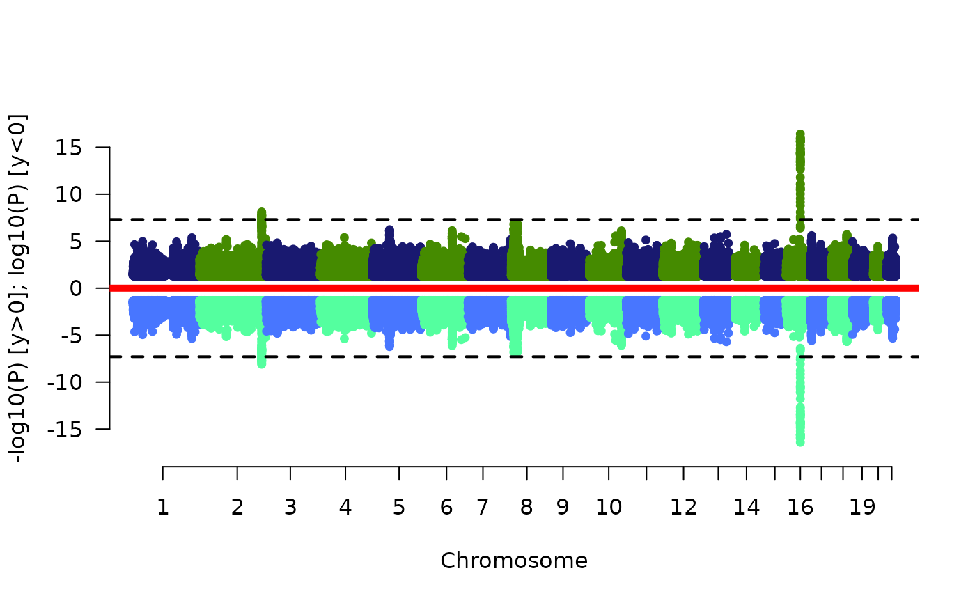
## 8. Miamiplot (see also vignette)
## -----------------------------------------------------------
if (requireNamespace("gap.datasets", quietly = TRUE)) {
data("mhtdata", package = "gap.datasets")
mhtdata <- within(mhtdata,{pr=p})
miamiplot(mhtdata,chr="chr",bp="pos",p="p",pr="pr",snp="rsn")
}
## -----------------------------------------------------------
## 7. Export high-resolution PNG
## -----------------------------------------------------------
f <- tempfile(fileext = ".png")
png(f, height = 3600, width = 6000, res = 600)
opar <- par()
par(cex = 0.7)
mhtplot(gwas, control = ops, pch = 19)
par(opar)
#> Warning: graphical parameter "cin" cannot be set
#> Warning: graphical parameter "cra" cannot be set
#> Warning: graphical parameter "csi" cannot be set
#> Warning: graphical parameter "cxy" cannot be set
#> Warning: graphical parameter "din" cannot be set
#> Warning: graphical parameter "page" cannot be set
dev.off()
#> agg_record_435030e2bd8d
#> 2
## -----------------------------------------------------------
## 8. Miamiplot (see also vignette)
## -----------------------------------------------------------
if (requireNamespace("gap.datasets", quietly = TRUE)) {
data("mhtdata", package = "gap.datasets")
mhtdata <- within(mhtdata,{pr=p})
miamiplot(mhtdata,chr="chr",bp="pos",p="p",pr="pr",snp="rsn")
}
 # }
# }