Quantile Plot for Gumbel Regression
qtplot.gumbel.RdPlots quantiles associated with a Gumbel model.
Usage
qtplot.gumbel(object, show.plot = TRUE,
    y.arg = TRUE, spline.fit = FALSE, label = TRUE,
    R = object@misc$R, percentiles = object@misc$percentiles,
    add.arg = FALSE, mpv = object@misc$mpv,
    xlab = NULL, ylab = "", main = "",
    pch = par()$pch, pcol.arg = par()$col,
    llty.arg = par()$lty, lcol.arg = par()$col, llwd.arg = par()$lwd,
    tcol.arg = par()$col, tadj = 1, ...)
Arguments
- object
A VGAM extremes model of the Gumbel type, produced by modelling functions such as
vglmandvgam, and with a family function that is eithergumbelorgumbelff.- show.plot
Logical. Plot it? If
FALSEno plot will be done.- y.arg
Logical. Add the raw data on to the plot?
- spline.fit
Logical. Use a spline fit through the fitted percentiles? This can be useful if there are large gaps between some values along the covariate.
- label
Logical. Label the percentiles?
- R
See
gumbel.- percentiles
See
gumbel.- add.arg
Logical. Add the plot to an existing plot?
- mpv
See
gumbel.- xlab
Caption for the x-axis. See
par.- ylab
Caption for the y-axis. See
par.- main
Title of the plot. See
title.- pch
Plotting character. See
par.- pcol.arg
Color of the points. See the
colargument ofpar.- llty.arg
Line type. Line type. See the
ltyargument ofpar.- lcol.arg
Color of the lines. See the
colargument ofpar.- llwd.arg
Line width. See the
lwdargument ofpar.- tcol.arg
Color of the text (if
labelisTRUE). See thecolargument ofpar.- tadj
Text justification. See the
adjargument ofpar.- ...
Arguments passed into the
plotfunction when setting up the entire plot. Useful arguments here includesubandlas.
Details
There should be a single covariate such as time.
The quantiles specified by percentiles are plotted.
Value
The object with a list called qtplot in the post
slot of object.
(If show.plot = FALSE then just the list is returned.)
The list contains components
- fitted.values
The percentiles of the response, possibly including the MPV.
- percentiles
The percentiles (small vector of values between 0 and 100.
Note
Unlike gumbel, one cannot have
percentiles = NULL.
Examples
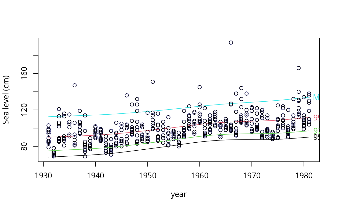
ymat <- as.matrix(venice[, paste("r", 1:10, sep = "")])
fit1 <- vgam(ymat ~ s(year, df = 3), gumbel(R = 365, mpv = TRUE),
             data = venice, trace = TRUE, na.action = na.pass)
#> VGAM  s.vam  loop  1 :  loglikelihood = -1137.5884
#> VGAM  s.vam  loop  2 :  loglikelihood = -1088.6181
#> VGAM  s.vam  loop  3 :  loglikelihood = -1079.7142
#> VGAM  s.vam  loop  4 :  loglikelihood = -1078.882
#> VGAM  s.vam  loop  5 :  loglikelihood = -1078.7252
#> VGAM  s.vam  loop  6 :  loglikelihood = -1078.713
#> VGAM  s.vam  loop  7 :  loglikelihood = -1078.7071
#> VGAM  s.vam  loop  8 :  loglikelihood = -1078.707
#> VGAM  s.vam  loop  9 :  loglikelihood = -1078.7066
#> VGAM  s.vam  loop  10 :  loglikelihood = -1078.7066
head(fitted(fit1))
#>        95%      99%      MPV
#> 1 68.17273 90.04047 112.6121
#> 2 68.46769 90.29102 112.8168
#> 3 68.76404 90.54248 113.0219
#> 4 69.05527 90.78985 113.2240
#> 5 69.33842 91.03085 113.4215
#> 6 69.61724 91.26808 113.6158

if (FALSE)  par(mfrow = c(1, 1), bty = "l", xpd = TRUE, las = 1)
qtplot(fit1, mpv = TRUE, lcol = c(1, 2, 5), tcol = c(1, 2, 5),
       lwd = 2, pcol = "blue", tadj = 0.4, ylab = "Sea level (cm)")

qtplot(fit1, perc = 97, mpv = FALSE, lcol = 3, tcol = 3,
       lwd = 2, tadj = 0.4, add = TRUE) -> saved

head(saved@post$qtplot$fitted)
#>        97%
#> 1 75.11341
#> 2 75.39428
#> 3 75.67638
#> 4 75.95369
#> 5 76.22346
#> 6 76.48908
 # \dontrun{}
head(saved@post$qtplot$fitted)
#> 97%
#> 1 75.11341
#> 2 75.39428
#> 3 75.67638
#> 4 75.95369
#> 5 76.22346
#> 6 76.48908
# \dontrun{}