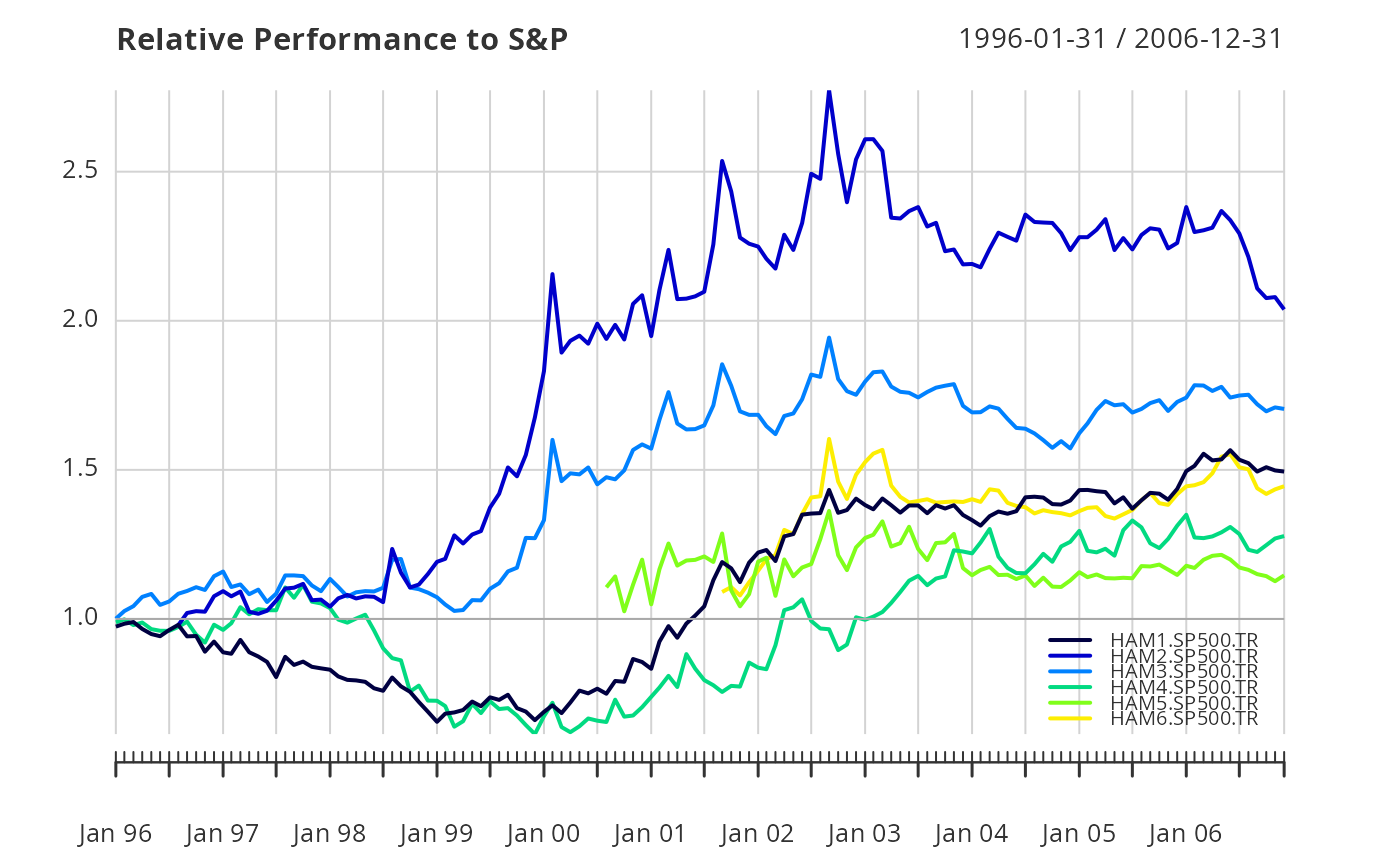
relative performance chart between multiple return series
Source:R/chart.RelativePerformance.R
chart.RelativePerformance.RdPlots a time series chart that shows the ratio of the cumulative performance for two assets at each point in time and makes periods of under- or out-performance easier to see.
Usage
chart.RelativePerformance(
  Ra,
  Rb,
  main = "Relative Performance",
  xaxis = TRUE,
  colorset = (1:12),
  legend.loc = NULL,
  ylog = FALSE,
  elementcolor = "darkgray",
  lty = 1,
  cex.legend = 0.7,
  ...
)
Arguments
- Ra
an xts, vector, matrix, data frame, timeSeries or zoo object of asset returns
- Rb
return vector of the benchmark asset
- main
set the chart title, same as in
plot- xaxis
if true, draws the x axis
- colorset
color palette to use, set by default to rational choices
- legend.loc
places a legend into one of nine locations on the chart: bottomright, bottom, bottomleft, left, topleft, top, topright, right, or center.
- ylog
TRUE/FALSE set the y-axis to logarithmic scale, similar to
plot, default FALSE- elementcolor
provides the color for drawing less-important chart elements, such as the box lines, axis lines, etc. replaces
darken- lty
set the line type, same as in
plot- cex.legend
the magnification to be used for sizing the legend relative to the current setting of 'cex'.
- ...
any other passthru parameters
Details
To show under- and out-performance through different periods of time, a time series view is more helpful. The value of the chart is less important than the slope of the line. If the slope is positive, the first asset (numerator) is outperforming the second, and vice versa. May be used to look at the returns of a fund relative to each member of the peer group and the peer group index. Alternatively, it might be used to assess the peers individually against an asset class or peer group index.
Examples
data(managers)
chart.RelativePerformance(managers[, 1:6, drop=FALSE],
    managers[, 8, drop=FALSE],
    colorset=rich8equal, legend.loc="bottomright",
    main="Relative Performance to S&P")