Create a histogram of returns, with optional curve fits for density and
normal. This is a wrapper function for hist, see
the help for that function for additional arguments you may wish to pass in.
Usage
chart.Histogram(
  R,
  breaks = "FD",
  main = NULL,
  xlab = "Returns",
  ylab = "Frequency",
  methods = c("none", "add.density", "add.normal", "add.centered", "add.cauchy",
    "add.sst", "add.rug", "add.risk", "add.qqplot"),
  show.outliers = TRUE,
  colorset = c("lightgray", "#00008F", "#005AFF", "#23FFDC", "#ECFF13", "#FF4A00",
    "#800000"),
  border.col = "white",
  lwd = 2,
  xlim = NULL,
  ylim = NULL,
  element.color = "darkgray",
  note.lines = NULL,
  note.labels = NULL,
  note.cex = 0.7,
  note.color = "darkgray",
  probability = FALSE,
  p = 0.95,
  cex.axis = 0.8,
  cex.legend = 0.8,
  cex.lab = 1,
  cex.main = 1,
  xaxis = TRUE,
  yaxis = TRUE,
  ...
)
Arguments
- R
an xts, vector, matrix, data frame, timeSeries or zoo object of asset returns
- breaks
one of:
a vector giving the breakpoints between histogram cells,
a single number giving the number of cells for the histogram,
a character string naming an algorithm to compute the number of cells (see ‘Details’),
a function to compute the number of cells.
For the last three the number is a suggestion only. see
histfor details, default "FD"- main
set the chart title, same as in
plot- xlab
set the x-axis label, same as in
plot- ylab
set the y-axis label, same as in
plot- methods
what to graph, one or more of:
add.density to display the density plot
add.normal to display a fitted normal distibution line over the mean
add.centered to display a fitted normal line over zero
add.rug to display a rug of the observations
add.risk to display common risk metrics
add.qqplot to display a small qqplot in the upper corner of the histogram plot
- show.outliers
logical; if TRUE (the default), the histogram will show all of the data points. If FALSE, it will show only the first through the fourth quartile and will exclude outliers.
- colorset
color palette to use, set by default to rational choices
- border.col
color to use for the border
- lwd
set the line width, same as in
plot- xlim
set the x-axis limit, same as in
plot- ylim
set the y-axis limits, same as in
plot- element.color
provides the color for drawing chart elements, such as the box lines, axis lines, etc. Default is "darkgray"
- note.lines
draws a vertical line through the value given.
- note.labels
adds a text label to vertical lines specified for note.lines.
- note.cex
The magnification to be used for note line labels relative to the current setting of 'cex'.
- note.color
specifies the color(s) of the vertical lines drawn.
- probability
logical; if TRUE, the histogram graphic is a representation of frequencies, the counts component of the result; if FALSE, probability densities, component density, are plotted (so that the histogram has a total area of one). Defaults to TRUE if and only if breaks are equidistant (and probability is not specified). see
hist- p
confidence level for calculation, default p=.99
- cex.axis
The magnification to be used for axis annotation relative to the current setting of 'cex', same as in
plot.- cex.legend
The magnification to be used for sizing the legend relative to the current setting of 'cex'.
- cex.lab
The magnification to be used for x- and y-axis labels relative to the current setting of 'cex'.
- cex.main
The magnification to be used for the main title relative to the current setting of 'cex'.
- xaxis
if true, draws the x axis
- yaxis
if true, draws the y axis
- ...
any other passthru parameters to
plot
Details
The default for breaks is "FD". Other names for which
algorithms are supplied are "Sturges" (see
nclass.Sturges), "Scott", and "FD" /
"Freedman-Diaconis" (with corresponding functions
nclass.scott and nclass.FD). Case is ignored
and partial matching is used. Alternatively, a function can be supplied
which will compute the intended number of breaks as a function of R.
Examples
data(edhec)
chart.Histogram(edhec[,'Equity Market Neutral',drop=FALSE])
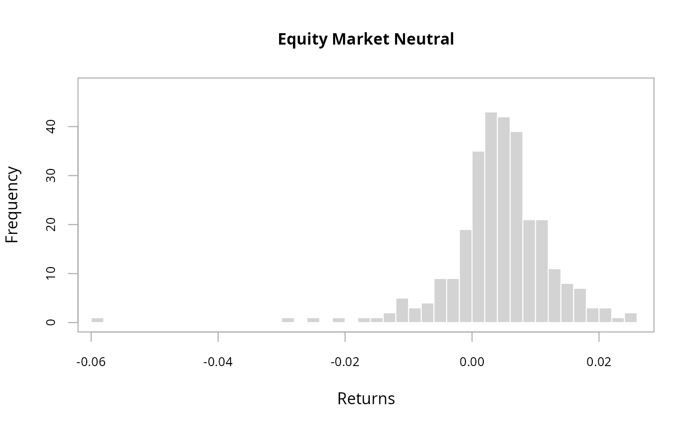 # version with more breaks and the
# standard close fit density distribution
chart.Histogram(edhec[,'Equity Market Neutral',drop=FALSE],
breaks=40, methods = c("add.density", "add.rug") )
# version with more breaks and the
# standard close fit density distribution
chart.Histogram(edhec[,'Equity Market Neutral',drop=FALSE],
breaks=40, methods = c("add.density", "add.rug") )
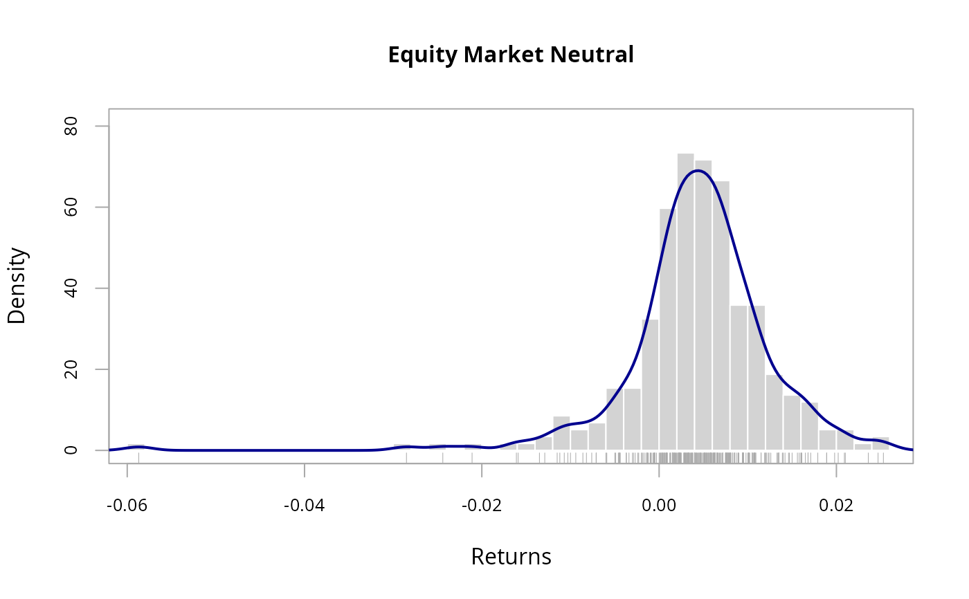 chart.Histogram(edhec[,'Equity Market Neutral',drop=FALSE],
methods = c( "add.density", "add.normal") )
chart.Histogram(edhec[,'Equity Market Neutral',drop=FALSE],
methods = c( "add.density", "add.normal") )
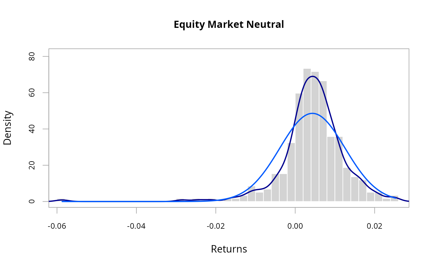 # version with just the histogram and
# normal distribution centered on 0
chart.Histogram(edhec[,'Equity Market Neutral',drop=FALSE],
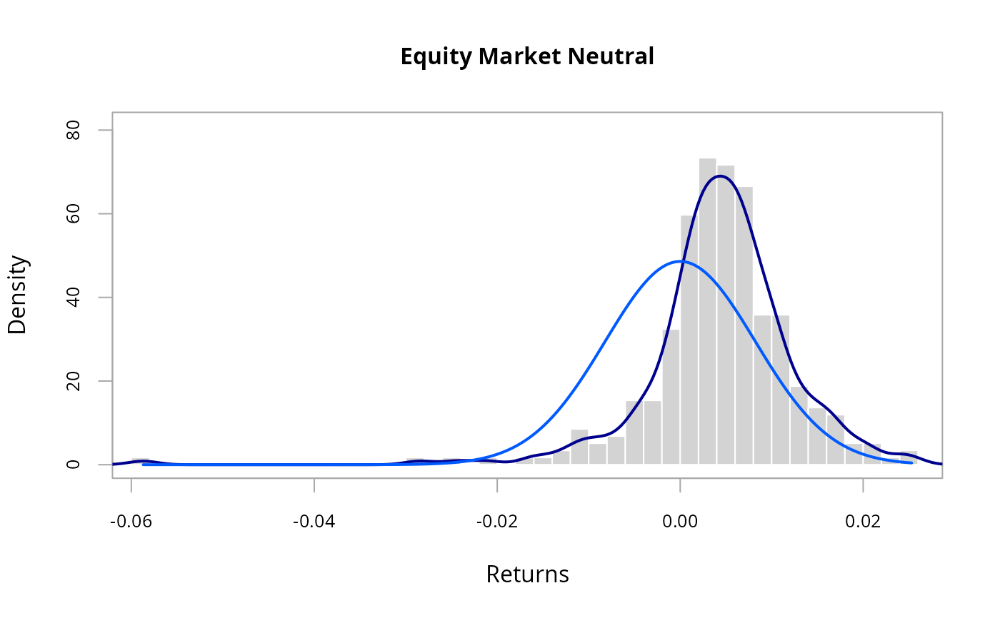
methods = c( "add.density", "add.centered") )
# version with just the histogram and
# normal distribution centered on 0
chart.Histogram(edhec[,'Equity Market Neutral',drop=FALSE],
methods = c( "add.density", "add.centered") )
 # add a rug to the previous plot
# for more granularity on precisely where the distribution fell
chart.Histogram(edhec[,'Equity Market Neutral',drop=FALSE],
methods = c( "add.centered", "add.density", "add.rug") )
# now show a qqplot to give us another view
# on how normal the data are
chart.Histogram(edhec[,'Equity Market Neutral',drop=FALSE],
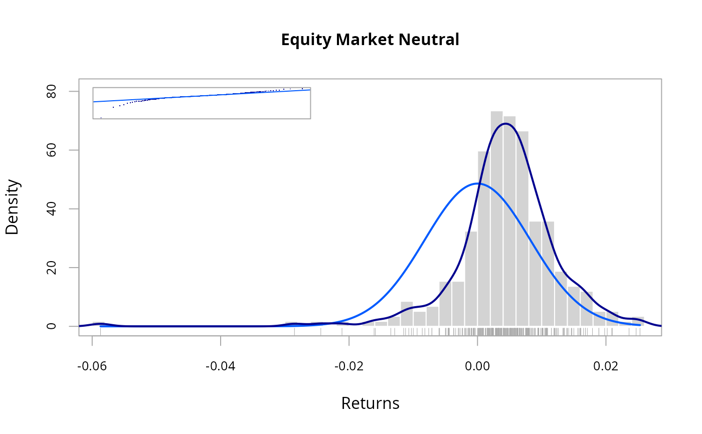
methods = c("add.centered","add.density","add.rug","add.qqplot"))
# add a rug to the previous plot
# for more granularity on precisely where the distribution fell
chart.Histogram(edhec[,'Equity Market Neutral',drop=FALSE],
methods = c( "add.centered", "add.density", "add.rug") )
# now show a qqplot to give us another view
# on how normal the data are
chart.Histogram(edhec[,'Equity Market Neutral',drop=FALSE],
methods = c("add.centered","add.density","add.rug","add.qqplot"))
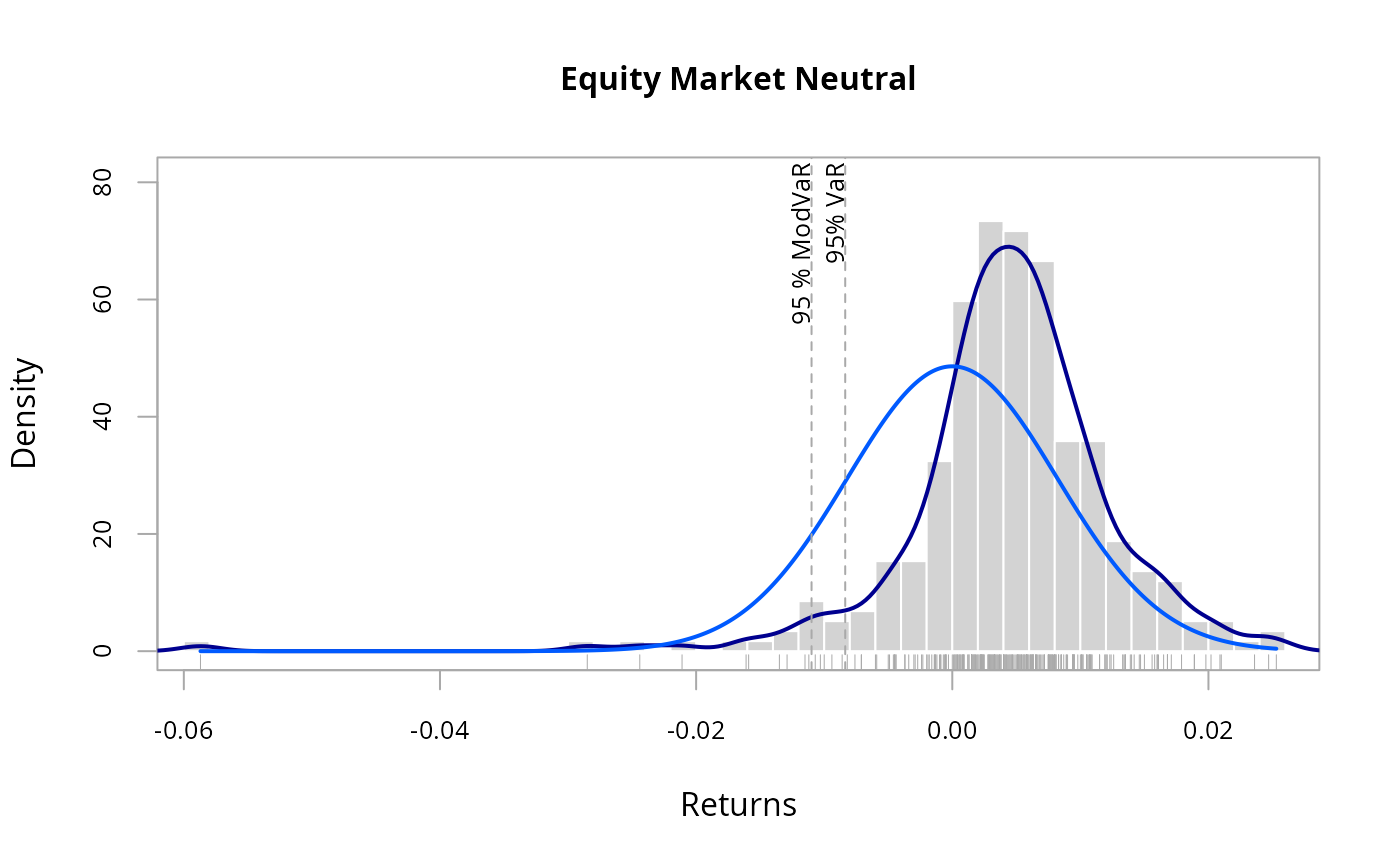
 # add risk measure(s) to show where those are
# in relation to observed returns
chart.Histogram(edhec[,'Equity Market Neutral',drop=FALSE],
methods = c("add.density","add.centered","add.rug","add.risk"))
# add risk measure(s) to show where those are
# in relation to observed returns
chart.Histogram(edhec[,'Equity Market Neutral',drop=FALSE],
methods = c("add.density","add.centered","add.rug","add.risk"))