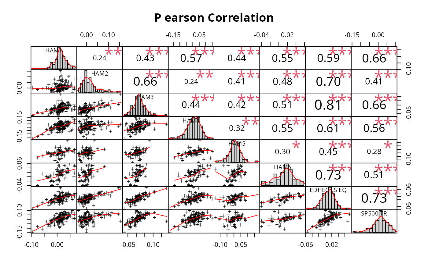
Visualization of a Correlation Matrix. On top the (absolute) value of the
correlation plus the result of the cor.test as stars. On bottom, the
bivariate scatterplots, with a fitted line. When the method parameter
is set to "spearman" or "kendall", the lower panel scatterplots are automatically
transformed to plot the monotonically ranked data rather than the raw values,
providing visual alignment with the evaluated correlation method.
Usage
chart.Correlation(
  R,
  histogram = TRUE,
  method = c("pearson", "kendall", "spearman"),
  pch = 1,
  ...
)
Arguments
- R
data for the x axis, can take matrix,vector, or timeseries
- histogram
TRUE/FALSE whether or not to display a histogram
- method
a character string indicating which correlation coefficient (or covariance) is to be computed. One of "pearson" (default), "kendall", or "spearman", can be abbreviated.
- pch
See
par- ...
any other passthru parameters into
pairs
Examples
data(managers)
chart.Correlation(managers[, 1:8], histogram = TRUE, pch = "+")