Creates a time series chart with some extensions.
Source:R/chart.TimeSeries.R, R/chart.TimeSeries.base.R, R/chart.TimeSeries.builtin.R, and 5 more
chart.TimeSeries.RdDraws a line chart and labels the x-axis with the appropriate dates. This
is really a "primitive", since it extends the base plot and
standardizes the elements of a chart. Adds attributes for shading areas of
the timeline or aligning vertical lines along the timeline. This function is
intended to be used inside other charting functions.
chart.TimeSeries(
  R,
  ...,
  auto.grid = TRUE,
  xaxis = TRUE,
  yaxis = TRUE,
  yaxis.right = FALSE,
  type = "l",
  lty = 1,
  lwd = 1,
  las = par("las"),
  main = "",
  ylab = "",
  xlab = "",
  date.format.in = "%Y-%m-%d",
  date.format = NULL,
  xlim = NULL,
  ylim = NULL,
  element.color = "darkgray",
  event.lines = NULL,
  event.labels = NULL,
  period.areas = NULL,
  event.color = "darkgray",
  period.color = "aliceblue",
  colorset = (1:12),
  pch = (1:12),
  legend.loc = NULL,
  ylog = FALSE,
  cex.axis = 0.8,
  cex.legend = 0.8,
  cex.lab = 1,
  cex.labels = 0.8,
  cex.main = 1,
  major.ticks = "auto",
  minor.ticks = TRUE,
  grid.color = "lightgray",
  grid.lty = "dotted",
  xaxis.labels = NULL,
  plot.engine = "default",
  yaxis.pct = FALSE
)

chart.TimeSeries.base(
  R,
  auto.grid,
  xaxis,
  yaxis,
  yaxis.right,
  type,
  lty,
  lwd,
  las,
  main,
  ylab,
  xlab,
  date.format.in,
  date.format,
  xlim,
  ylim,
  element.color,
  event.lines,
  event.labels,
  period.areas,
  event.color,
  period.color,
  colorset,
  pch,
  legend.loc,
  ylog,
  cex.axis,
  cex.legend,
  cex.lab,
  cex.labels,
  cex.main,
  major.ticks,
  minor.ticks,
  grid.color,
  grid.lty,
  xaxis.labels,
  plot.engine,
  yaxis.pct,
  ...
)

chart.TimeSeries.builtin(
  R,
  auto.grid,
  xaxis,
  yaxis,
  yaxis.right,
  type,
  lty,
  lwd,
  las,
  main,
  ylab,
  xlab,
  date.format.in,
  date.format,
  xlim,
  ylim,
  element.color,
  event.lines,
  event.labels,
  period.areas,
  event.color,
  period.color,
  colorset,
  pch,
  legend.loc,
  ylog,
  cex.axis,
  cex.legend,
  cex.lab,
  cex.labels,
  cex.main,
  major.ticks,
  minor.ticks,
  grid.color,
  grid.lty,
  xaxis.labels,
  yaxis.pct,
  ...
)

chart.TimeSeries.dygraph(R)

chart.TimeSeries.ggplot2(
  R,
  auto.grid,
  xaxis,
  yaxis,
  yaxis.right,
  type,
  lty,
  lwd,
  las,
  main,
  ylab,
  xlab,
  date.format.in,
  date.format,
  xlim,
  ylim,
  element.color,
  event.lines,
  event.labels,
  period.areas,
  event.color,
  period.color,
  colorset,
  pch,
  legend.loc,
  ylog,
  cex.axis,
  cex.legend,
  cex.lab,
  cex.labels,
  cex.main,
  major.ticks,
  minor.ticks,
  grid.color,
  grid.lty,
  xaxis.labels,
  plot.engine,
  yaxis.pct
)

chart.TimeSeries.googlevis(R, xlab, ylab, main)

chart.TimeSeries.plotly(R, main, ...)

charts.TimeSeries(R, space = 0, main = "Returns", ...)
Arguments
- R
an xts, vector, matrix, data frame, timeSeries or zoo object of asset returns
- ...
any other passthru parameters
- auto.grid
if true, draws a grid aligned with the points on the x and y axes
- xaxis
if true, draws the x axis
- yaxis
if true, draws the y axis
- yaxis.right
if true, draws the y axis on the right-hand side of the plot
- type
set the chart type, same as in
plot- lty
set the line type, same as in
plot- lwd
set the line width, same as in
plot- las
set the axis label rotation, same as in
plot- main
set the chart title, same as in
plot- ylab
set the y-axis label, same as in
plot- xlab
set the x-axis label, same as in
plot- date.format.in
allows specification of other date formats in the data object, defaults to "%Y-%m-%d"
- date.format
re-format the dates for the xaxis; the default is "%m/%y"
- xlim
set the x-axis limit, same as in
plot- ylim
set the y-axis limit, same as in
plot- element.color
provides the color for drawing chart elements, such as the box lines, axis lines, etc. Default is "darkgray"
- event.lines
if not null, vertical lines will be drawn to indicate that an event happened during that time period.
event.linesshould be a list of dates (e.g.,c("09/03","05/06"))formatted the same as date.format. This function matches the re-formatted row names (dates) with the events.list, so to get a match the formatting needs to be correct.- event.labels
if not null and event.lines is not null, this will apply a list of text labels (e.g.,
c("This Event", "That Event")to the vertical lines drawn. See the example below.- period.areas
these are shaded areas described by start and end dates in a vector of xts date rangees, e.g.,
c("1926-10::1927-11","1929-08::1933-03")See the examples below.- event.color
draws the event described in
event.labelsin the color specified- period.color
draws the shaded region described by
period.areasin the color specified- colorset
color palette to use, set by default to rational choices
- pch
symbols to use, see also
plot- legend.loc
places a legend into one of nine locations on the chart: bottomright, bottom, bottomleft, left, topleft, top, topright, right, or center.
- ylog
TRUE/FALSE set the y-axis to logarithmic scale, similar to
plot, default FALSE- cex.axis
The magnification to be used for axis annotation relative to the current setting of 'cex', same as in
plot.- cex.legend
The magnification to be used for sizing the legend relative to the current setting of 'cex'.
- cex.lab
The magnification to be used for x- and y-axis labels relative to the current setting of 'cex'.
- cex.labels
The magnification to be used for event line labels relative to the current setting of 'cex'.
- cex.main
The magnification to be used for the chart title relative to the current setting of 'cex'.
- major.ticks
Should major tickmarks be drawn and labeled, default 'auto'
- minor.ticks
Should minor tickmarks be drawn, default TRUE
- grid.color
sets the color for the reference grid
- grid.lty
defines the line type for the grid
- xaxis.labels
Allows for non-date labeling of date axes, default is NULL
- plot.engine
choose the plot engine you wish to use: ggplot2, plotly,dygraph,googlevis and default
- yaxis.pct
if TRUE, scales the y axis labels by 100
- space
default 0
See also
Examples
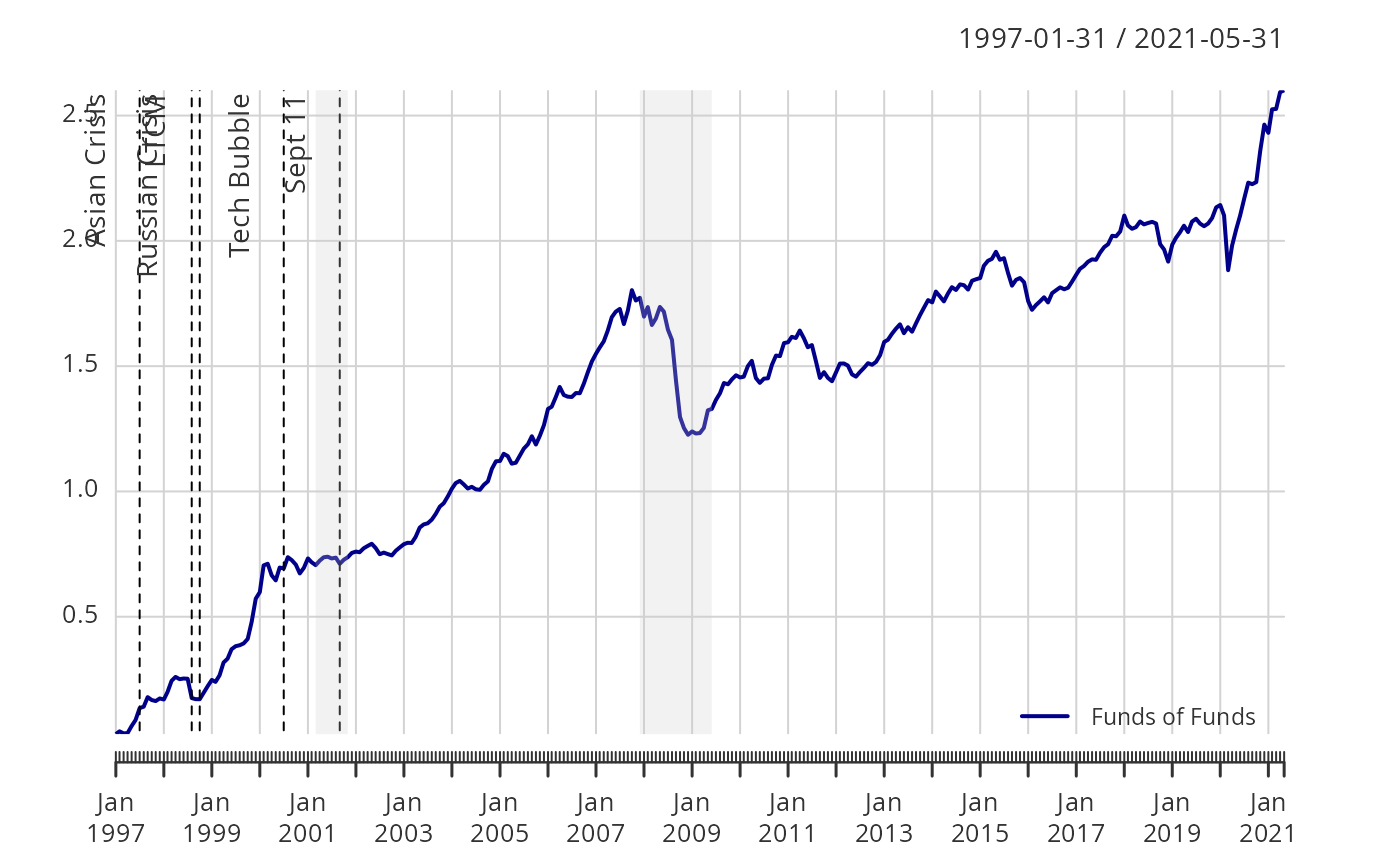
# These are start and end dates, formatted as xts ranges.
## https://www.nber.org-cycles.html
cycles.dates<-c("1857-06/1858-12",
"1860-10/1861-06",
"1865-04/1867-12",
"1869-06/1870-12",
"1873-10/1879-03",
"1882-03/1885-05",
"1887-03/1888-04",
"1890-07/1891-05",
"1893-01/1894-06",
"1895-12/1897-06",
"1899-06/1900-12",
"1902-09/1904-08",
"1907-05/1908-06",
"1910-01/1912-01",
"1913-01/1914-12",
"1918-08/1919-03",
"1920-01/1921-07",
"1923-05/1924-07",
"1926-10/1927-11",
"1929-08/1933-03",
"1937-05/1938-06",
"1945-02/1945-10",
"1948-11/1949-10",
"1953-07/1954-05",
"1957-08/1958-04",
"1960-04/1961-02",
"1969-12/1970-11",
"1973-11/1975-03",
"1980-01/1980-07",
"1981-07/1982-11",
"1990-07/1991-03",
"2001-03/2001-11",
"2007-12/2009-06"
)
# Event lists - FOR BEST RESULTS, KEEP THESE DATES IN ORDER
risk.dates = c(
"Oct 87",
"Feb 94",
"Jul 97",
"Aug 98",
"Oct 98",
"Jul 00",
"Sep 01")
risk.labels = c(
"Black Monday",
"Bond Crash",
"Asian Crisis",
"Russian Crisis",
"LTCM",
"Tech Bubble",
"Sept 11")
data(edhec)
R=edhec[,"Funds of Funds",drop=FALSE]
Return.cumulative = cumprod(1+R) - 1
chart.TimeSeries(Return.cumulative)
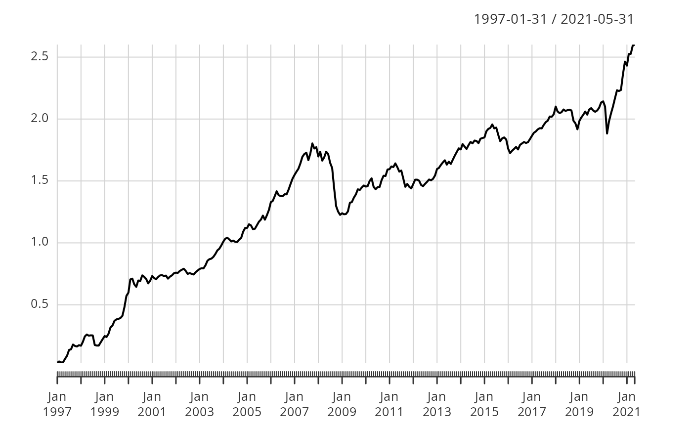 chart.TimeSeries(Return.cumulative, colorset = "darkblue",
legend.loc = "bottomright",
period.areas = cycles.dates,
period.color = rgb(204/255, 204/255, 204/255, alpha=0.25),
event.lines = risk.dates,
event.labels = risk.labels,
event.color = "red", lwd = 2)
chart.TimeSeries(Return.cumulative, colorset = "darkblue",
legend.loc = "bottomright",
period.areas = cycles.dates,
period.color = rgb(204/255, 204/255, 204/255, alpha=0.25),
event.lines = risk.dates,
event.labels = risk.labels,
event.color = "red", lwd = 2)