Create ACF chart or ACF with PACF two-panel chart
Source:R/chart.ACF.R, R/chart.ACFplus.R
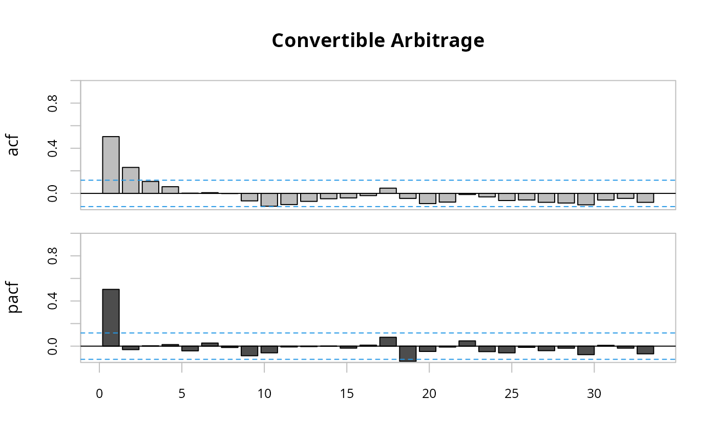
chart.ACF.RdCreates an ACF chart or a two-panel plot with the ACF and PACF set to some specific defaults.
chart.ACF(R, maxlag = NULL, elementcolor = "gray", main = NULL, ...)

chart.ACFplus(R, maxlag = NULL, elementcolor = "gray", main = NULL, ...)
Arguments
Note
Inspired by the website: https://www.stat.pitt.edu/stoffer/tsa2/Rcode/acf2.R "...here's an R function that will plot the ACF and PACF of a time series at the same time on the SAME SCALE, and it leaves out the zero lag in the ACF: acf2.R. If your time series is in x and you want the ACF and PACF of x to lag 50, the call to the function is acf2(x,50). The number of lags is optional, so acf2(x) will use a default number of lags [sqrt(n) + 10, where n is the number of observations]."
That description made a lot of sense, so it's implemented here for both the ACF alone and the ACF with the PACF.
See also
Examples
data(edhec)
chart.ACFplus(edhec[,1,drop=FALSE])